-
-

Logo
-

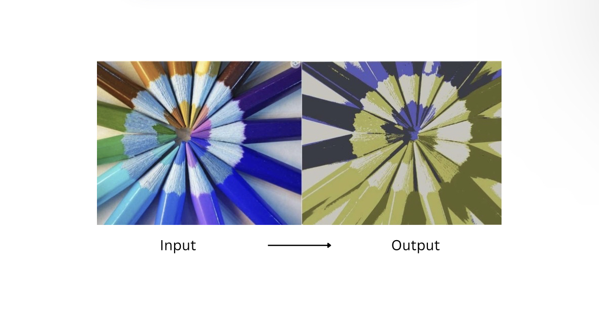
Color Transformation for Protanopia and Deuteranopia

Inspiration
Art is a universal experience, and everyone deserves the opportunity to engage with it fully. Yet, for a significant portion of the population, those with color blindness, experiencing art can be limited, especially when it comes to red and green hues. These two colors constitute approximately 35–40% of artworks, respectively, making them crucial elements in visual art. Unfortunately, this means that many paintings, illustrations, and digital pieces are often inaccessible to individuals with red-green color blindness.
What it does
We are developing an AI that dynamically adjusts and enhances the perception of red and green tones based on a novel approach inspired through research, generating pictures the colorblind are able to understand. This ensures that art becomes more inclusive and perceptually enriching for all.
How we built it
Scikit-learn provides classic machine learning models like KMeans, which are useful for color clustering and segmentation.
OpenCV (cv2) is a powerful computer vision library often used for image manipulation and filtering.
NumPy supports mathematical and matrix operations, making it ideal for processing image data.
Pillow (PIL) helps with loading and saving images, as well as converting formats and enhancing image quality.
For more advanced tasks, TensorFlow and PyTorch offer deep learning frameworks that can be used to create models for color correction.
Finally, Matplotlib and Seaborn are visualization tools useful for plotting color maps and histograms, helping to understand and visualize image data better.
Challenges we ran into
The execution of the algorithm we decided to utilize
Creating a basic and accurate sample for our app
Finding novel methods not yet applied in AI for color vision deficiency
Balancing color accuracy while preserving artistic intent
Accomplishments that we're proud of
Designing a project that promotes inclusiveness in the understanding of Art
Creating an algorithm based on novel research:
That recolors images naturally
Allows colorblind people to easily distinguish between indistinguishable colors
Built a user-friendly interface
Testing our method on person who is diagnosed with red and green color blindness and having positive and successful results
What we learned
We gained a better understanding of the experiences of color blind people
We developed a methodology that enables colorblind users to experience and distinguish the differences between colors
What's next for AI to Enhance Art Perception for Protanopia & Deuteranopia
Implementing an evaluation test for the user to ensure a more accurate output for the audience by:
Allowing users to draw the confusion line in a CIE 1931 chart, color diagram, to identify the shades of colors that they see as one, to make it more personalized and suitable for the user .
Replacing the K-means clustering by fuzzy clustering to have a more precise result.
Conducting further assessments on colorblind people


Log in or sign up for Devpost to join the conversation.