-
-
Demo Password: MENTOR2026
Inspiration
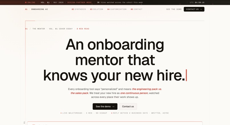
Starting a new job should feel exciting. For most of us, it feels like getting handed forty-seven Slack DMs, an onboarding Loom recorded by someone who left a year ago, a Notion handbook nobody's updated since 2024, and a manager whose "let me know if you need anything!" somehow means nothing.
Companies pour over four billion dollars a year into onboarding. Roughly thirty percent of new hires leave within ninety days. Seventy percent say they were inadequately onboarded. That gap isn't getting smaller — and it isn't a content problem.
The hardest part of starting a new job isn't what they teach you. It's everything they don't. How does your manager actually like to be pinged — Slack or email, morning or end of day? When the staff engineer says "interesting idea, let's discuss offline" — does she mean she wants to discuss it, or that she's politely killing it? Which meeting can you skip, and which one will define your first performance review? What does "shipping fast" mean here, versus where you used to work?
Nobody writes that down. You're supposed to figure it out by getting it wrong, repeatedly, in front of the people you're trying to impress.
Great mentors solve that. Mentors don't scale. So we built one that does.
What it does
lockedinlife is an AI mentor for the first ninety days at any new job — and for every moment after where you're expected to figure it out alone.
The product is built around three surfaces and a persistent mentor chat.
Home is your daily snapshot — a calm unified timeline that interleaves today's meetings with focus items on a single rail. No "day fourteen at Acme" counter. No widget noise. Just what's happening today and what you owe yourself.
People ranks the people in your orbit by what's actually influencing your work right now — not by who DMs you the most. Chip size literally scales with the attention each person deserves. Big chips up top with mentor reasoning ("approving your activation roadmap"), condensed avatars at the bottom for the long tail. Click any person and you land in their relationship view: the latest interaction (collapsed by default), what's coming up with them, and the timeline of every meeting and message you've shared.
You mirrors that structure turned inward — your goals, the patterns the mentor has noticed about you, and your week-by-week journey, with inline references that link back to the people and meetings that mattered.
A persistent mentor chat lives across every screen, invoked via Cmd+K or a docked pill in the top-right corner. It absorbs both asking and searching — one conversational input, automatically scoped to whatever page you're on. Type "what did we agree on about pricing?" and it pulls the thread. Type "how should I prep for my Wednesday 1:1?" and it coaches.
The hero feature is the post-meeting debrief. After every conversation, the mentor doesn't just summarize what was said — it reads what was meant. "Priya said let's discuss offline. Last two times she used that phrase, she had a substantive concern she didn't want to raise in front of the team. Want help drafting a follow-up that addresses her real concerns?"
That's the moment that turns onboarding from generic content into actual mentorship.
How we built it
We started by inverting the conventional hackathon approach. Most teams build a feature, then write a pitch around it. We did the opposite — drafted the two-minute video script first, then designed the prototype backward from what the script needed to demonstrate. Because this hackathon weights story and impact at ninety percent and prototype quality at ten percent, that discipline was essential. The prototype's job was to serve the demo, not be a real product.
The product itself went through four major redesign passes. We started with eight screens and narrowed to three plus a chat. The first People view was an org-chart directory; we replaced it with mentor-curated importance tiers. The first Person view had identity, bio, and "how to work with them" as separate static sections; we collapsed identity into a one-line breadcrumb, killed the bio entirely, and wove coaching observations into the contextual read of the latest meeting where they actually become useful. We added a search bar to the Person view, realized it duplicated what the mentor already does, and ripped it out. Every iteration made the surface smaller and the worldview sharper.
Wireframes were built in HTML using a calm-coach visual language inspired by Linear, Cron, and Mercury. Left rail navigation with the filled-tile active state convention. The mentor chat is a slide-in overlay, not a push, because at typical viewport sizes a push would crush the canvas.
The full two-minute video was produced in roughly an hour using a stack of best-in-class AI tools fired in parallel: ElevenLabs for narration (Eleven v3 alpha with audio tags for emotional pacing), Veo 3 for cinematic b-roll, Midjourney v7 for character stills, Runway Gen-4 image-to-video for animating those stills into 2-second loops, Suno v4 for the original score, and Descript for assembly. We fired all the long-running generations in parallel browser tabs and used the wait time to screen-record the wireframe footage.
Challenges we ran into
The hardest design work was subtractive. Every iteration meant killing something we'd written or drawn — and the things we removed were almost always the things our instinct said to add.
The People view took the most rounds. The first version grouped people by org-chart relationship — Manager / Peers / Cross-functional / Leadership. Clean, conventional, and wrong, because that's not how anyone actually thinks about who matters in their week. We replaced it with mentor-curated tiers (Focus / Active / Quiet) where chip size scales with current importance, and importance is content-aware rather than frequency-aware. That insight — that someone who DMs you constantly is less important than the skip-level you haven't talked to in two weeks but who'll review your first project — became the core product worldview, but only after we'd built and discarded the directory version.
The Person view went through five versions. Each iteration cut something we'd added the round before. We learned that a static "how to work with them" profile is noise; the same observations weave naturally into the contextual coaching of the latest meeting, where they're actually useful. We learned that a scoped search input fragments interaction with the mentor; one conversational input that absorbs both asking and searching is more honest to the mentorship metaphor.
We also learned to kill AI-product chrome — sublines that explain what the layout does. "Ranked by what's influencing your goals — not message volume" sounded helpful, but it announced what the design was already showing. The chip-size hierarchy is the explanation. If a line of UI is explaining what the layout does, it dies.
On the production side, AI tooling threw curveballs. ElevenLabs' Studio export pipeline broke on us under deadline, forcing a fallback to the simpler Speech Synthesis interface mid-build. Veo 3's default audio output clashed with the narration until we explicitly prompted "no dialogue." Runway Gen-4 occasionally morphed character faces in the image-to-video step, requiring re-runs. AI video tools still hallucinate UI text, which forced us to use kinetic-typography overlays for the cold open's punchlines instead of trying to generate recognizable Slack windows.
Accomplishments that we're proud of
The reframe is the thing we're most proud of: onboarding isn't a training problem, it's a mentorship problem. That single move re-poses the entire industry's approach. Companies have been investing in content — training videos, handbooks, bootcamps — when what new hires actually need is mentorship. Mentorship doesn't scale. That's the entire reason this product exists.
The People view's content-aware tier system is the worldview rendered as UI. Chip size encodes attention budget. Big chips up top with mentor reasoning, condensed avatars at the bottom for the long tail. Without reading a word, you know who matters this week.
The single-input mentor model — one conversational entry point that absorbs both asking and searching, automatically scoped to the current page — makes the product feel like a relationship instead of a database. The post-meeting debrief that decodes subtext ("what was said" vs "what was meant") is the demoable hero moment that pays off the entire pitch.
The visual consistency across screens reinforces the worldview structurally: the You view mirrors the Person view's three-zone shape (Latest / Ahead / Timeline) turned inward, so the design quietly argues that self is just another person you're getting to know.
And we shipped a complete two-minute video — AI-generated narration, cinematic b-roll, animated character clips, original score, screen-recorded prototype demo — in a single hour, using only AI tools. The script does the heavy lifting; AI handled the surface.
What we learned
Three lessons we'd give another team building an AI product.
Subtractive design beats additive design. The best moves we made were what we removed: the identity zone on the Person view, the search bar that duplicated the mentor, the sublines that explained what the layout was already showing. Each removal made the worldview sharper, not smaller. Anyone can add features; the craft is knowing what doesn't earn its place on the page.
Voice and tone matter as much as visual design in AI products. A coach who says "worth a follow-up" is doing fundamentally different work than an assistant who says "you should send this now." The product's identity lives in the language as much as the layout. Every line of UI copy got written and rewritten in coach voice. The "not for me" button on coaching prompts (versus the conventional "dismiss") signals user respect at the level of language. People can feel the difference even when they can't articulate it.
The script does the heavy lifting; AI tools handle the surface. When you have one hour to ship a video, the temptation is to go ambitious on the visuals. The opposite is correct. A sharp script with simple AI b-roll, kinetic-typography overlays for punchlines, and a single coherent narrator outperforms an over-produced video with mediocre writing every time. The production stack we chose was deliberately minimal — best-in-class for each part, fired in parallel, assembled fast.
What's next for AI Mentor
Mid-term. Real integrations — Slack, Notion, Google Calendar, Loom transcripts, Zoom recordings — so the mentor can ingest the company's actual implicit knowledge instead of synthetic placeholder data. Build out the You screen with the practice-round coaching loop fully functional. Launch a closed beta with one Series B startup as a pilot partner; instrument carefully so we can measure whether new hires feel less lost in their first thirty days, not just whether they click around.
Long-term. Onboarding is the beachhead, not the ceiling. The same product pattern — you're a smart person in a new context, surrounded by tacit knowledge you don't have access to, with no one whose explicit job it is to mentor you — applies to every major life transition. Returning from parental leave. Getting promoted to manager for the first time. Switching industries mid-career. Moving to a new country. Even starting college.
The TAM expands from "new hires" (~70M per year in the US alone) to "anyone navigating a major life transition" — essentially everyone, repeatedly, throughout a career. That's why the domain is lockedinlife.ai, not lockedinjob.ai. We always intended to grow into the second word.
Built With
- claude
- supabase
- vercel


Log in or sign up for Devpost to join the conversation.