-
-
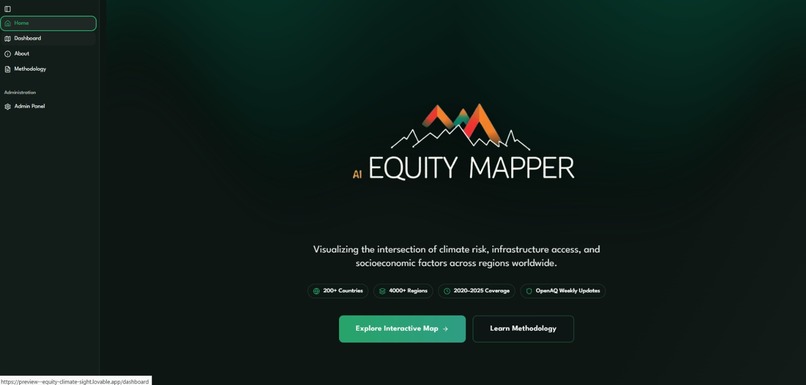
Homepage
-
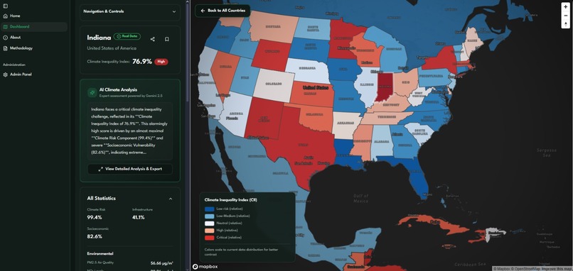
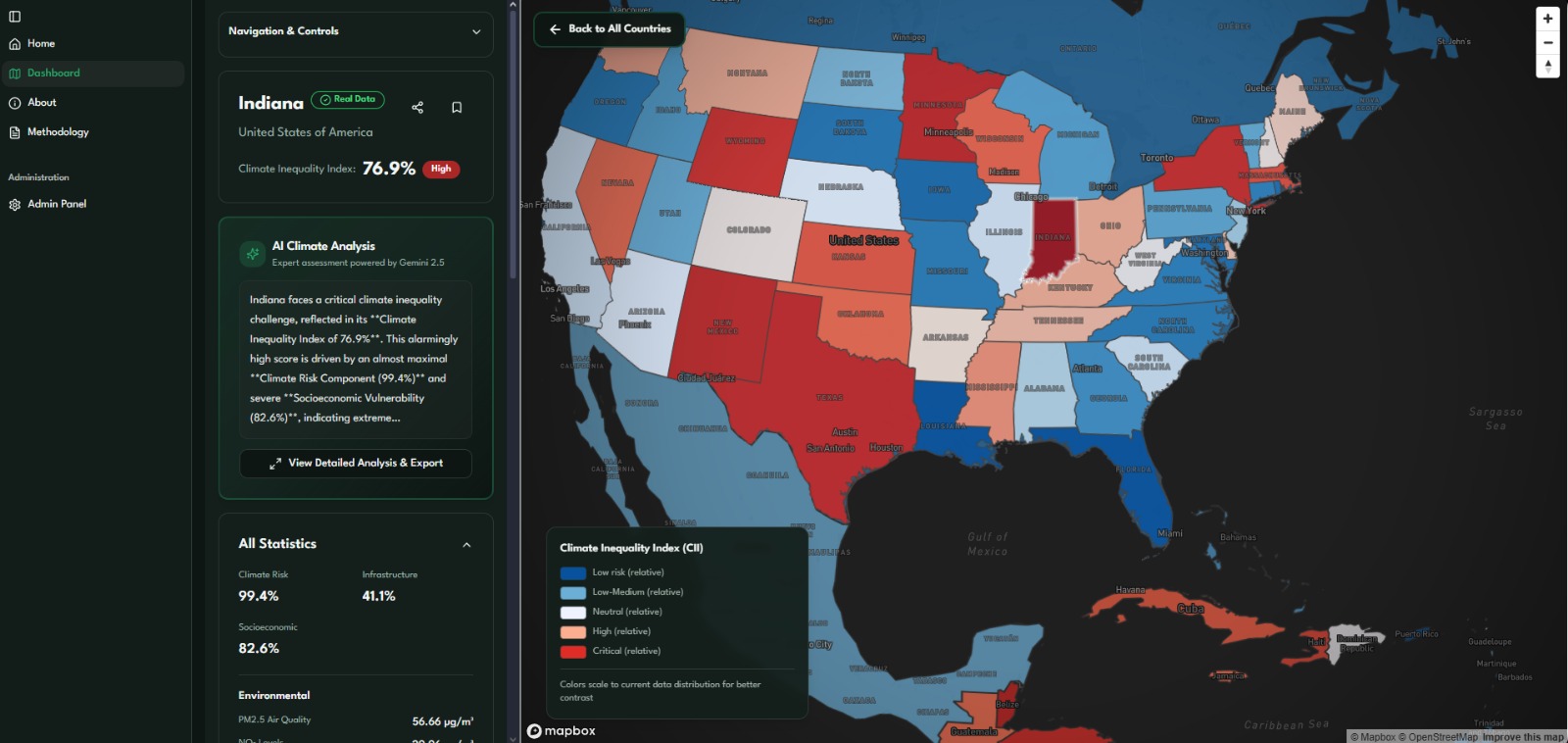
Specific region data, AI Region analysis, all regions in one country
-

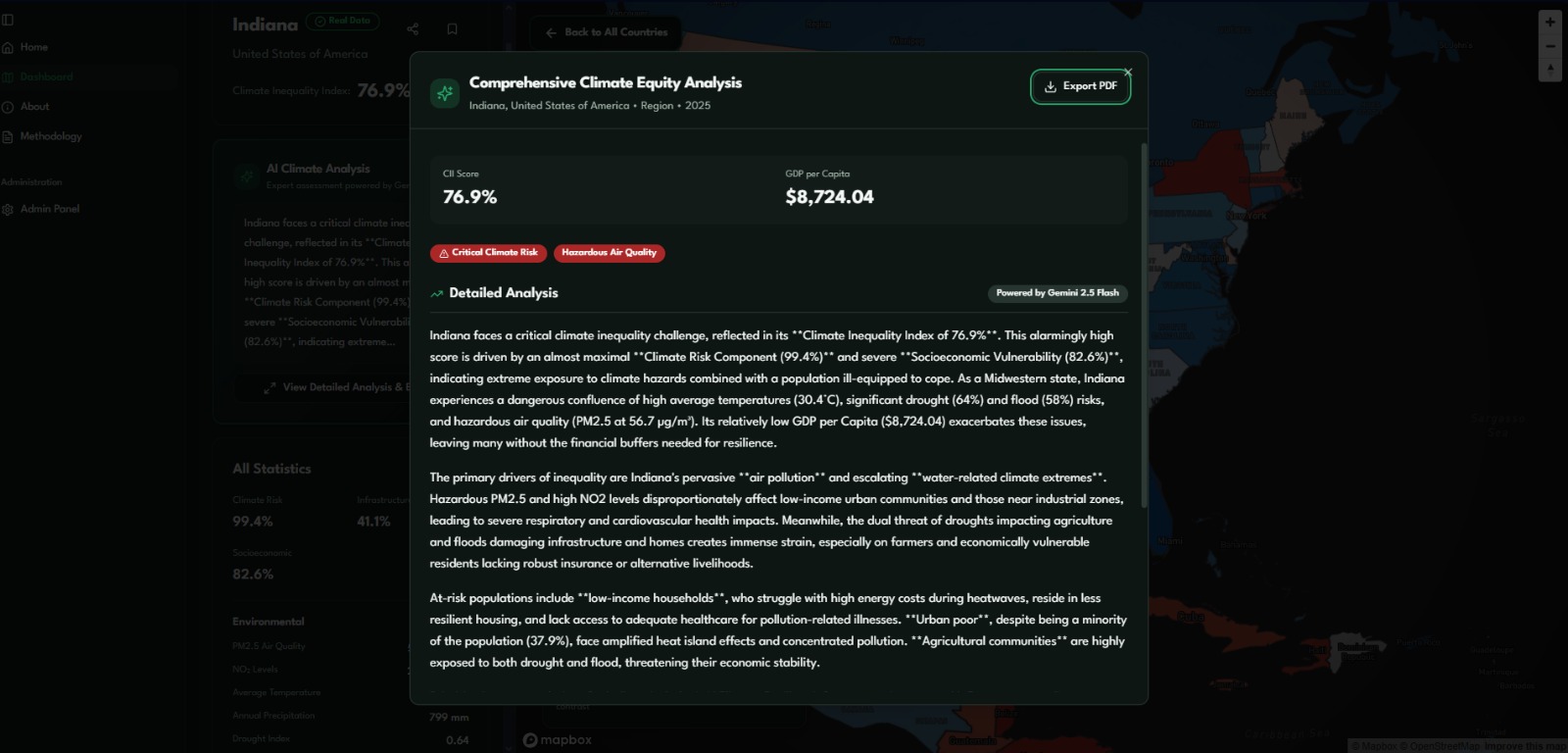
Comprehensive AI Climate Equity Analysis for a specific region(can be shared and exported to PDF)
-

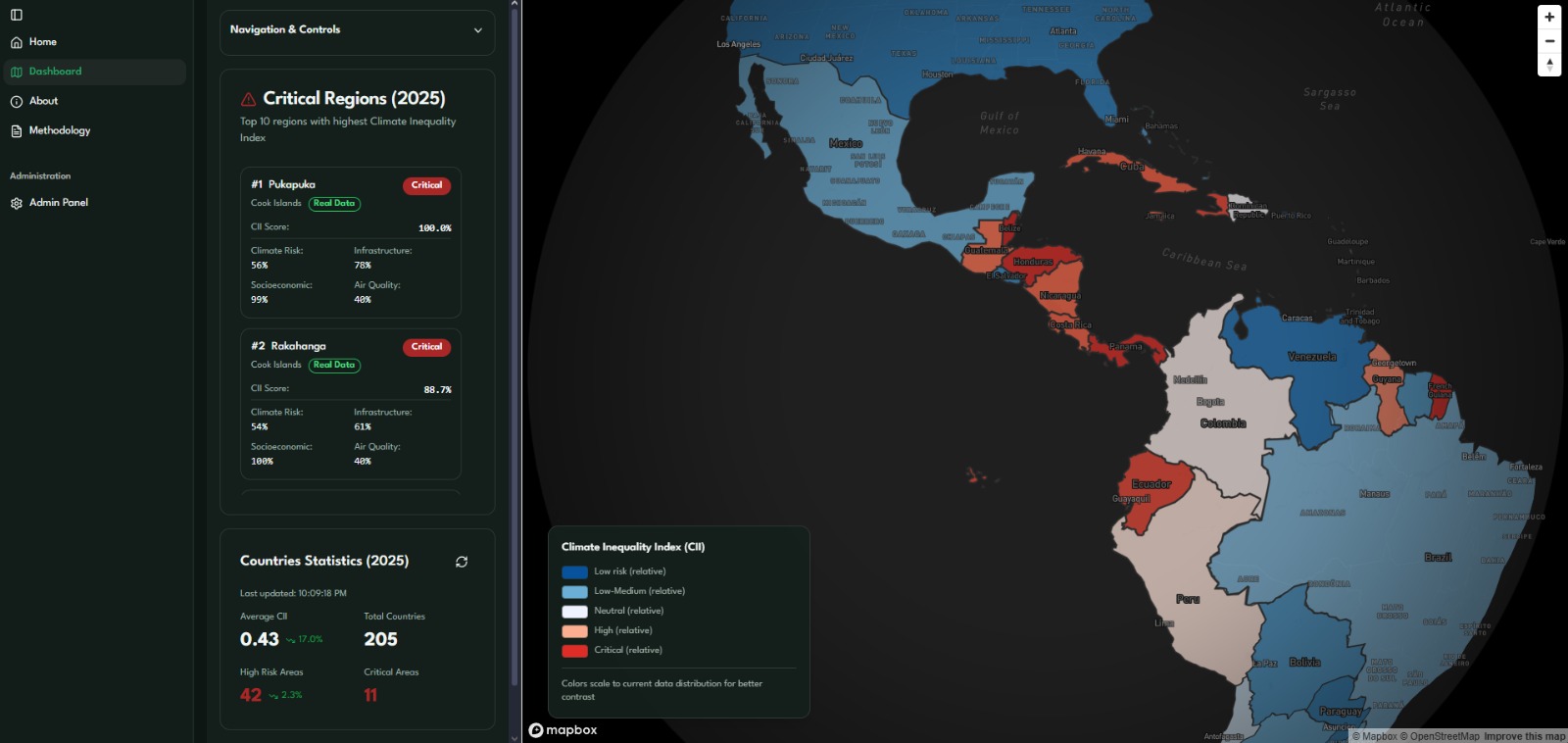
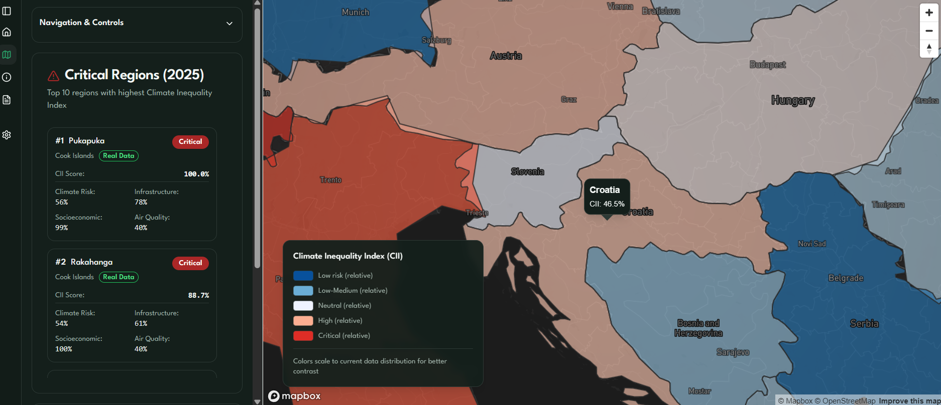
Critical Regions with highest CII, all country statistics
-

Critical Regions
-
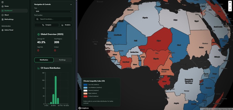
Expanded analytics data, distribution and country rankings
-
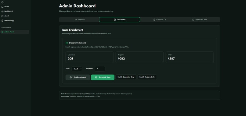
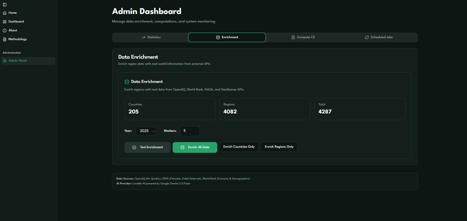
Admin dashboard, data management, computations and system monitoring, scheduled daily "jobs"
-

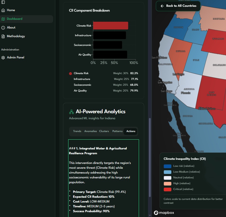
CII Component Breakdown, advance ML insights for specific regions powered by AI analytics (Trends, Anomalies, Clusters, Patterns & Actions)


Inspiration
Climate impacts aren’t shared equally. Some regions can invest in adaptation, while others face floods, droughts, and pollution with limited resources.
We wanted a clear, data-driven way to show where climate risk, poor infrastructure, and socioeconomic vulnerability intersect—and to help direct funding where it’s needed most.
What it does
AI Equity Mapper is an interactive Mapbox web app that visualizes climate inequality across regions using open data sources like ASDI ERA5, OpenAQ, Ookla and the World Bank.
It computes a unified Climate Inequality Index (CII) on a 0–1 scale:
CII = (0.30 × Climate Risk) + (0.25 × (1 – Infrastructure Access)) + (0.25 × Socioeconomic Vulnerability) + (0.20 × Air Quality)
How we built it
- ETL (Python): Fetch and normalize datasets (ASDI, ERA5, OpenAQ, Ookla ,World Bank), compute CII, and export results to Supabase.
- Database: Supabase (PostgreSQL + PostGIS) with automated upsert scripts.
- Frontend: React.js (TypeScript) + Mapbox GL + Tailwind CSS for visualization and interaction.
- Deployment: Lovable Cloud for full-stack hosting and continuous integration.
Challenges we ran into
Fragmented APIs: requiring custom fallbacks to fetch data by location. Data heterogeneity: Combining climate, infrastructure, and socioeconomic datasets with different spatial resolutions. Normalization logic: Designing consistent scaling so that all indicators contribute fairly to CII. Real-time integration: Making the pipeline lightweight enough to refresh daily without hitting API limits.
Accomplishments that we're proud of
- Built a huge full end-to-end pipeline from open data to visualization. Scale: Successfully integrated a lot of regions across 205 countries with real geographic boundaries
- Created a clean, interpretable CII metric grounded in real environmental and socioeconomic data.
- Designed a responsive map UI showing top critical regions in real time.
- Integrated automatic Supabase updates through ETL scripts. -Prompt engineering is as critical as traditional programming—small wording changes dramatically affect output quality
What we learned
- Transparent formulas and normalization are key to trust in data indices.
- Handling geospatial data (CRS, topology, validation) is critical for accuracy.
- Visual storytelling turns complex datasets into actionable insights. -Climate data is messy: Real-world datasets have gaps, outliers, and inconsistencies.
What's next for AI Equity Mapper
Real-time stress testing: Stream in severe-weather alerts (Copernicus EDO, NASA GPM) and show how CII shifts during extreme events. Impact tracking: Partner with municipalities or NGOs to monitor CII before/after adaptation investments and surface ROI dashboards. Inequality analytics: Layer a Gini-style index over regional distributions to quantify how unevenly climate burdens fall within a country. Community feedback loop: Let local stakeholders contribute ground-truth updates (e.g., new flood defenses) that feed back into the index.
Built With
- asdi
- cloud
- gemini
- lovable
- mapbox
- ookla
- openaq
- python
- react.js
- supabase.
- tailwind
- typescript

Log in or sign up for Devpost to join the conversation.