AI Energy Consumption Analytics: Exploring Different Sides of Compute Tradeoff
💡 Inspiration: From Idea to Impact
I was struck by how AI’s energy footprint has quietly become one of its biggest hidden costs.
Training deep networks at scale is powerful — but what’s the price per joule of that performance?
In every ML conversation, the question reappears:
“Are we trading too much energy for too little gain?”
That curiosity sparked AI Energy Consumption Analytics — an attempt to visualize and quantify how architecture design, training strategies, and hardware decisions influence energy consumption patterns.
My goal was to create an interactive narrative where users can explore, filter, and question these tradeoffs directly.
About the Dashboard
Detailed Overview
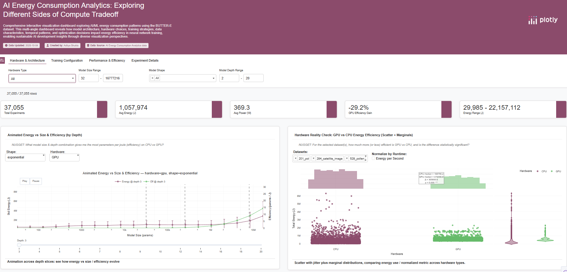
This dashboard provides 15 interconnected visualizations analyzing AI/ML energy consumption using the BUTTER-E Dataset.
Each visualization captures a different perspective — from architectural tradeoffs to environmental impact — forming a multi-layered exploration tool.
Some numbers behind the story:
- 📊 63,527 runs across 30,582 configurations
- 💻 Hardware: CPUs & GPUs across multiple compute nodes
- 🧠 Model shapes: 8 network architectures, 20 sizes, 14 depths
- 🔋 Metrics: Energy (J), Runtime (s), Power (W), Efficiency (J/s)
Together, these help answer a simple but profound question:
“Which model architectures and hardware setups deliver the best energy-efficiency tradeoffs — and when do they break down?”
Snapshot: Explanation of Plots
Below is a quick tour of the visualizations and their purpose.
Each is guided by a “NUGGET” question that invites exploration.
| Plot | What it shows | Why it matters |
|---|---|---|
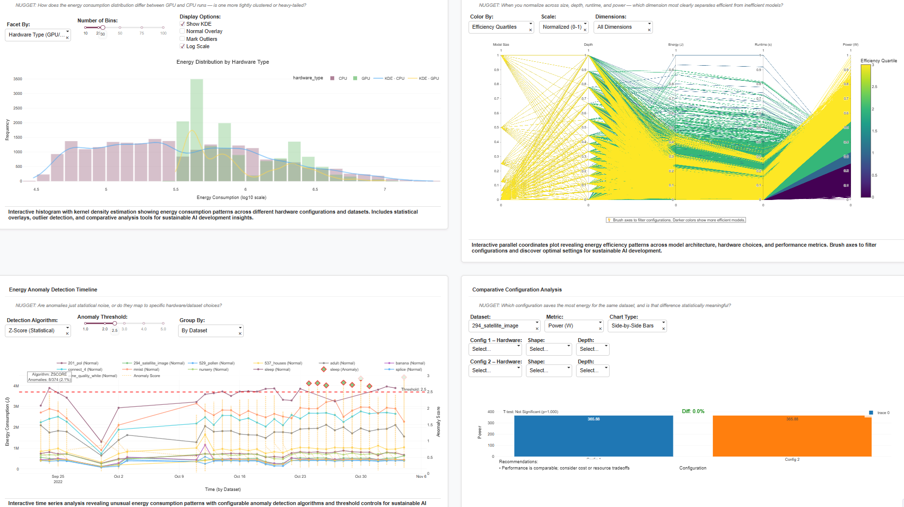
| Energy Distribution by Hardware | Histogram + KDE plots on a log scale for CPU vs GPU runs. | Reveals how GPU runs show wider variance and heavier tails — a sign of occasional over-provisioning or workload bursts. |
| Parallel Coordinates (Efficiency Patterns) | Multi-dimension view of size, depth, energy, runtime, power. | Lets you “brush” efficient regions interactively. Example: identify configurations where runtime increases but power stays stable. |
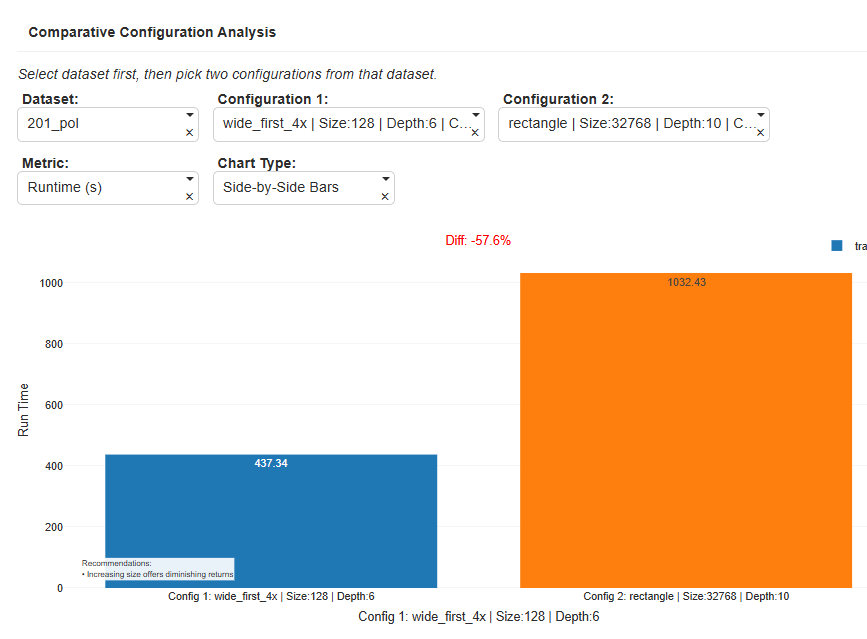
| Comparative Configuration Analysis | Compare two configurations side-by-side on the same dataset. | Example: For 201_pol, Config1 vs Config2 shows –57.6% faster runtime on GPU with minimal efficiency loss — a statistically significant improvement. |
| Energy Anomaly Detection Timeline | Time series of energy with anomaly detection (Z-score, IQR, Isolation Forest). | Detects runs where energy spikes or dips due to hardware instability or node misallocation. |
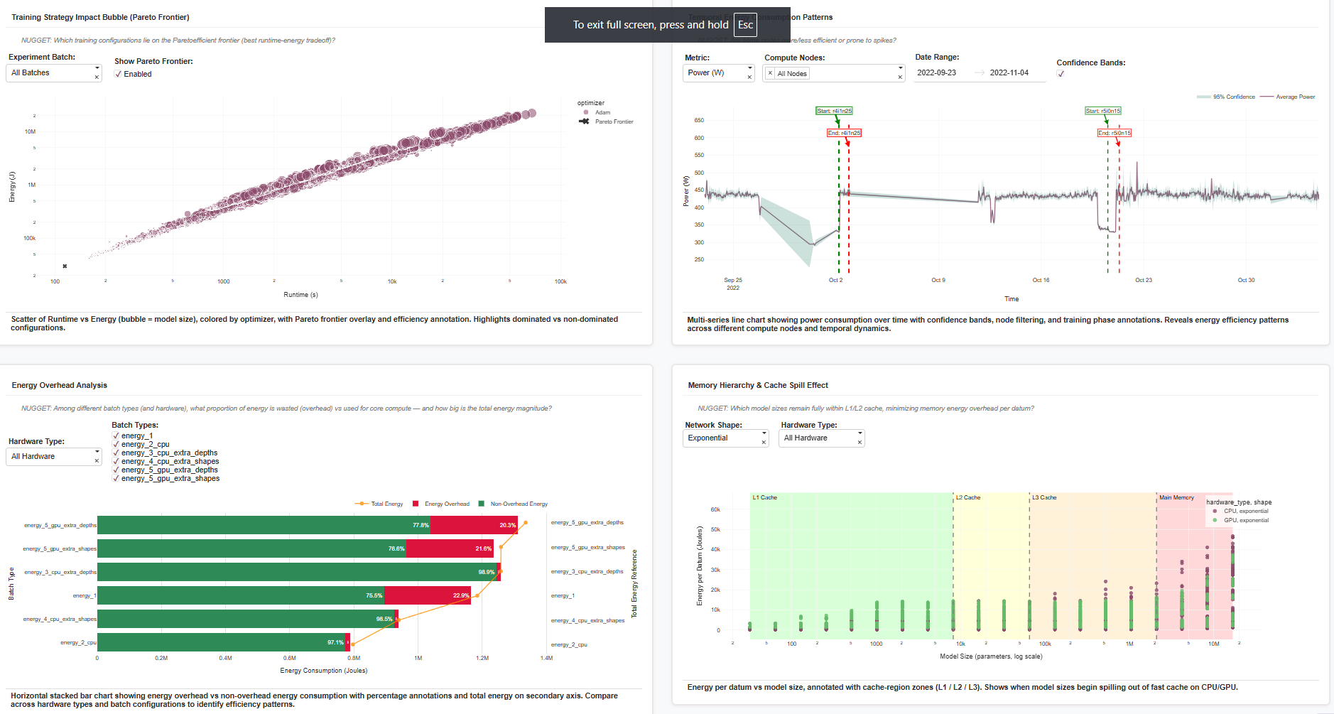
| Training Strategy Impact (Pareto Frontier) | Scatter of runtime vs energy, bubble = model size, color = optimizer. | Reveals dominant “Pareto-optimal” setups — e.g. Adam optimizer at mid-scale models outperforms in both runtime and energy. |
| Energy Overhead Analysis | Horizontal stacked bar separating overhead vs core energy. | Quantifies “wasted watts” — e.g. ~22–29% of energy spent on memory overhead in certain GPU batches. |
| Memory Hierarchy & Cache Spill Effect | Scatter plot with annotated L1/L2/L3 cache regions. | Identifies at what model sizes energy spikes due to cache spillover — visualizing hardware bottlenecks. |
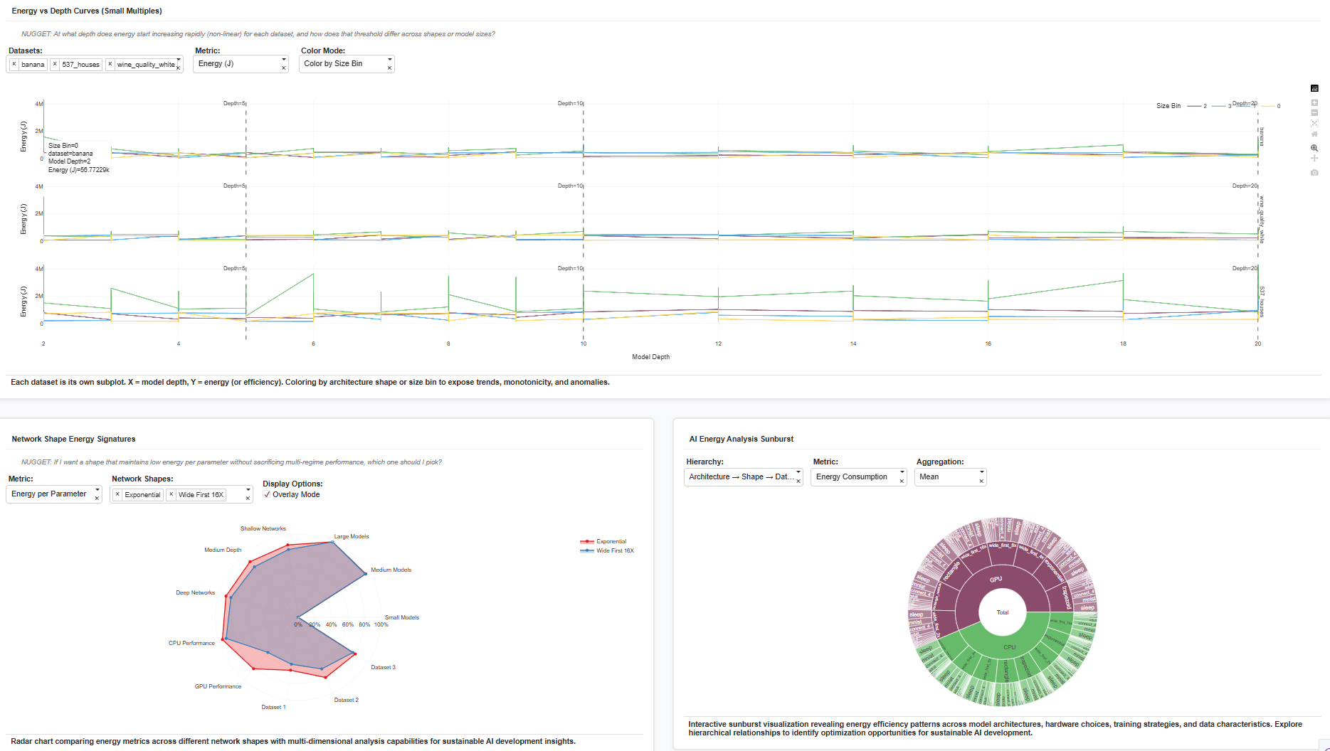
| Energy vs Depth Curves (Small Multiples) | Each dataset in its own subplot, X = depth, Y = energy. | Shows when energy starts increasing non-linearly — e.g., after depth > 10, exponential models diverge. |
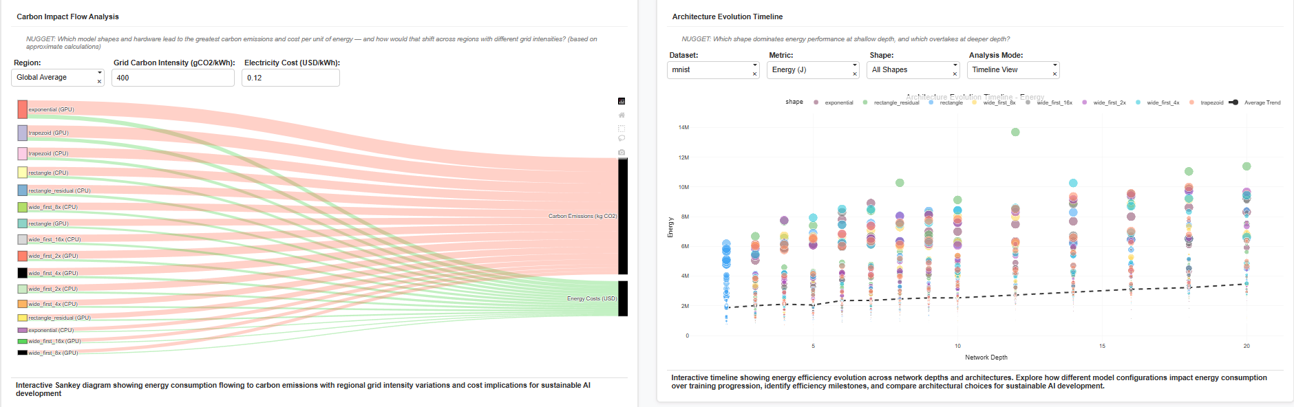
| Carbon Impact Flow Analysis (Sankey) | Energy flow → carbon emissions → cost. | Converts energy numbers into real-world impact: at 400 gCO₂/kWh, the same configuration emits ~ 0.12 kg CO₂ per 10k J. |
| Architecture Evolution Timeline | Scatter of energy over depth and shape evolution. | Shows which shapes dominate shallow vs deep layers — e.g., “wide_first” shapes gain efficiency at greater depth. |
| Radar (Energy Signatures) | Multi-metric radar of architectures. | Identifies balanced models: exponential vs wide_first tradeoffs shown across datasets. |
| Sunburst (Hierarchical Energy Breakdown) | Architecture → Shape → Dataset energy aggregation. | Reveals which hierarchy contributes most to total energy footprint. |
| Leaderboard Table (AG Grid) | Top energy-efficient configurations sorted dynamically. | Serves as a quick “hall of fame” for sustainable models. |
| Overhead vs Non-Overhead Bar (Batchwise) | Breakdown of energy used for computation vs wasted operations. | Useful for optimizer tuning and scheduling. |
| Anomaly-Score Timeline (with thresholds) | Same metric overlaid with z-score thresholds. | Helps analysts see not only anomalies but why they occur. |
📃 About the Dataset
The dataset powering this dashboard is BUTTER-E: Energy Consumption Data for Empirical Deep Learning, hosted by OpenEI.
It records node-level watt-meter energy traces from deep learning experiments, covering:
- Model parameters (shape, size, depth, optimizer, batch, dataset)
- Energy, runtime, power, and derived efficiency metrics
- CPU/GPU hardware metadata
The richness of this dataset allowed analysis of memory hierarchy effects, Pareto frontiers, overhead ratios, and carbon impact — all in one cohesive environment.
⚙️ Challenges Faced
1. High-Dimensional Complexity
The dataset spanned over 60k runs with 12+ parameters. Managing clarity required faceting, brushing, and log scaling to avoid clutter.
2. Performance and Interactivity
Rendering 100k+ points interactively without lag was a challenge. Solved by sampling, vector aggregation, and dynamic loading in Plotly Dash.
3. Balancing Technical Depth with Visual Storytelling
Each chart is anchored by a “NUGGET” question to keep it interpretive, not just technical — e.g.,
“At what depth does energy growth become non-linear, and does GPU still justify its overhead?”
4. Handling Outliers & Scaling Differences
Energy varied across six orders of magnitude. Log transforms and normalization were essential for meaningful cross-hardware comparisons.
5. Building Consistency Across 15 Visualizations
Each visualization feeds into the narrative — energy vs efficiency tradeoffs — while remaining modular and interactive.
Closing Thoughts
This dashboard isn’t just a visualization — it’s a decision-support tool for AI researchers and engineers.
It helps answer practical questions like:
- Which architectures deliver efficiency per joule?
- Where is my GPU under-utilized?
- What configurations spill beyond cache limits?
By quantifying these tradeoffs, the dashboard bridges AI innovation and energy sustainability — an increasingly critical intersection as models continue to grow.
Live Dashboard: https://c16199c7-3692-427f-bbeb-f775aeb517d6.plotly.app
Dataset: OpenEI – BUTTER-E Energy Dataset
Author: Aditya Shukla


Log in or sign up for Devpost to join the conversation.