Inspiration
Global agriculture decisions depend on complex datasets that are hard to interpret quickly. We wanted a tool that turns FAOSTAT data into clear, decision‑ready insights for researchers and policymakers.
What it does
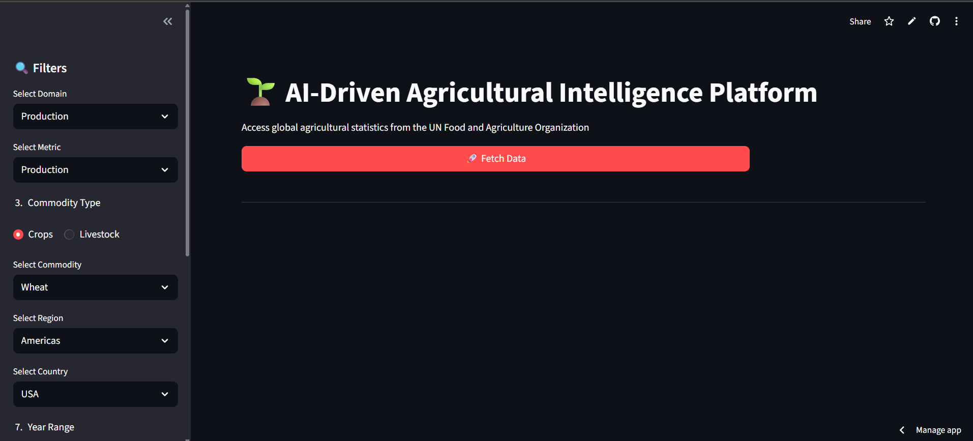
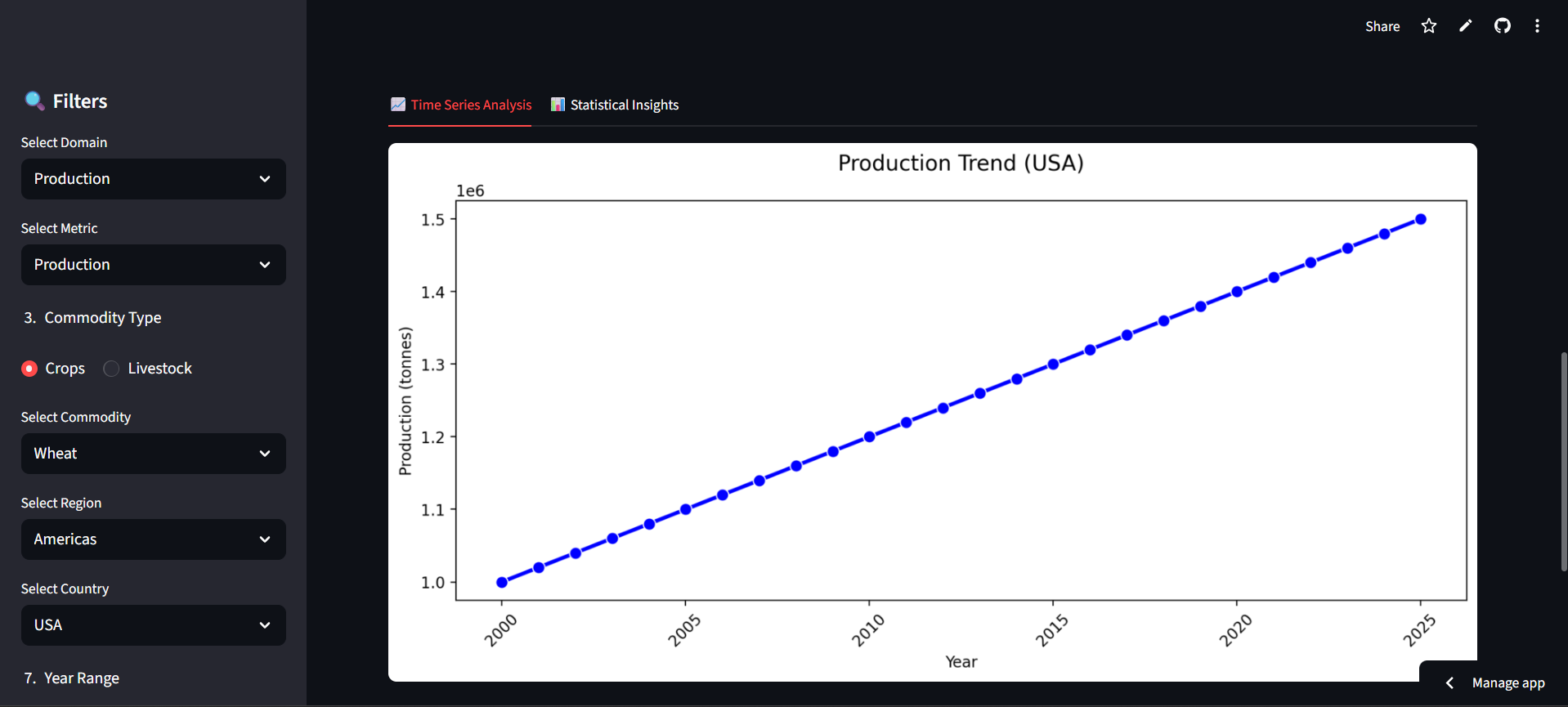
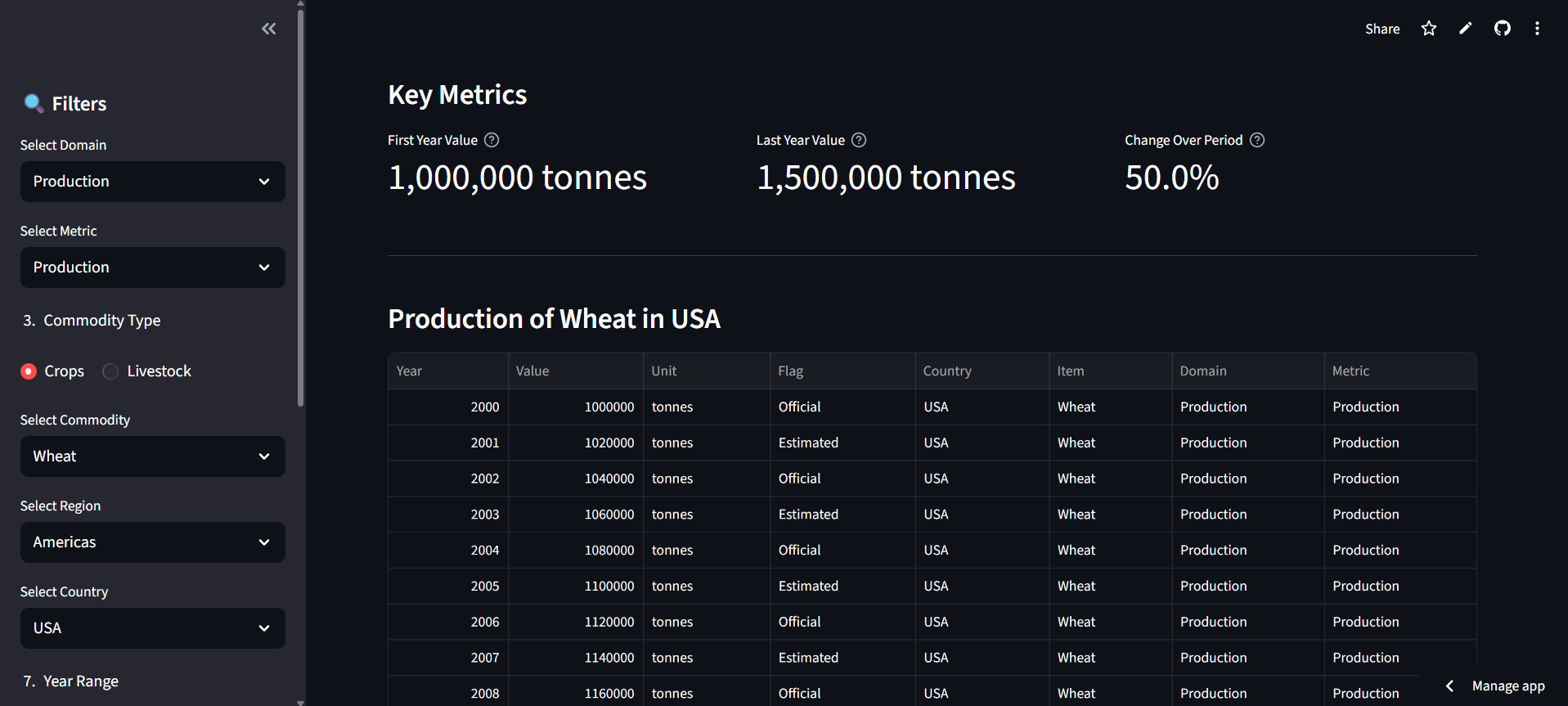
AgroVision‑AI provides an interactive Streamlit dashboard to explore agricultural production, trade, food security, prices, and emissions by domain, commodity, country, and year range. It summarizes trends, shows key metrics, and supports data export for further analysis.
How we built it
We built the app in Python with Streamlit for the UI, Pandas for data handling, and Matplotlib/Seaborn for visualization. The data layer is structured to integrate FAOSTAT sources, and the analytics pipeline is designed to summarize trends and support AI‑assisted interpretation (future expansion).
Challenges we ran into
Mapping FAOSTAT codes to human‑readable categories and ensuring consistent time‑series summaries were challenging. We also had to balance clarity and performance in the UI while keeping the app simple for non‑technical users.
Accomplishments that we're proud of
- A clean, usable dashboard that turns raw agriculture data into readable insights
- Clear trend and summary views suitable for decision‑making
- A foundation that can scale to AI‑assisted analysis and policy recommendations
What we learned
We learned how to simplify complex public datasets into human‑friendly dashboards, and how to structure a data pipeline that can evolve from descriptive analytics to AI‑driven insights.
What's next for AgroVision‑AI
- Full FAOSTAT API integration
- Gemini‑powered analytical narratives and recommendations
- Downloadable reports and country/commodity comparison views
- Improved forecasting and uncertainty summaries using statistical models

Log in or sign up for Devpost to join the conversation.