-
-
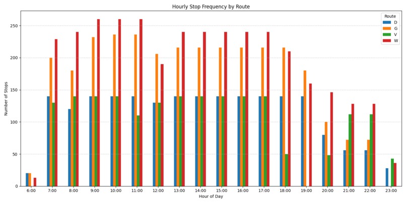
Grouped Bar Chart
-
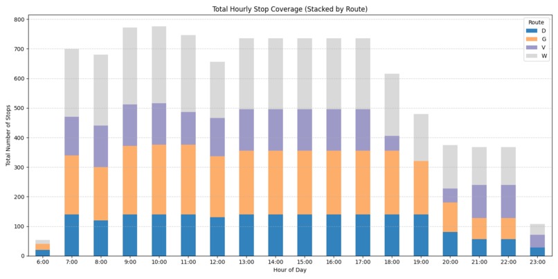
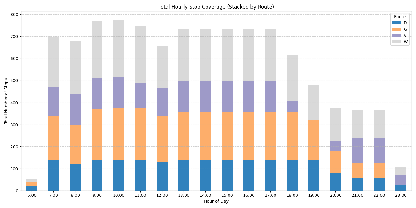
Stacked Bar Chart
-

Inspiration
AggieCommute was inspired by the daily challenges UC Davis students face when commuting across campus — especially with packed buses, full parking lots, and limited evening service. With Unitrans GTFS data and the TAPS Parking Impact Map both publicly accessible, we saw an opportunity to use open data to make transportation smarter, more efficient, and more sustainable for the UC Davis community.
What it does
AggieCommute analyzes Unitrans GTFS and TAPS parking data to uncover:
- When and where campus buses operate most heavily
- Which parking lots fill up earliest
- Where there are mismatches between transit coverage and commuter demand
It presents these insights through:
- Interactive visualizations (bar charts, stacked charts, weighted heatmap)
- A clean, responsive web UI
- A heatmap page that highlights service concentration by stop activity
How I built it
- Backend/Data: I parsed and joined GTFS files (
routes.txt,trips.txt,stop_times.txt, andstops.txt) using Python and Pandas. Data was visualized with Matplotlib and Folium. - Frontend/UI: I built the user interface using Next.js and Tailwind CSS, with separate pages for the landing overview, route visualizations, and a dedicated heatmap page.
- Heatmap: I created a weighted stop heatmap based on the number of scheduled trips per stop, segmented by time of day.
- Parking Analysis: I manually reviewed the TAPS Parking Impact Map to log average congestion times for campus lots and linked these insights to nearby Unitrans routes.
Challenges I ran into
- Understanding how to join multiple GTFS tables properly and handle null/missing values
- Dealing with inconsistent or sparse
arrival_timedata in the stop times file - Embedding large HTML-based Folium maps cleanly in the Next.js frontend
- Designing a responsive UI layout that presents complex data clearly
Accomplishments that I am proud of
- Turning raw GTFS data into meaningful insights and polished visualizations
- Deploying a responsive, multi-page UI with clear navigation and user flow
- Creating a weighted heatmap that highlights service intensity across campus
- Aligning visual insights with real-world parking congestion to inform planning decisions
- Successfully used Folium for the first time to generate and embed interactive geographic heatmaps
What I learned
- How GTFS data is structured and how public transit systems are modeled
- How to use Python to manipulate and visualize real-world transportation datasets
- How to create dynamic Next.js pages with Tailwind and embed maps and charts
- How to communicate data insights clearly through design and user experience
What's next for AggieCommute
- Incorporate weekend service comparison to highlight weekend/weekday discrepancies
- Add filters to the heatmap by time or route for more detailed analysis
- Work with UC Davis TAPS or Unitrans to share findings and suggest improvements
- Explore real-time bus arrival integration to support future route optimization

Log in or sign up for Devpost to join the conversation.