-
-
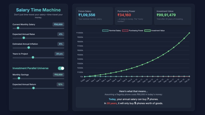
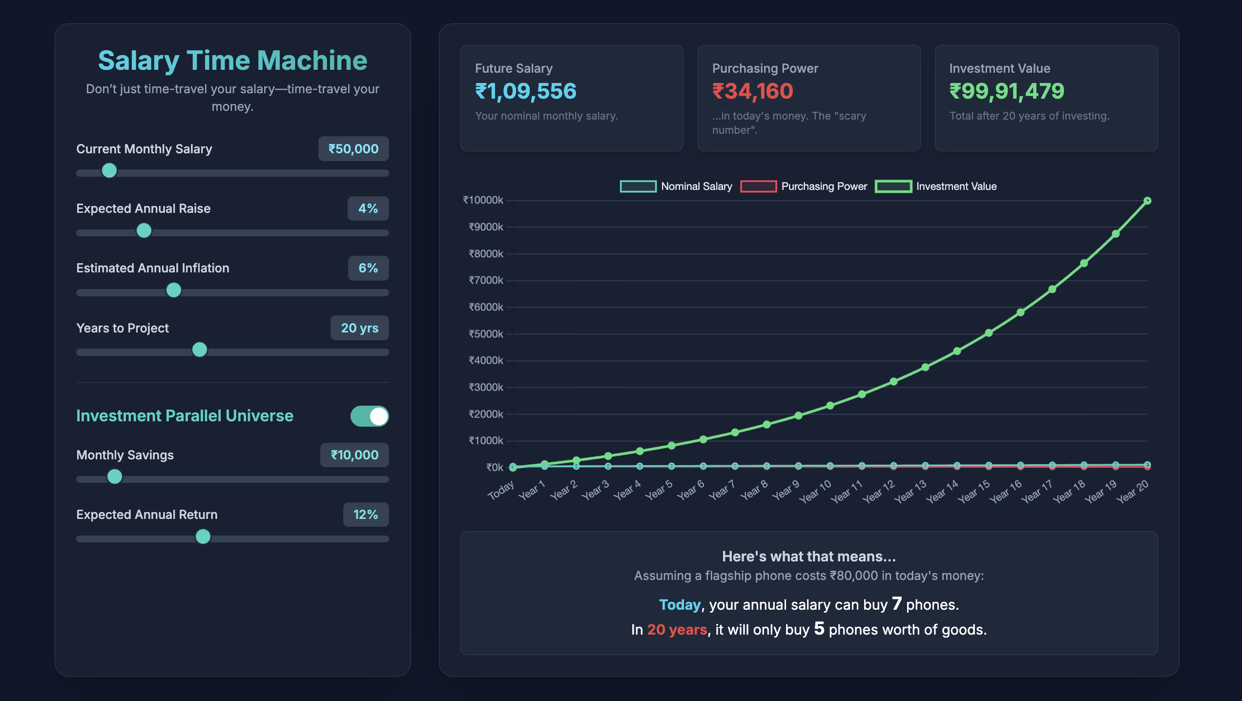
Demo of home page
Inspiration
I realized that for most people, especially those early in their careers, the future value of their money is a complete black box. A ₹50,000 monthly salary feels fantastic today, but what will it actually buy in 20 years? This universal anxiety is what inspired me. The gap between a rising salary and falling purchasing power is a critical, often misunderstood concept, and I wanted to build a tool that makes this complex economic reality instantly understandable, personal, and even a little bit fun.
What it does
Salary Time Machine is an interactive web app that acts as a financial crystal ball. A user enters their current salary, their expected annual raise, and a projected inflation rate. Instantly, the app generates a dynamic graph and clear metrics showing two critical future projections:
Their nominal future salary: The impressive number they'll see on their payslip in 10, 20, or 30 years.
Their real purchasing power: What that future salary will be worth in today's money—the "scary number" that reveals the silent impact of inflation.
Crucially, it also features an "Investment Parallel Universe" toggle. With a single click, users can see how making a modest monthly investment dramatically alters their financial future, transforming a story of decline into one of growth and security.
How I built it
For a hackathon, speed and a flashy user experience are key, so I deliberately chose a simple and powerful tech stack to deliver a polished product quickly.
Frontend: I used vanilla HTML, CSS, and JavaScript as the core. This allowed for rapid development without any complex setup or build process.
Styling: Tailwind CSS, loaded via a CDN, enabled me to create a modern, responsive, and visually appealing dark-mode interface with utility-first classes.
Charting: Chart.js, also loaded from a CDN, was the perfect choice for creating the beautiful, interactive, and responsive line graph that forms the centerpiece of the application.
All the financial calculations are handled in real-time in the browser using JavaScript, ensuring the app feels instantaneous and highly interactive.
Challenges I ran into
My biggest challenge was ensuring the financial calculations were not only accurate but also updated smoothly in real-time. Initially, recalculating the entire 50-year projection every time a slider moved caused a slight lag, so I had to optimize my core calculateProjections() function to be highly efficient. I also debated the best way to visualize the compounding effect of investments—calculating it monthly versus annually, and ultimately settled on a monthly compounding loop within each year to provide a more accurate and impressive growth curve.
Accomplishments that I'm proud of
I'm incredibly proud of the user experience. The moment a user moves a slider and sees the entire chart, the stat cards, and the relatable "iPhone" example update instantly is the "aha!" moment I was aiming for. The most satisfying accomplishment is watching someone toggle the investment feature on for the first time. Seeing the green investment line soar above the others provides a powerful, immediate understanding of why investing is so critical—an insight that's more impactful than reading a dozen articles on the topic.
What I learned
Technically, I learned how to effectively implement and customize Chart.js to create a polished and dynamic data visualization. More importantly, I learned how to translate complex financial concepts into a simple, intuitive, and engaging user interface. The project reinforced the idea that the presentation of data is just as important as the data itself. Making a potentially dry or scary topic like inflation feel interactive and empowering was my biggest takeaway.
What's next for Salary Time Machine
I see a huge potential to expand this tool. My next steps would include:
Lifestyle Cost Projector: Allowing users to input their current rent, grocery, and utility bills to see how those specific costs will inflate over time.
Scenario Planning: Adding presets for different economic scenarios (e.g., "High Inflation Decade," "Market Boom").
User Accounts: Giving users the ability to save their projections and track their progress over time.
Actionable Advice: Integrating suggestions for investment options or savings strategies based on the user's results.
Built With
- chart.js
- css
- html
- javascript
- tailwindcss

Log in or sign up for Devpost to join the conversation.