-
-
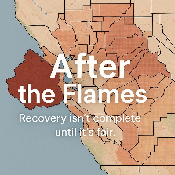
aftaflames

🌎 Inspiration
When wildfires strike, they leave behind more than just scorched land—they leave behind deep inequities. Low-income families, seniors, immigrants, and renters often face the longest and hardest road to recovery. While response agencies focus on speed, equity often takes a back seat. Our team asked: What if recovery efforts could be both fast and fair?
After the Flames was born from that question.
💡 What It Does
After the Flames is a powerful wildfire recovery dashboard built specifically for the state of California. It is powered by authoritative datasets such as the CDC/ATSDR Social Vulnerability Index (SVI) and CalFire’s Wildfire Perimeter GeoJSON data, enabling evidence-based planning and action. It overlays historical and real-time fire perimeter data with demographic vulnerability factors such as:
- Percentage of renters
- Elderly population
- Households with no vehicle
- Limited English proficiency
- Median income
These factors are used to calculate an Equity Score for each ZIP code.
🧮 How the Equity Score is Calculated
We used a weighted formula that incorporates key vulnerability indicators to generate a normalized score between 0 and 100:
Equity Score =
  (renterWeight × renter_pct / 25) +
  (elderlyWeight × elderly_pct / 10) +
  (lepWeight × LEP_pct / 15) -
  (incomeWeight × income / 10000)
Optional factors such as disabled population, shelter access score, and disaster history can be added for further nuance. The result is then normalized to a 0–100 scale, with higher scores indicating higher vulnerability. The higher the score, the more vulnerable the community. After the Flames then provides:
- 🎯 Priority recovery recommendations (e.g., bilingual aid, shelter expansion, ADA compliance)
- 📍 Map visualizations with timeline sliders and filtering
- 📊 ZIP-code level vulnerability rankings
- 📤 Exportable recovery plans for field deployment
- 🔊 "Voices" dashboard to hear real audio stories of those impacted
🗺️ Screens and Features
- Dashboard Tab: Interactive map + demographic filters + top vulnerable ZIP codes
- Settings Tab: Adjustable weight sliders for customizing Equity Score calculations
- Voices Tab: Audio submissions of real (mocked) survivor testimonies categorized by urgency or need
- ZIP Recovery Plan: Automatically generated plan based on demographics
🛠️ How We Built It
- Frontend: Next.js, TailwindCSS, Leaflet.js for map rendering
- AI-Generated Audio: ElevenLabs to simulate real-time community voice input
- Mocked API Backend: MongoDB schema + Express.js endpoint structure prepared with Cursor IDE
- Data Sources:
🧠 Challenges We Ran Into
- Finding and structuring accurate datasets that align geographically with wildfire-affected ZIP codes
- Designing a score formula that balances multiple factors without bias
- Making the app feel more human-centered and emotionally grounded
✅ What We’re Proud Of
- Built a working, interactive dashboard in under 36 hours
- Integrated equity as a first-class principle in disaster planning
- Added a highly unique "Voices" layer, showcasing first-person narratives (synthetic but plausible)
- Delivered both a policy-facing and citizen-facing tool
📚 What We Learned
- Real-world problems don’t have clean datasets
- Equity isn’t just an ethical concern, it’s a design constraint
- Impactful design often comes from blending quantitative data with qualitative voices
🔮 What's Next
- Connect with local agencies to test real deployments in wildfire-vulnerable zones
- Add mobile-first features for field workers
- Partner with CalFire or OES for data pipeline integration
- Collect real community voices via Twilio or SMS API
- Integrate LLM-powered summarization of audio logs for policy briefings
Built With
- gemini
- mongodb
- next.js
- typescript

Log in or sign up for Devpost to join the conversation.