Inspiration
We drew inspiration from platforms like Robinhood and Bloomberg that make complex financial data accessible to everyday people. Our goal was to bring clarity to the housing market so everyone can use Affordly. This would help communities and new graduates who are entering the market for the first time. By simplifying this process, we aimed to help users make smarter and more confident housing decisions by using Affordly.
What it does
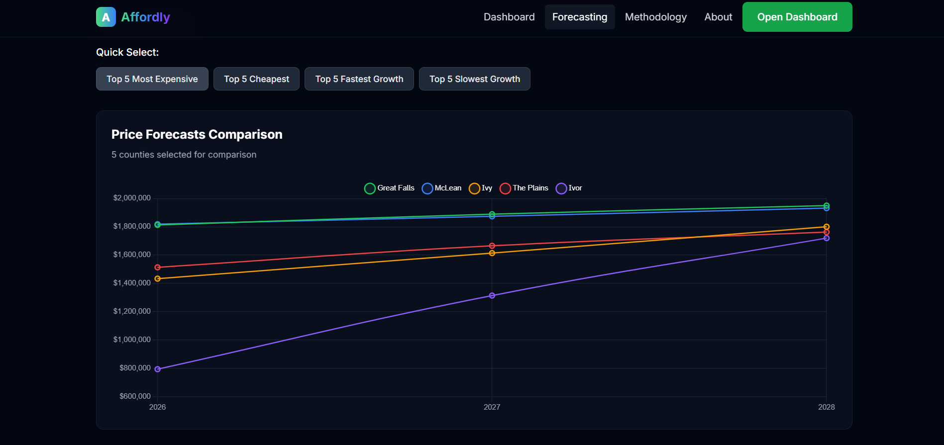
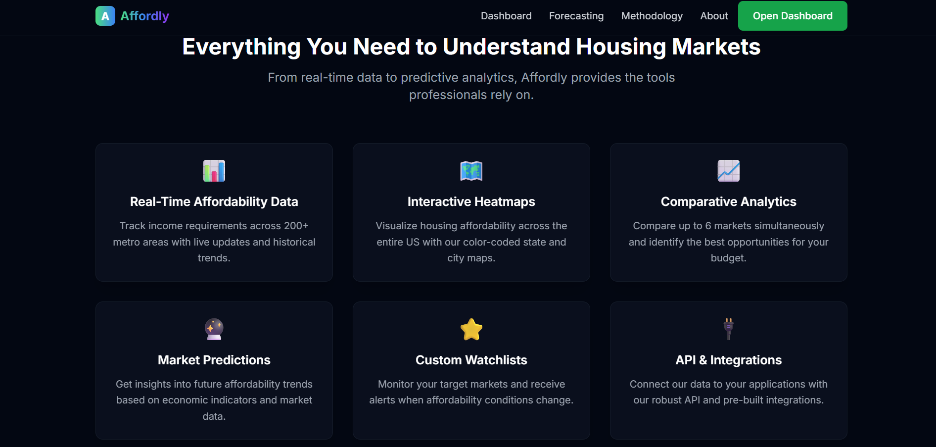
Affordly is a housing affordability and forecasting platform designed to help users better understand real estate markets across the United States. It combines real-time affordability data, interactive visualizations, and predictive modeling to show where and when homeownership is most accessible. Users can explore income requirements by city and metro area, view comparative analytics across multiple regions, and access forecasts/predictions generated using machine learning models to predict housing price trends from 2026, 2027, and 2028. The platform also provides features such as custom watchlists, interactive dashboards, and an API for integration. This allows for homebuyers, financial advisors, and real estate professionals to have better knowledge about real estate near them.
How we built it
We built Affordly by combining full-stack web development and machine learning practices. To power the application, we used housing market data from the Redfin API and supplemented it with demographic and economic indicators, which were web-scraped from the U.S. Census Bureau. This ensured we had market-level prices and affordability data. After cleaning the raw inputs, we used SARIMAX (Seasonal AutoRegressive Integrated Moving Average with eXogenous regressors) models to generate county-level home price forecasts for 2026-2028. SARIMAX was ideal because it captures housing prices and the variables like income, tax rates, and regional trends sourced from the census. We then serialized predictions into JSON for easy integration into our Next.js frontend, where visualizations like dashboards, heatmaps, and market comparisons help users interpret future housing affordability. The result is a system that tightly integrates real-time APIs, statistical modeling, and web visualization using graphs and charts into one cohesive platform, Affordly.
Challenges we ran into
One of the main challenges we faced was forecasting and predicting, partifucallry dealing with data quality issues. The handling of missing and null values in the housing datasets required careful processing and integration. Another difficulty came from forecasting the counties. We experimented with linear methods first, but ultimately moved to SARIMAX, which achieved more accurate and reliable predictions throughout different counties.
Accomplishments that we're proud of
The main accomplishments that we are proud of include the forecasting model we made and the UI friendly frontend. the forecasting required machine learning knowledge and helped give predictions to users. The UI friendly frontend made the site visually appealing and used charts and graphs to help make the overall structure look simple and consistent.
What we learned
Through this project, we learned about the importance of collecting, cleaning, and using it correctly. We also gained more experience with frontend, backend, and machine learning to help create our dashboard that can be presented.
What's next for Affordly
Looking ahead for Affordly, we plan to integrate live data by connecting to APIs for real-time housing and mortgage information. We also want to introduce user accounts so individuals can personalize their dashboards, save preferences, and receive alerts. Finally, we aim to expand beyond major metro areas by including smaller cities, and maybe end the move towards international housing and make the platform more accessible to users around the world.
Built With
- charts.js
- javascript
- next.js
- redfin-api
- tailwind-css


Log in or sign up for Devpost to join the conversation.