-
-
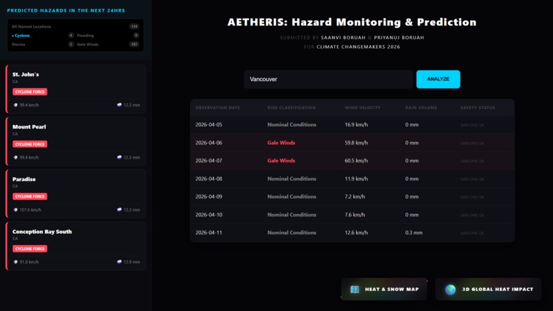
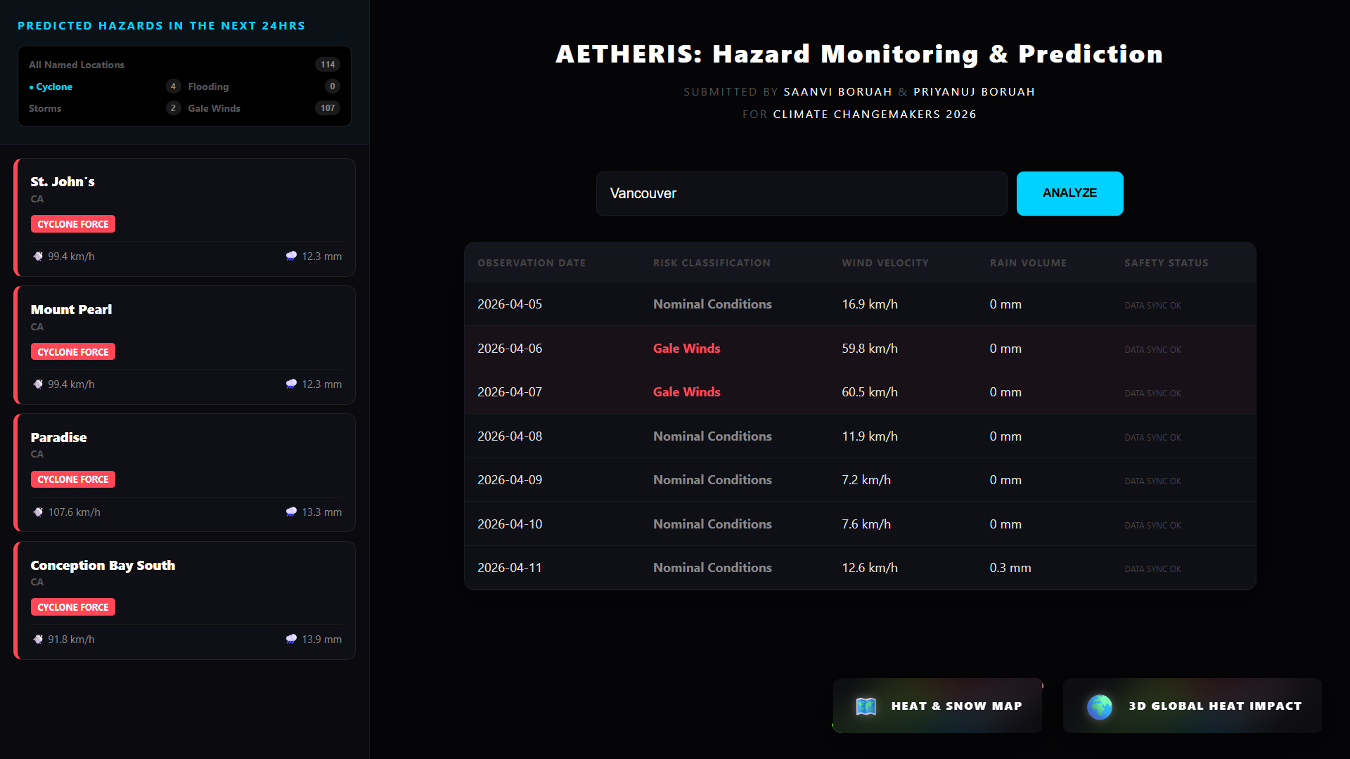
Hazard monitoring & prediction page showing 4 cyclone predictions
-
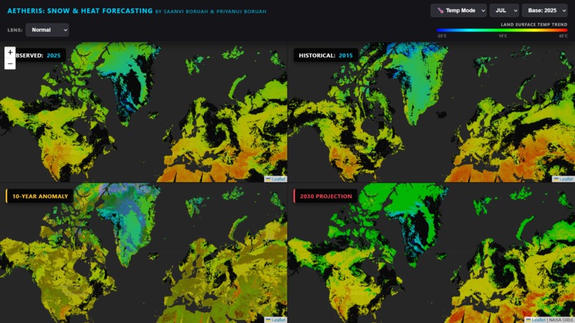
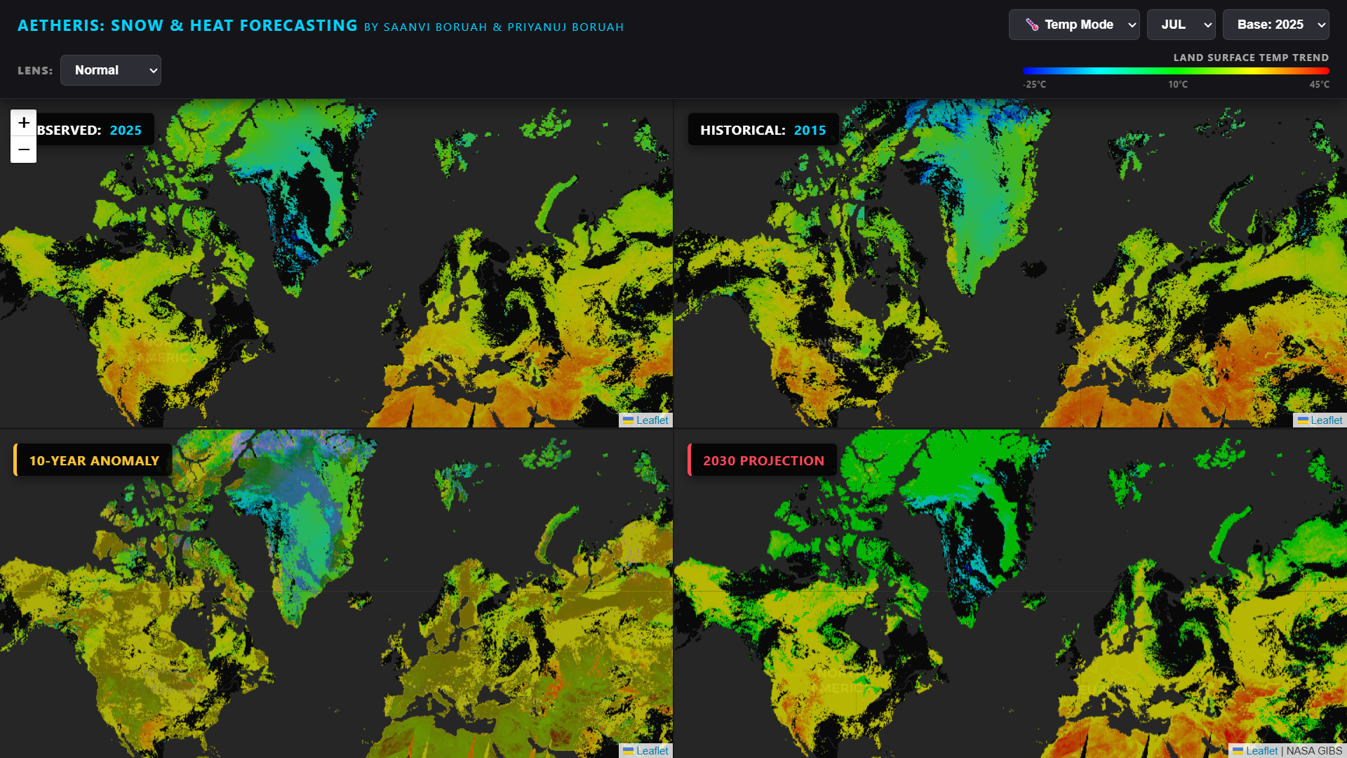
Heat spread forecasting for the entire world (2015 vs 2025 vs 2030)
-
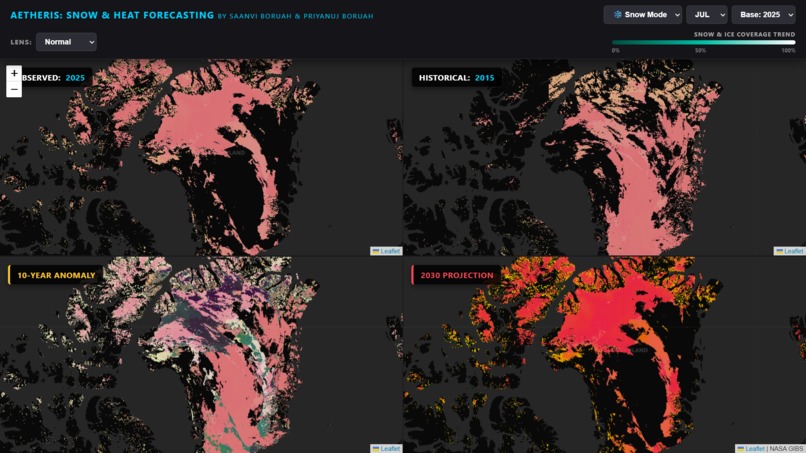
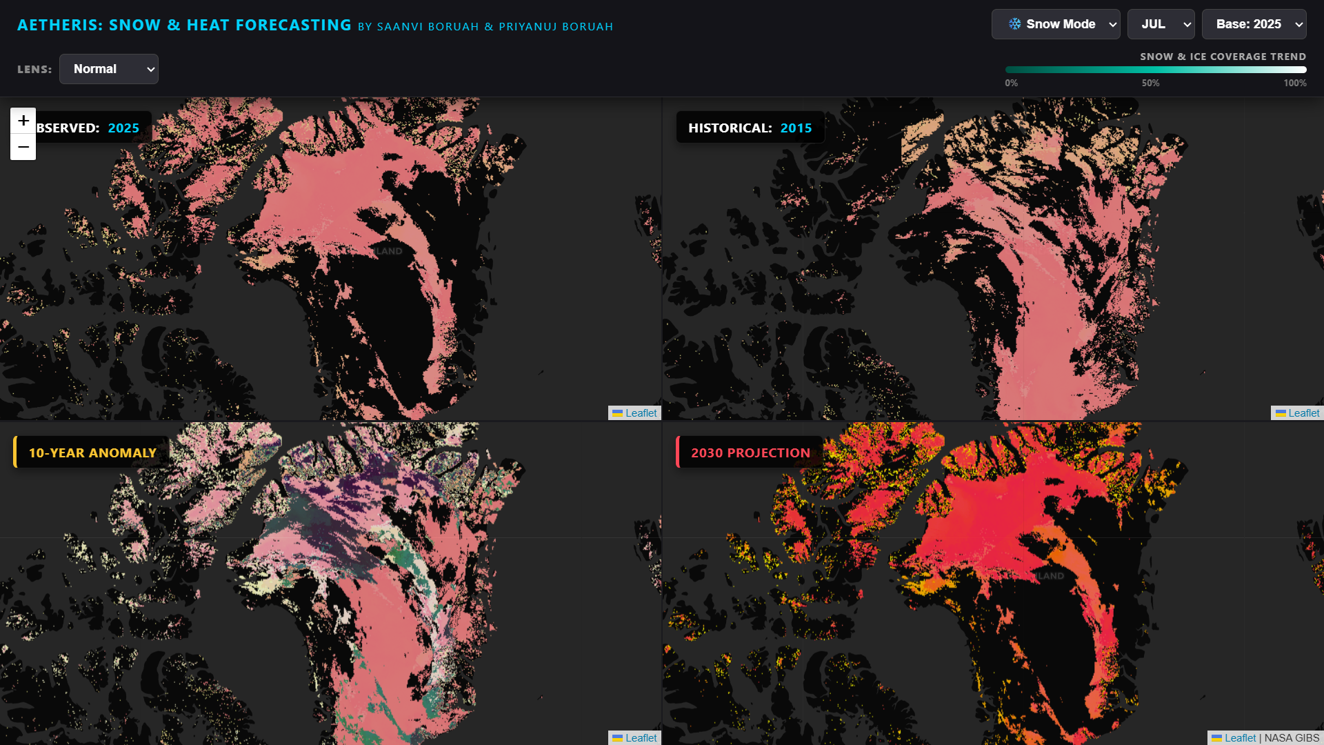
Snow cover forecasting for North America and Greenland (2015 vs 2025 vs 2030)
-
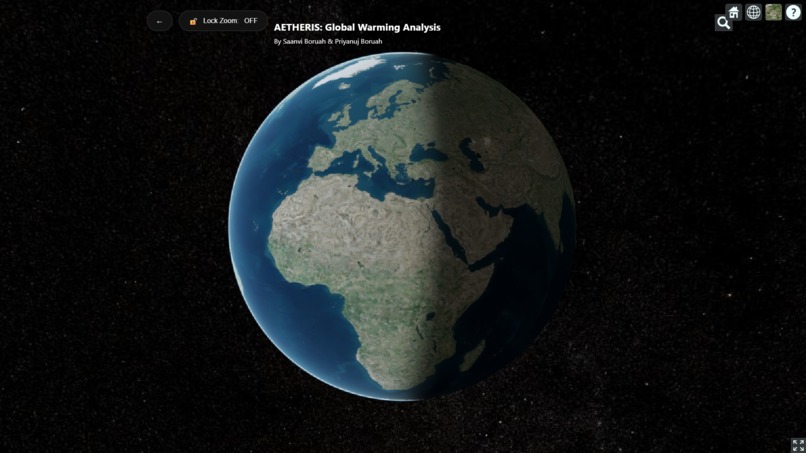
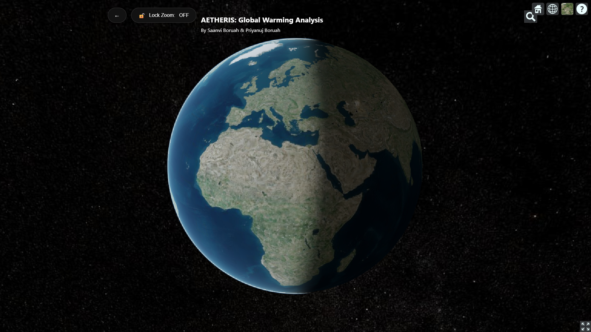
3D Interactive Globe Default View
-
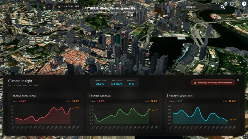
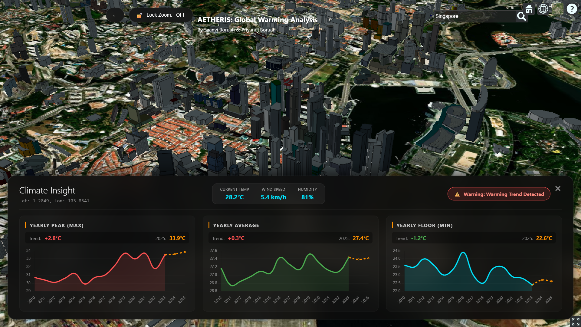
Global Warming validation for Singapore in the 3D Globe with just one click
Inspiration
2024 was officially recorded as the hottest year in human history, crossing the 1.5°C warming threshold. While global leaders discuss abstract statistics, local communities—especially those in remote and Indigenous regions—are facing the immediate reality of disappearing snow cover and intensifying storm surges.
We were inspired to build AETHERIS because there is a massive "data gap" between high-level satellite science and ground-level tactical safety. We wanted to create a tool that follows the Two-Eyed Seeing approach: using the "best of Western science" (NASA satellites) to validate and support the "traditional knowledge" of changes observed by local communities for generations.
What it does
AETHERIS is an integrated climate intelligence suite consisting of three specialized modules:
- 3D Global Warming Analyzer: A CesiumJS-powered globe that allows users to click any coordinate to fetch 15 years of historical data and generate a 2026 temperature forecast.
- NASA Snow & Heat Forecaster: A 4-pane synchronized map system that visually calculates 10-year anomalies and 2030 projections for Land Surface Temp and Snow Cover using MODIS satellite imagery.
- Hazard Monitor & Predictor: A real-time monitor for over 350+ global hubs (with a deep focus on Canadian provinces) that provides 24-hour predictive alerts for gales, floods, and storms.
How we built it
We utilized a multi-layered tech stack to handle massive geospatial datasets:
- The Visualization: We used CesiumJS for 3D rendering and Leaflet for the 2D historical comparison maps.
- The Data: We integrated the NASA GIBS API for satellite imagery and the Open-Meteo Archive API for over a decade of daily climate records.
- The Intelligence: We implemented a Linear Regression algorithm in JavaScript to project future trends based on historical slopes.
The forecasting logic follows the standard linear equation: \[ y = mx + b \] Where the slope \( m \) is calculated as: \[ m = \frac{n(\sum xy) - (\sum x)(\sum y)}{n(\sum x^2) - (\sum x)^2} \] This allows our tool to provide a data-backed prediction for 2026 directly in the user's browser.
Challenges we faced
The biggest technical hurdle was Synchronized Map Rendering. Syncing four high-resolution Leaflet maps to move and zoom perfectly together required a custom "Sync-Engine" to prevent infinite loops of move-events. Additionally, processing 15 years of daily temperature data for a single "click" on the globe required optimizing our Flask backend to ensure the UI remained responsive on mobile devices.
What we learned
We learned that climate data is only powerful if it is accessible. By applying an Equity & Justice Lens, we realized that our tool’s "Click-Anywhere" functionality is vital for marginalized communities that are often ignored by mainstream weather services. We also deepened our understanding of CSS Blend Modes, specifically using mix-blend-mode: difference to visually highlight 10-year environmental anomalies.


Log in or sign up for Devpost to join the conversation.