-
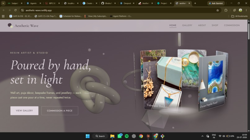
Landing Page
-
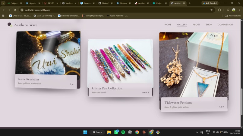
Gallery Section
-
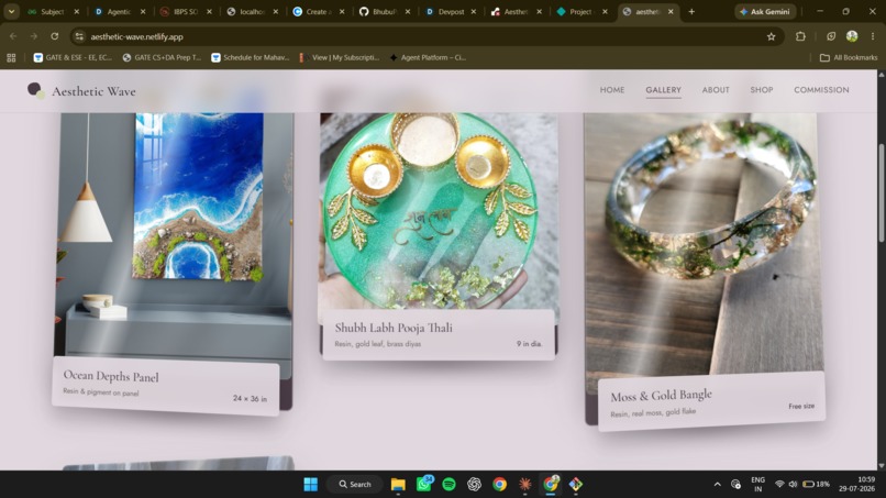
Gallery Display
-
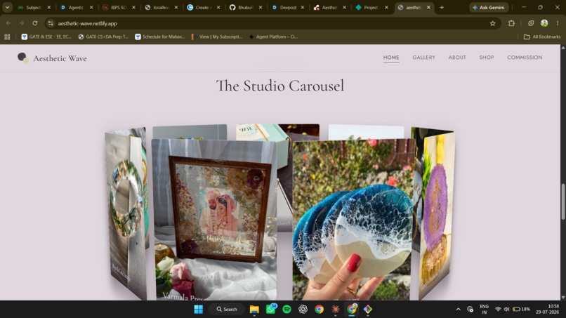
Picture store on Homepage
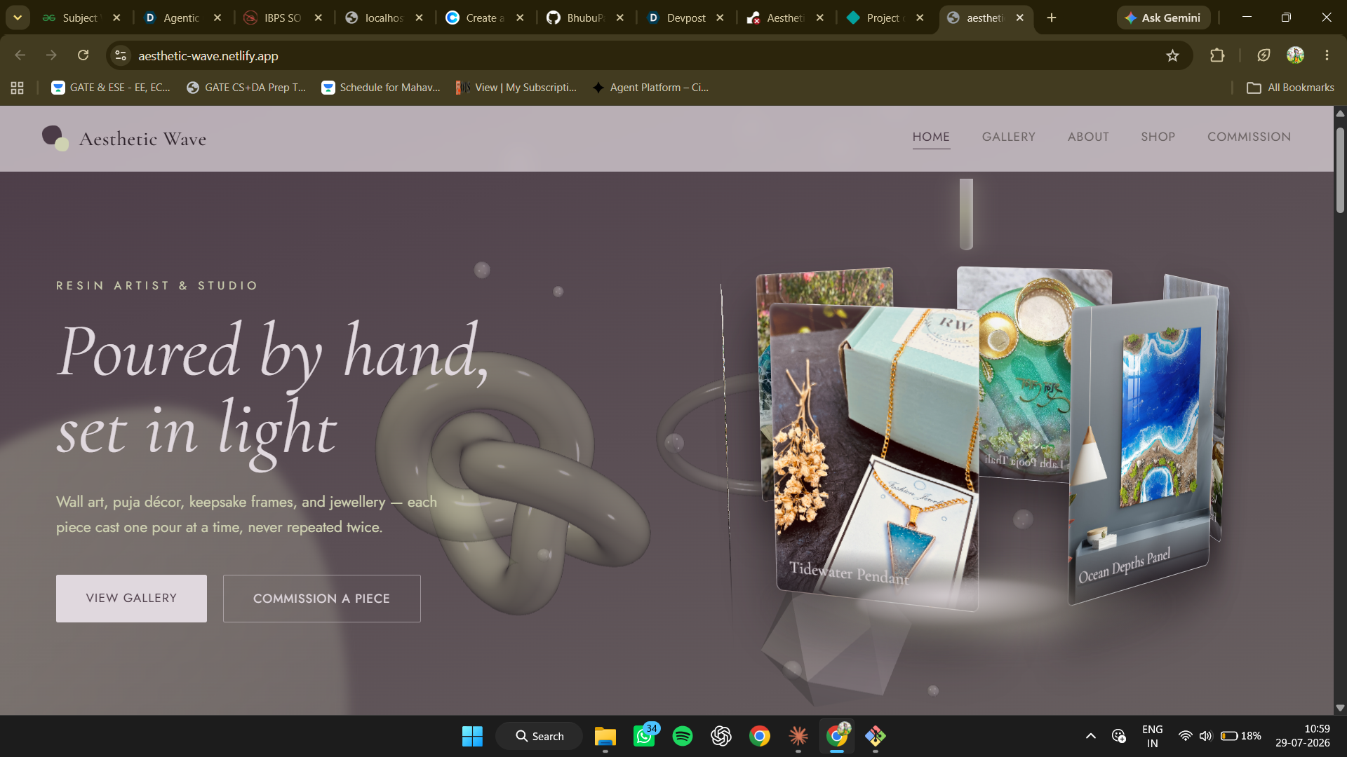
Aesthetic Wave — A Resin Studio You Can Tilt Inspiration I watched someone shop for a resin bangle once. They never looked at it straight on — they held it up, turned it, angled it toward the window, and then decided. Resin isn't judged as an image. It's judged by how light moves through it.
Every resin artist's site I found ignored this: flat grid, flat photos, flat shadows — the exact opposite of the material. So the premise became the interface should behave like the material it sells. Resin begins as liquid and ends as glass; the site should too.
What I built A five-view portfolio and commission site where nothing is a flat rectangle.
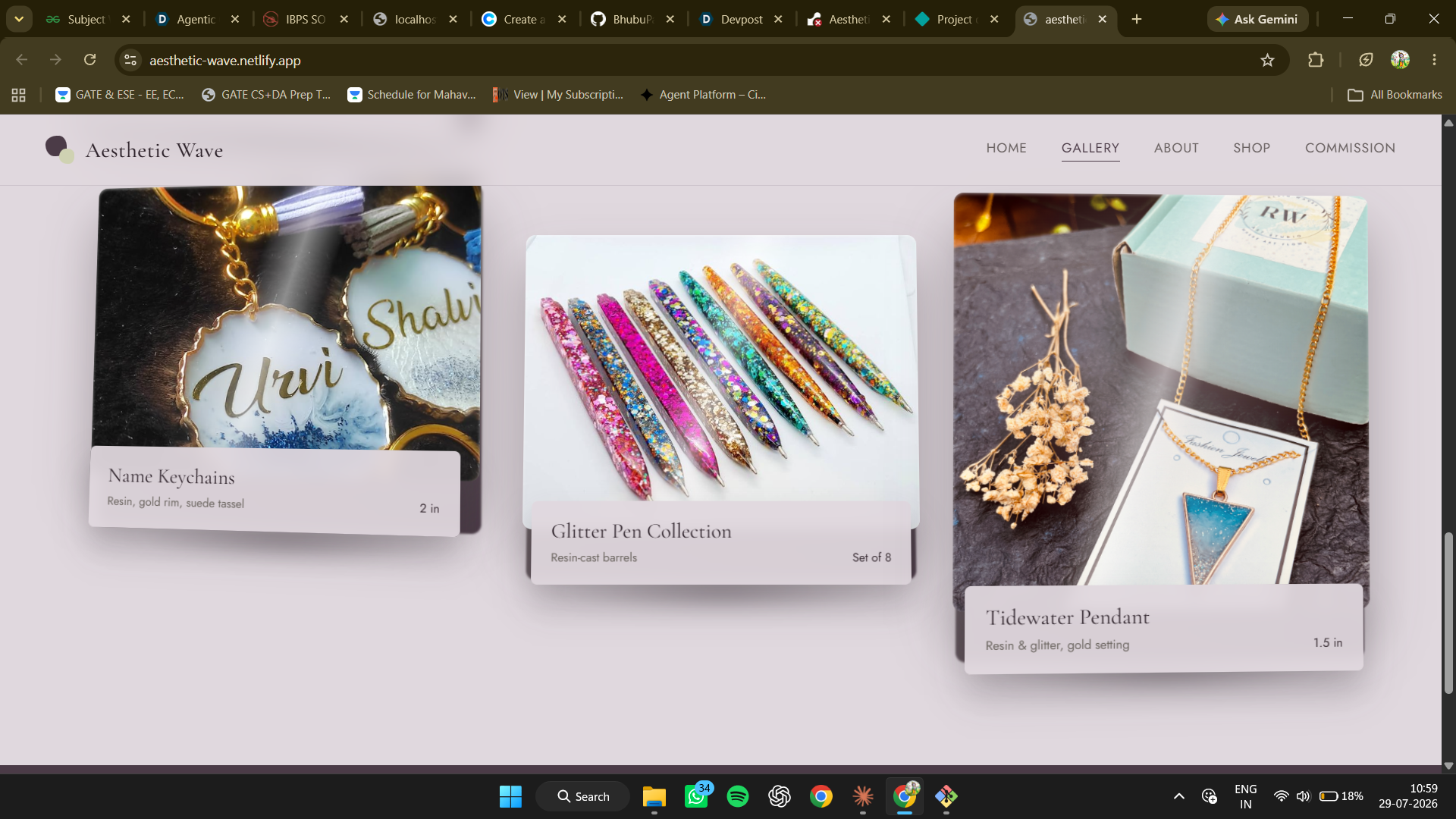
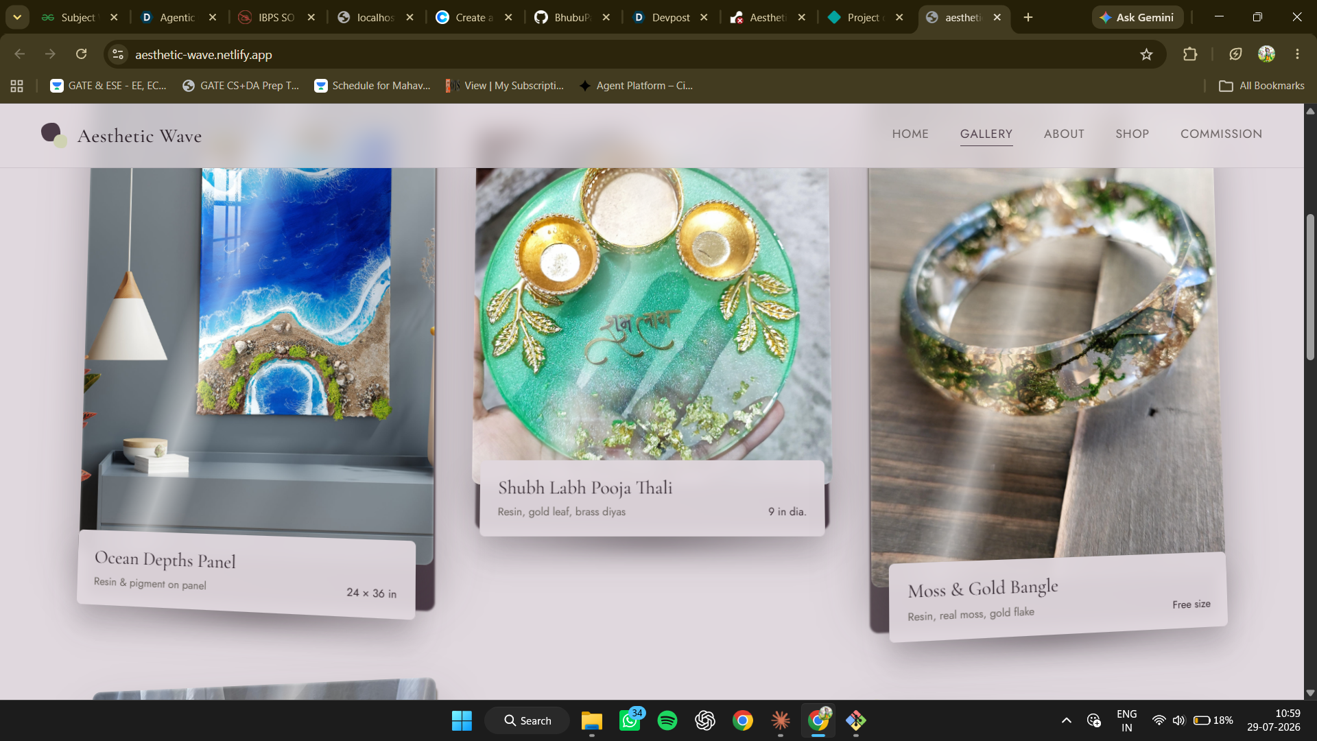
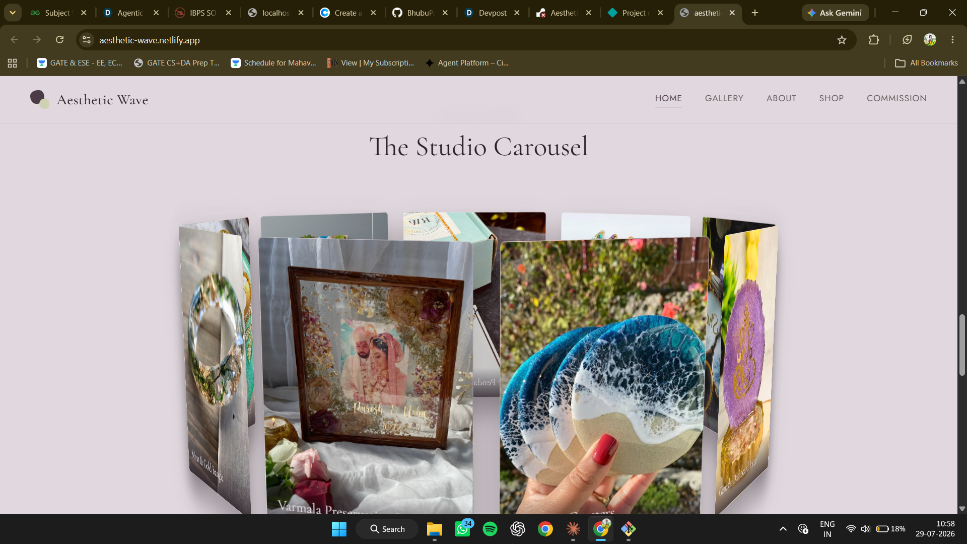
A pour intro — resin falls down the screen and clears away like a curtain. A WebGL resin layer — translucent glass forms with real transmission and clearcoat, droplets falling through, rotating toward your cursor. A hero pour ring — six real pieces on a rotating 3D cylinder, resin streaming over it, pooling beneath. A gallery display wall — the part I'm happiest with. Each work is a layered 3D slab: backing plate behind, cast shadow, image face, title plate floating at $+46\text{px}$ in Z. Hover and a slab lifts off the wall and turns to follow you — the digital version of picking it up. A resin cursor trail — canvas droplets falling under gravity. How I built it three.js with MeshPhysicalMaterial for the glass — transmission and clearcoat are what sell resin as resin instead of tinted plastic. Canvas 2D for the cursor trail. Everything else is CSS 3D: perspective, preserve-3d, per-element translateZ, plus keyframed pours, drips, and gloss sweeps. IntersectionObserver for scroll reveals; React for routing, filtering, and the commission form. Palette kept restrained — plum, sage, warm grey — so motion carries the experience, not colour noise.
Challenges Perspective doesn't respect layout. The hero ring swung out over the headline at some widths — fine in one viewport, broken in the next. I made the geometry itself responsive, deriving radius from viewport width and collapsing the hero to one column below $1150\text{px}$.
A fixed camera distance is not a fixed scale. Taller layouts ballooned every mesh, turning subtle accents into clutter. Perspective size scales with height, so camera distance had to follow it:
$$z = 7.2 \cdot \max\left(1, \frac{h}{560}\right)$$
WebGL contexts leak. View switches tore down the canvas host but left the renderer alive. Instead of trusting lifecycle hooks, a watcher reconciles renderer state against the live DOM every $400\text{ms}$ — less elegant, far more robust.
What I learned 3D on the web is a restraint problem, not a rendering one. My first passes had motion everywhere and it read as noise. What worked was reserving depth for one meaning: this is a physical object you could hold. The glass forms stay ambient; the slabs and ring are what you touch.
And the strongest 3D moment in the whole build is the smallest — a card lifting off the wall toward your cursor. It costs almost nothing. It just happens to be exactly how a person handles a piece of resin.

Log in or sign up for Devpost to join the conversation.