-
-
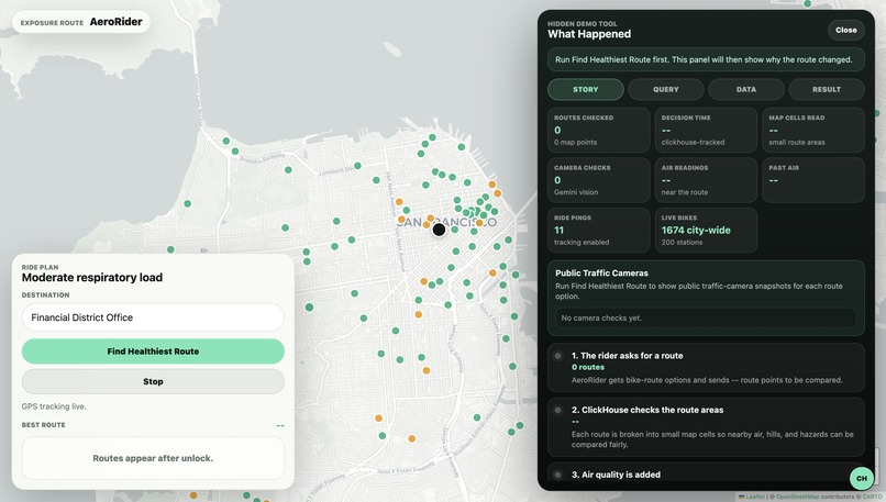
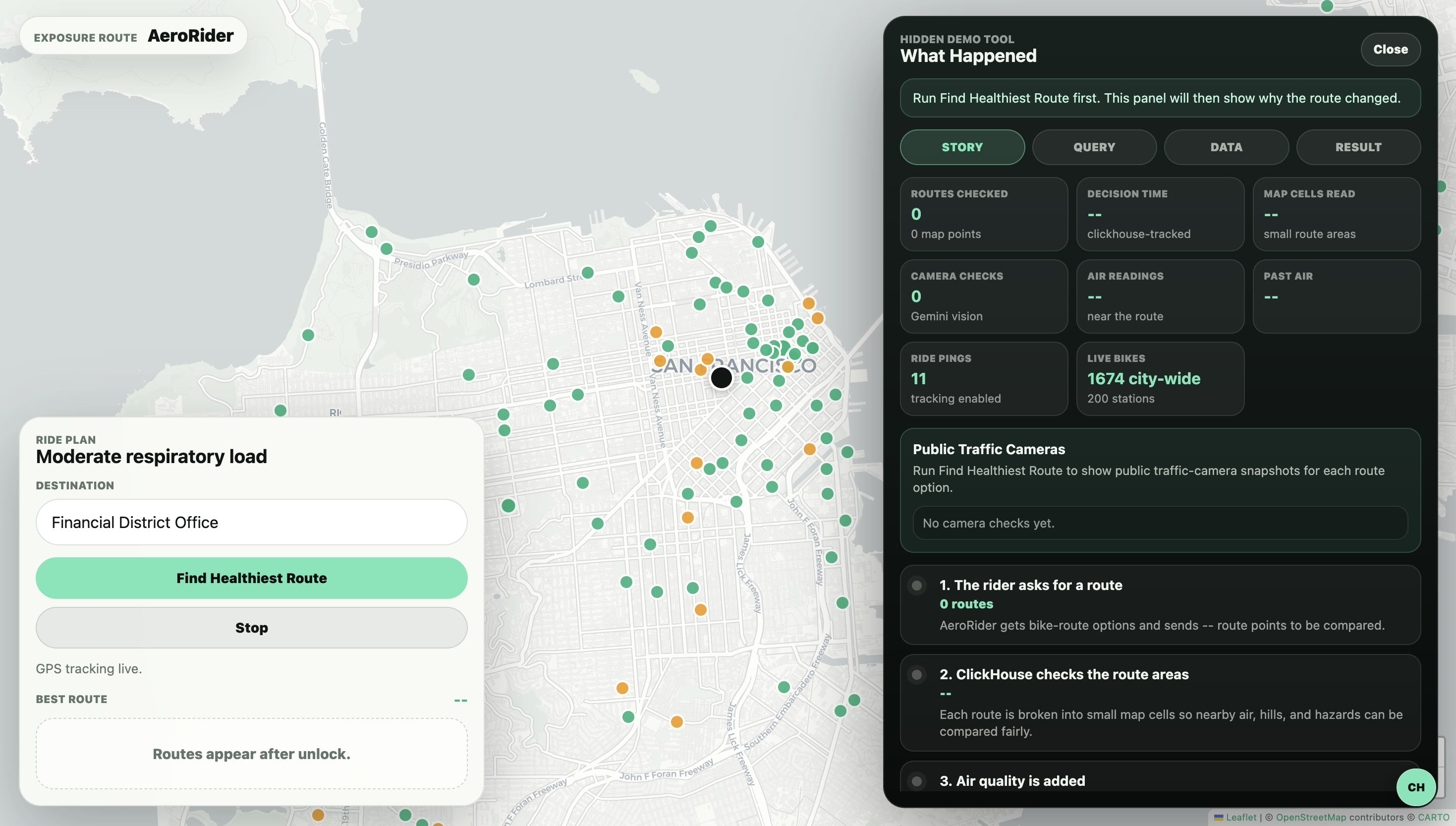
The Product
-
Workflow
-
The Result
Inspiration
Cyclists usually get routes optimized for speed, not health. In a city like San Francisco, the shortest route can mean steep hills, bad air, congestion, or a blocked street. We wanted AeroRider to feel like a smarter bike copilot: one that chooses the route that is safest for your lungs, not just the route that is fastest.
What it does
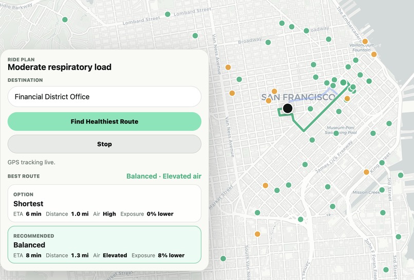
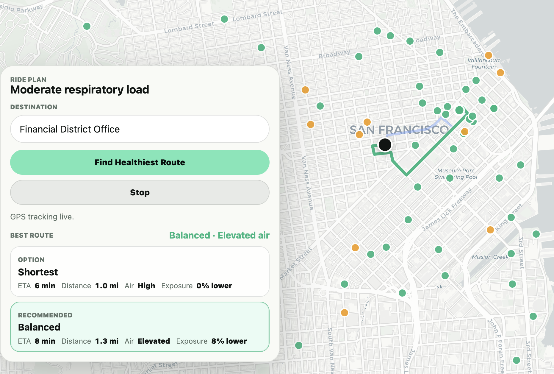
AeroRider takes a rider’s current location and destination, fetches multiple bike route options, and scores each route against air quality, elevation, traffic context, and visual hazards.
Instead of simply warning the rider, AeroRider can reroute them. If the shortest route has higher respiratory load or a nearby camera/AI signal detects a hazard, the app recommends a cleaner alternative and explains the tradeoff.
How we built it
We built a local live demo with a cloud analytics backend:
- Frontend: Leaflet/CyclOSM map UI for route planning and ride tracking.
- Backend: FastAPI service that coordinates routing, scoring, Gemini, and ClickHouse.
- Database: ClickHouse Cloud for fast route scoring over spatial/time-series data.
- Data: WAQI air-quality readings, elevation grids, ride GPS pings, and public traffic-camera context.
- AI: Gemini analyzes visual traffic evidence and returns a structured hazard verdict.
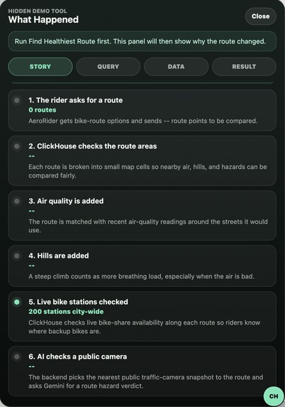
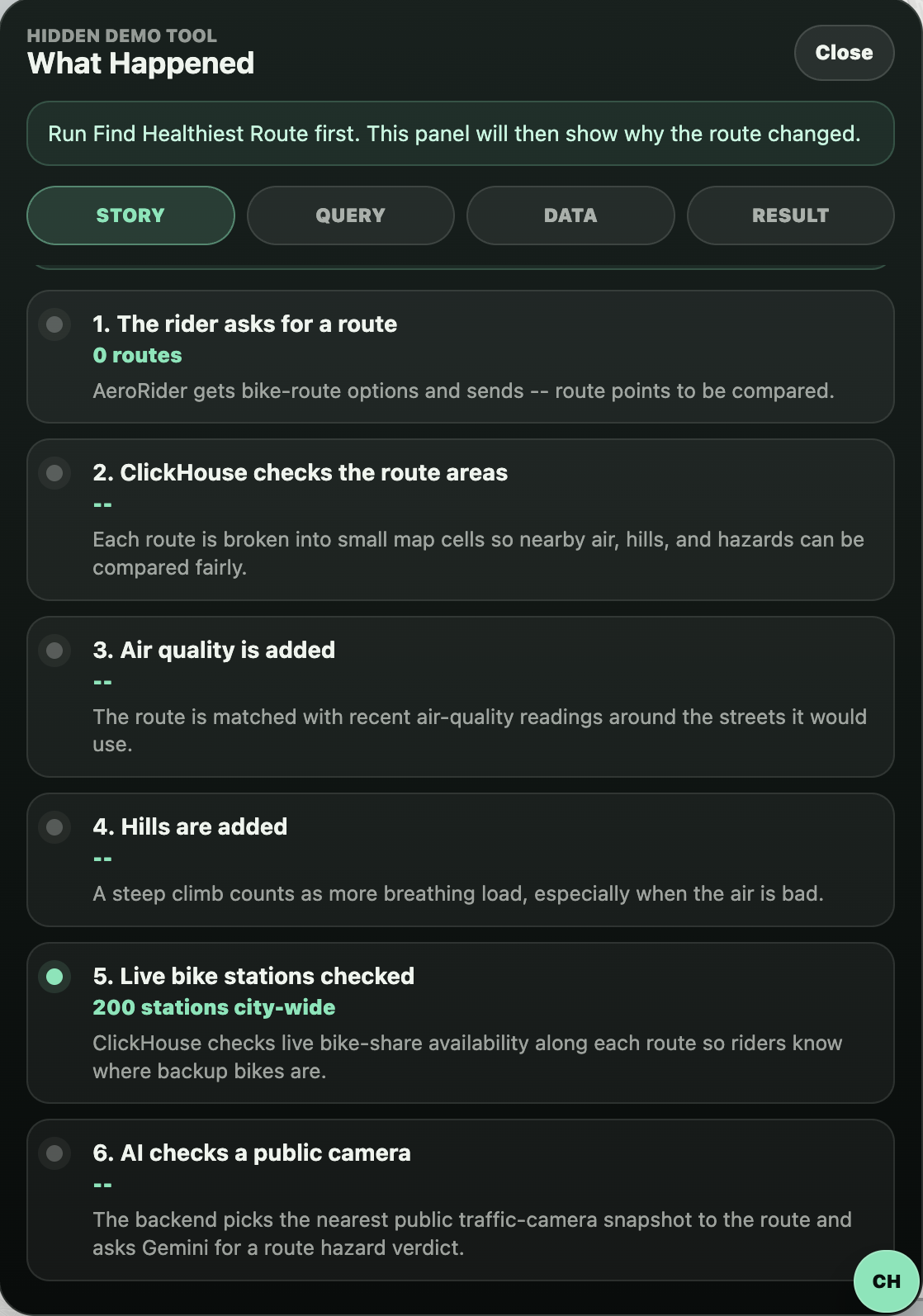
- Spatial logic: route points are converted into map cells, joined with AQI/elevation/hazard data, and ranked by respiratory load.
The core idea is that ClickHouse scores whole route geometries, not just one point on the map.
Challenges we ran into
The hardest part was making the demo feel like a real product instead of a dashboard. Early versions showed too many raw metrics and looked overly technical. We simplified the UI around the rider’s actual question: “Which route should I take?”
Another challenge was visual data. Public city-street CCTV feeds are not always available, especially for bike lanes. We explored public traffic-camera sources and designed the system so real camera snapshots can be swapped in wherever coverage exists.
We also had to tune GPS behavior, routing providers, and route scoring so the demo did not produce obviously unrealistic paths.
Accomplishments that we're proud of
We are proud that AeroRider became more than a warning system. It actively compares route options and chooses a better path.
We are also proud of the ClickHouse integration. Route geometry, AQI, elevation, visual hazards, and ride pings all become queryable spatial/time-series data. That lets the demo show both live decisions and post-ride analytics.
The hidden ClickHouse view is another highlight: it lets judges see the behind-the-scenes route decision without cluttering the rider experience.
What we learned
We learned that “AI + maps” only becomes compelling when the AI changes the outcome. A chatbot explanation was not enough. The stronger demo is when Gemini produces a hazard signal, ClickHouse stores it, and the route actually changes.
We also learned that public mobility data is messy. Air quality, traffic cameras, bike routes, and elevation all have different formats, coverage, and reliability. ClickHouse helped unify those signals into one fast decision layer.
What's next for AeroRider
Next, we want to connect more real-world data sources:
- Better city-street camera coverage.
- Construction and road-closure feeds.
- Traffic congestion APIs.
- Crowd-reported hazards from riders.
- Personalized sensitivity profiles for asthma, COPD, or poor air-quality days.
- Better post-ride reports showing actual exposure versus avoided exposure.
Long term, AeroRider could become a health-aware routing layer for bikeshare systems, delivery cyclists, and urban commuters.
Built With
- caltrans/511-traffic-cameras
- clickhouse-cloud
- css
- cyclosm
- fastapi
- google-gemini-api
- google-maps
- h3-geospatial-indexing
- html
- javascript
- leaflet.js
- python
- three.js
- valhalla-routing
- waqi-api

Log in or sign up for Devpost to join the conversation.