🌍 Aeromap: A Breath of Intelligence for the Air We Share
💡 Inspiration
It all started with a simple thought —
we check the weather before going out, but how often do we check the air we breathe?
During recent smog events and rising pollution in cities, we realized that people — especially in smaller towns — don’t have access to live, reliable air quality data. The more we looked into it, the clearer it became that awareness is the first step toward change.
We wanted to build something that could visualize what’s invisible —
an app that doesn’t just show pollution levels, but also explains why it’s happening, what it means for your health, and how it might change tomorrow.
That’s how Aeromap was born — a blend of AI, environmental data, and human empathy.
🌫️ What It Does
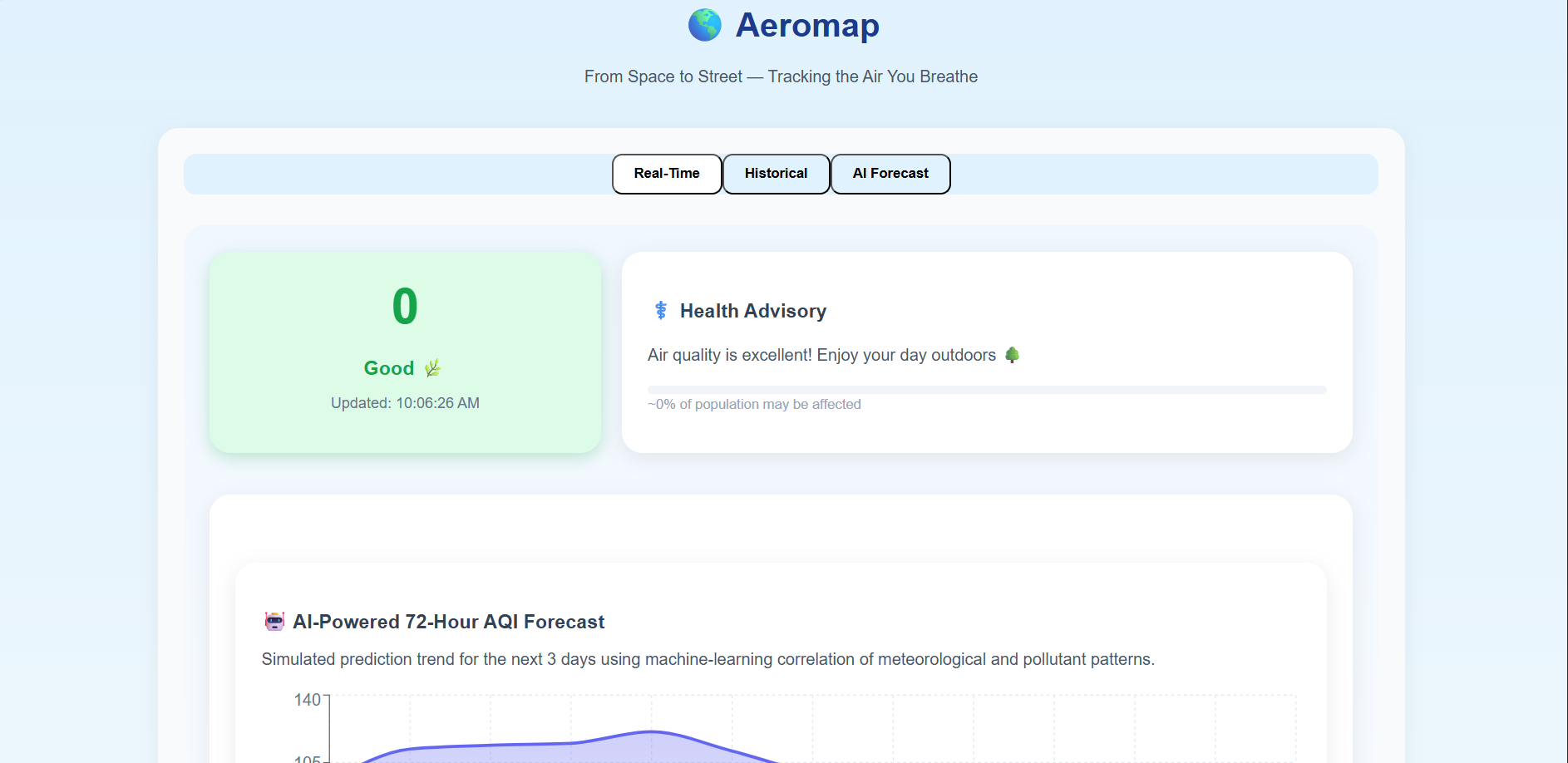
Aeromap is an AI-powered web app that lets you:
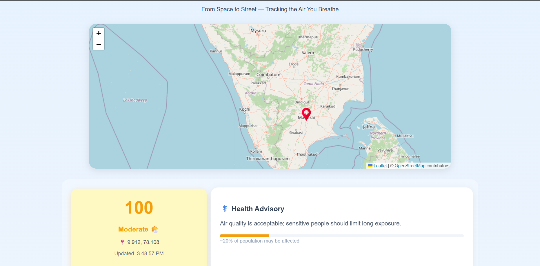
- 🌍 Click anywhere on an interactive map and see live air quality data
- 🌡️ View weather conditions like temperature, humidity, and wind speed
- 🧪 Analyze pollutant concentrations (PM₂.₅, PM₁₀, NO₂, SO₂, CO, O₃)
- ⚕️ Get AI-generated summaries and health advisories in plain English
- 📈 See predicted AQI trends for the next 24–72 hours
- 🤖 Understand possible causes of pollution in that area (traffic, industry, weather patterns)
It’s like having an environmental scientist explain what’s happening in your neighborhood — instantly.
🛠️ How We Built It
We used a mix of modern web technologies and real-world data to bring Aeromap to life.
Frontend: Built with React (Vite) for speed and modularity.
We used React Leaflet for interactive maps, Recharts for visual graphs, and Framer Motion + TailwindCSS for a clean, animated UI.Backend: Powered by Node.js + Express, serving real-time data through REST APIs.
It fetches data from OpenWeatherMap’s Air Pollution & Weather APIs, processes it, and delivers it to the client.AI Integration: A simulated AI layer (using Hugging Face-style text generation) explains air conditions in human-friendly summaries — turning dry numbers into relatable insights.
Data Pipeline:
- You click on the map 🗺️
- Your coordinates are sent to the backend 🌐
- AQI and weather data are fetched live 🌫️
- AI summarizes the conditions 🤖
- Dashboard updates instantly ⚡
- You click on the map 🗺️
We also designed it to be state-driven — meaning every interaction triggers live updates without reloading the page.
⚔️ Challenges We Faced
No meaningful project comes without challenges — and we faced quite a few:
- 🌐 Handling real-time API limits — the OpenWeather API sometimes throttled requests, so we had to cache and smooth data intelligently.
- ⚠️ CORS issues — connecting React with Node.js took a lot of debugging to make cross-origin requests work smoothly.
- 📊 Balancing design and performance — rendering maps, charts, and animations together slowed things down initially.
- 🤖 Making AI sound “human” — writing prompts that make AI explanations simple but accurate was trickier than expected.
- 🌍 Dealing with missing or inconsistent data — not all regions had complete pollutant data, so we built smart fallbacks.
Each of these challenges pushed us to learn — and the result feels like a genuine fusion of data science, UI design, and engineering.
🏆 Accomplishments We’re Proud Of
- Built a working, real-time AQI visualizer from scratch
- Created a clean, modern UI that feels intuitive and alive
- Integrated AI-driven summaries and health advice to make data personal
- Combined multiple APIs into a seamless, interactive experience
- Delivered a complete project that is both technical and meaningful
But more than anything — we’re proud that Aeromap helps people become more aware of the air they live in.
📚 What We Learned
We learned that technology can make invisible problems visible.
On the technical side, we grew our skills in:
- React state management, context API, and component design
- Building and consuming RESTful APIs
- Handling real-time data efficiently
- Designing beautiful interfaces with Tailwind and Framer Motion
- Integrating AI/NLP for natural summaries
- Applying basic mathematical modeling for prediction:
$$ AQI_{predicted}(t) = A \sin(\omega t + \phi) + \epsilon $$
(Yes, even air quality follows patterns when you visualize it right.)
On a deeper level, we learned how to turn data into empathy — how to make environmental awareness interactive and emotional.
🚀 What’s Next for Aeromap
Aeromap is only the beginning.
In the future, we want to:
- 🔮 Train a real machine learning model to forecast AQI more accurately
- 🛰️ Integrate ISRO and CPCB satellite data for regional accuracy
- 🌫️ Add a pollution source heatmap showing industrial and traffic emissions
- 📱 Turn Aeromap into a Progressive Web App (PWA) for mobile alerts
- 🔔 Implement push notifications when air quality becomes hazardous
- 🧬 Use AI regression models (LSTM / CNN) to detect long-term pollution patterns
- 🌍 Launch a community reporting system where citizens can report local pollution
Our vision is for Aeromap to become the Google Maps of air quality —
a global, AI-driven platform that helps people see and breathe better.
❤️ Final Thoughts
Aeromap taught us something important:
Innovation doesn’t always have to come from chasing trends — sometimes, it comes from caring about something that affects everyone.
We didn’t just build a web app — we built a tool for awareness.
It’s not perfect, but it’s real. And that’s what makes it meaningful.
“If we can predict the weather, we can predict the air — and maybe, change it.”
✨ Aeromap: A breath of intelligence for the air we share.
Built With
- axios
- cors
- dotenv
- express.js
- framer-motion
- git
- github
- hugging-face-ai-api
- leaflet.js
- node.js
- openweathermap-api
- postman
- react
- react-leaflet
- recharts
- sqlite
- tailwindcss
- vite
- vs-code

Log in or sign up for Devpost to join the conversation.