Inspiration
We've all done it. Scrolled to the bottom of a 12,000-word privacy policy and clicked "I Agree" without reading a single line. Not because we don't care about our data — but because the system is designed to make reading feel impossible.
Privacy policies aren't long by accident. They're long by strategy. Platforms have legal teams who spend months crafting language that is technically transparent but practically unreadable. The average policy takes 18 minutes to read. The average user spends 6 seconds. That gap isn't a coincidence — it's the business model.
We built Aegis AI because we believe that in the age of AI, the data you unknowingly hand over today becomes the training data that shapes decisions about you tomorrow. Consent shouldn't be invisible. It should be the clearest thing on the screen.
What It Does
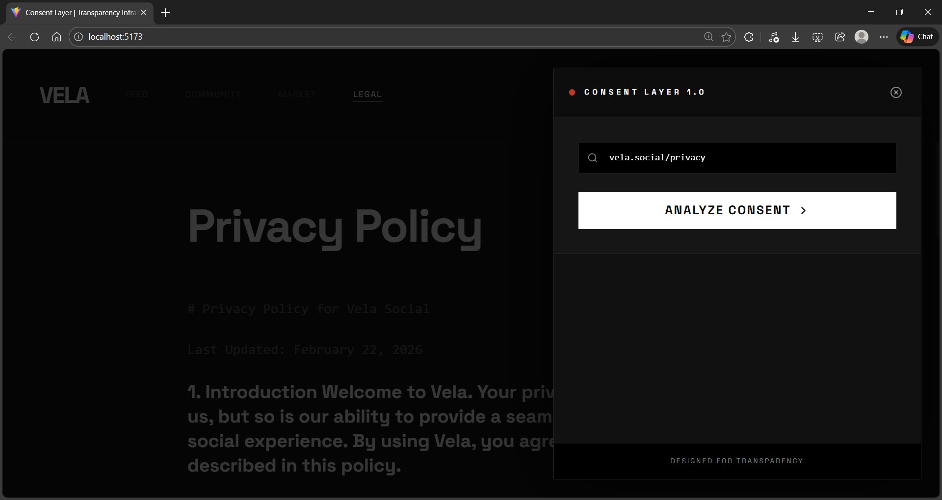
Aegis AI analyzes any privacy policy or terms of service and translates it into three honest, human-readable signals — instantly.
🔴 What You Lose — the real cost of signing up. Data collection, third-party sharing, broad permissions, indefinite retention. The stuff buried on page 7.
🟡 What's Unclear — the language designed to mean everything and nothing. "We may share with partners." "For purposes we deem appropriate." "Reasonable retention periods." Flagged and surfaced.
🟢 What's Safe — the clauses that actually protect you. Explicit rights, opt-out mechanisms, breach notifications, data deletion guarantees.
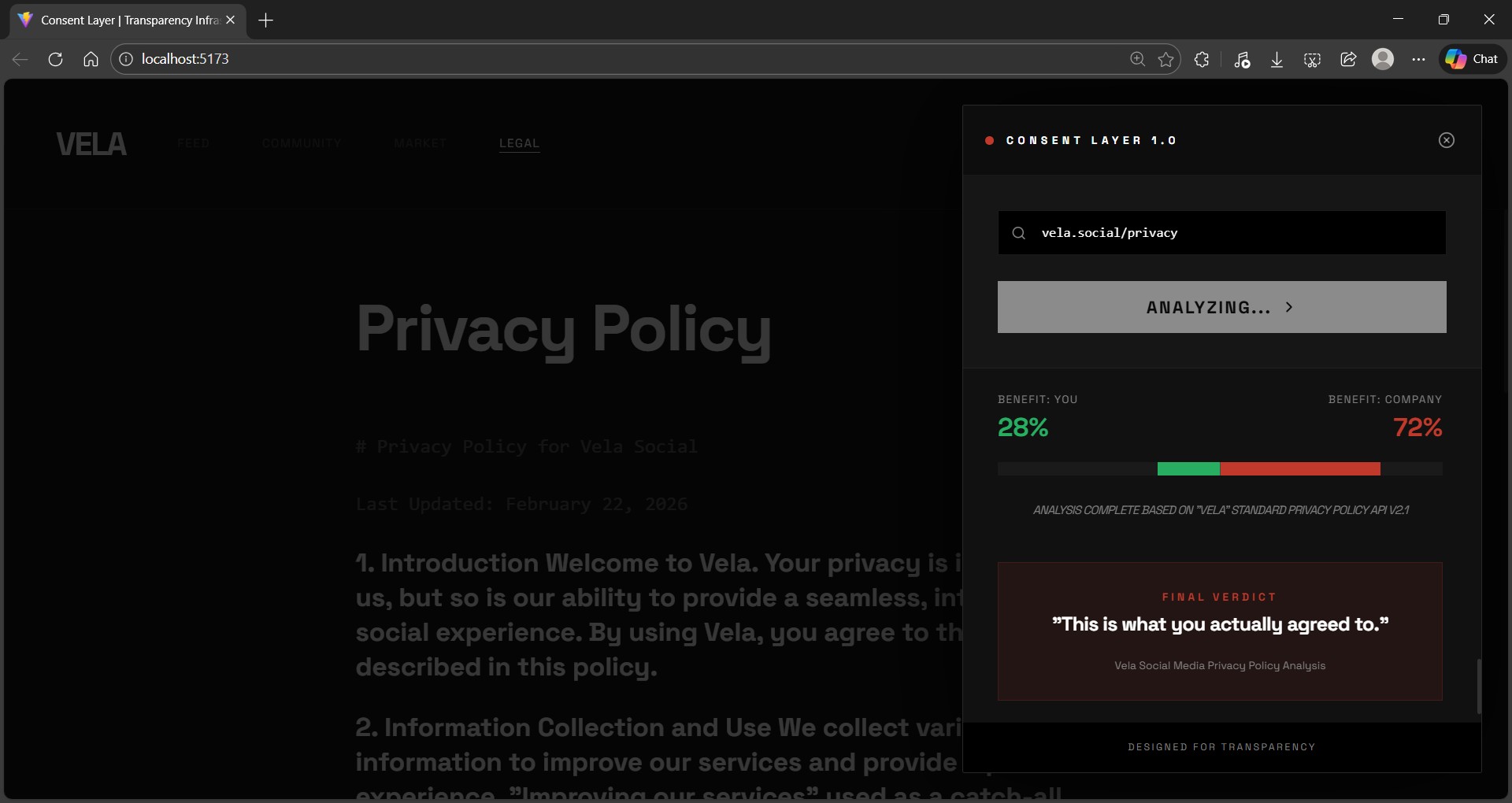
And the feature that stops people mid-scroll: the Benefit Balance Indicator — a visual score showing exactly who the agreement favors. Not a moral judgment. Just the truth. The entire analysis — from click to final score — takes 6 to 8 seconds.
How We Built It
Aegis AI is a React + Vite single-page app styled with a custom Tailwind config and animated entirely with Framer Motion.
The UI was built with one hard constraint: it cannot look like an AI made it. That meant throwing out the default Tailwind palette, avoiding glassmorphism and gradients, choosing Space Grotesk over the generic Inter default, and designing the layout like an editorial tool — not a SaaS dashboard. The result is a dark, typographic interface that feels closer to a security terminal than a web app.
The analysis engine uses a structured Claude API prompt that enforces strict JSON output — no free-form summaries, no hallucinated legalese. The response schema maps directly to the four display categories plus the benefit score. For the hackathon demo, the output is hardcoded from a real Claude response so the app works instantly with zero API keys or setup required.
The scanning animation — the part that makes the demo feel live — is a carefully timed sequence of status messages that cycle for 1.5 seconds before results cascade in. Each item reveals with a staggered Framer Motion fade. The balance bar animates outward from center. The whole flow lands in exactly 6–8 seconds — fast enough to feel real, slow enough to let the room react.
Challenges We Ran Into
Making it feel real without being real. The hardest design problem wasn't technical — it was timing. A demo that reveals results too fast looks scripted. Too slow and you lose the room. Getting the scanning phase, staggered cascade, and balance bar animation to feel genuinely live took more iteration than anything else in the build.
The UI constraint. Self-imposing "this cannot look AI-generated" as a hard rule creates real friction. Every default component, every stock color, every familiar layout pattern had to be consciously rejected and replaced. It slows you down — but the result is a product that actually looks considered.
Structured output reliability. Getting an LLM to return clean, consistent JSON with exactly the right keys, item counts, and word limits — every single time — requires more prompt engineering than it sounds. We went through several iterations before locking in a schema strict enough to be reliable but flexible enough to handle wildly different policy styles.
Accomplishments That We're Proud Of
The Benefit Balance Indicator. Nothing like it exists in any privacy tool we found. Showing users a single number — "this agreement is 72% in the platform's favor" — is more communicative than any summary paragraph. People understand it immediately, and it lands emotionally in a way that bullet points simply don't.
The demo flow. From click to final result in 6–8 seconds, with a UI that looks designed rather than generated — that's the thing we're most proud of technically. It works under pressure, works offline, and tells the story without anyone having to explain it.
The framing. Aegis AI isn't positioned as a legal tool or a compliance checker. It's positioned as infrastructure for digital literacy — something anyone should have access to, regardless of technical background or legal knowledge. Getting that framing right early shaped every decision that came after.
What We Learned
The gap between "working" and "demo-ready" is larger than we expected. A working prototype that requires setup, explanation, or context to understand is a weak demo. A demo that tells its own story in 8 seconds — with no presenter narration required — is a different product entirely. We learned to optimize for the latter from the start.
Design constraints are productivity tools. Having a clear rule ("no AI aesthetic, no default palette, no glassmorphism") made every visual decision faster, not slower. You stop evaluating options and start executing within the constraint.
Prompt structure matters more than model choice. The way you architect your prompt — enforced output schema, strict item limits, clear field definitions — produces dramatically more consistent results than a general-purpose summarization request, regardless of which model you're using.
What's Next for Aegis AI
The demo proves the concept. Here is what comes next:
Real-time analysis — connect the live Claude API so any policy URL can be analyzed on demand, not just the demo data.
Chrome Extension — the natural home for this tool is in the browser, surfacing a consent score the moment a user lands on a sign-up page.
Policy Change Tracking — alert users when a platform quietly updates its terms. Most policy changes happen silently. Aegis AI would change that.
AI Data Mapping — specifically flag clauses that permit platforms to use your data to train AI models. As this becomes standard practice, users deserve to know when they're opting in.
Accessibility Mode — simplified language output for users who want jargon-free, plain-English summaries.
The long-term vision: Aegis AI becomes the standard consent layer between users and every agreement they encounter online — the same way HTTPS became the standard for connection security. A small icon. A clear score. The truth, instantly.
Digital consent deserves the same infrastructure investment as digital security. This is the start of that.

Log in or sign up for Devpost to join the conversation.