-
-
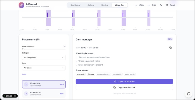
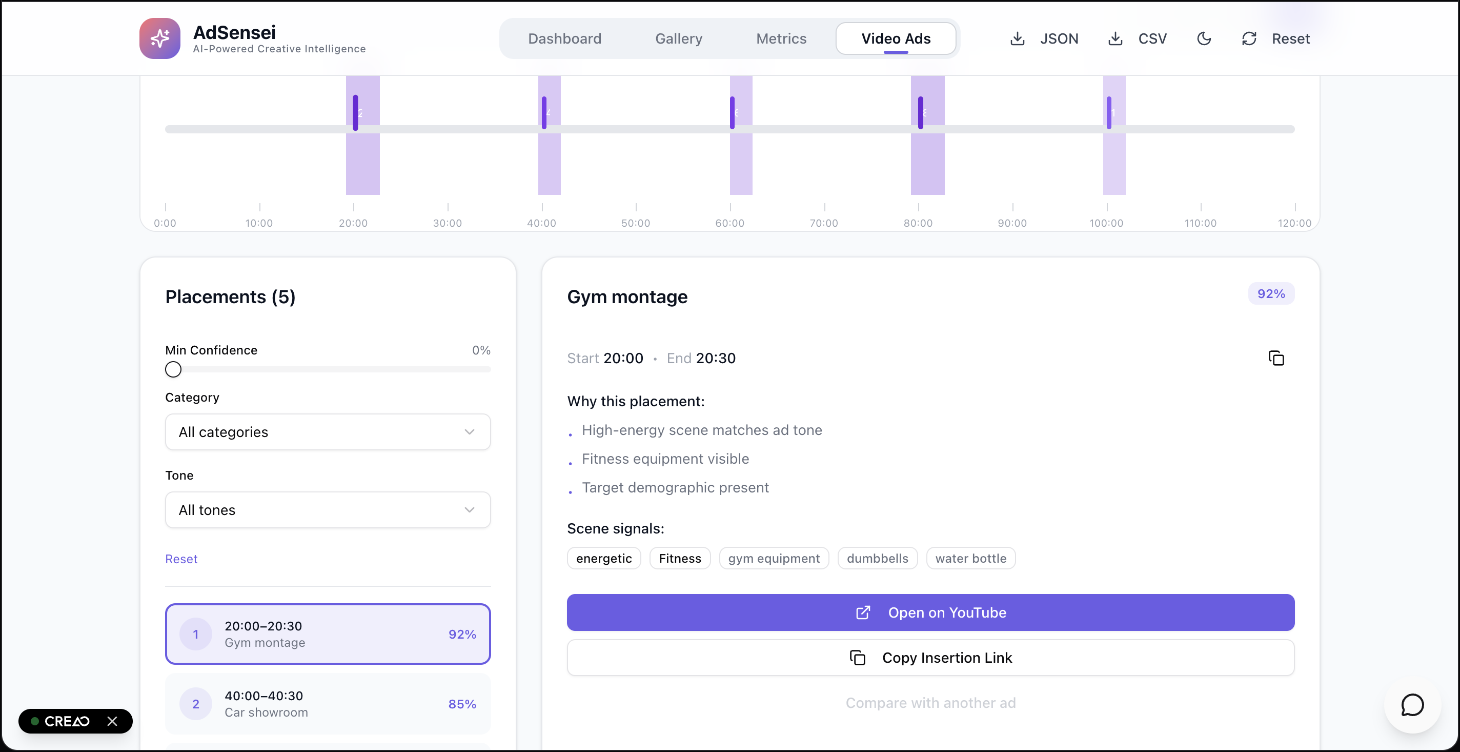
Ad placement in a Movie feature
-
Analyzing Ads
-
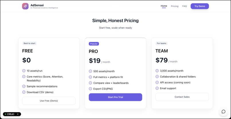
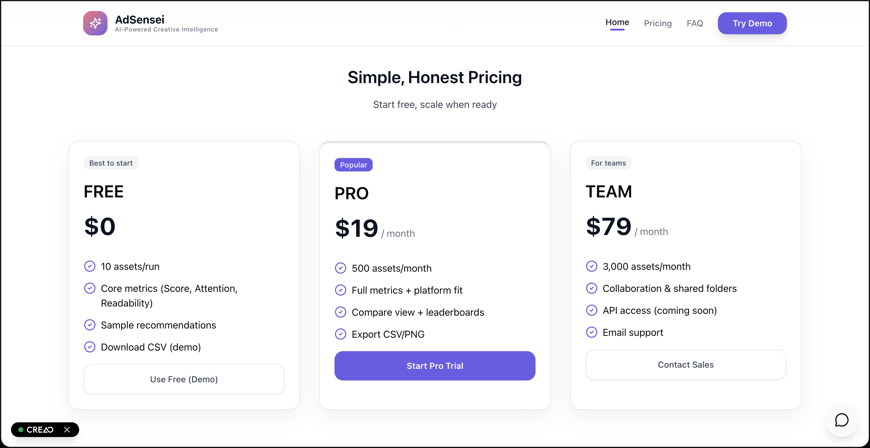
Our Pricing
-
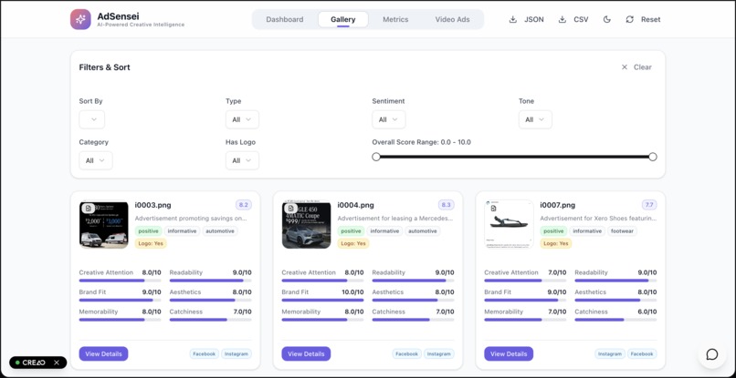
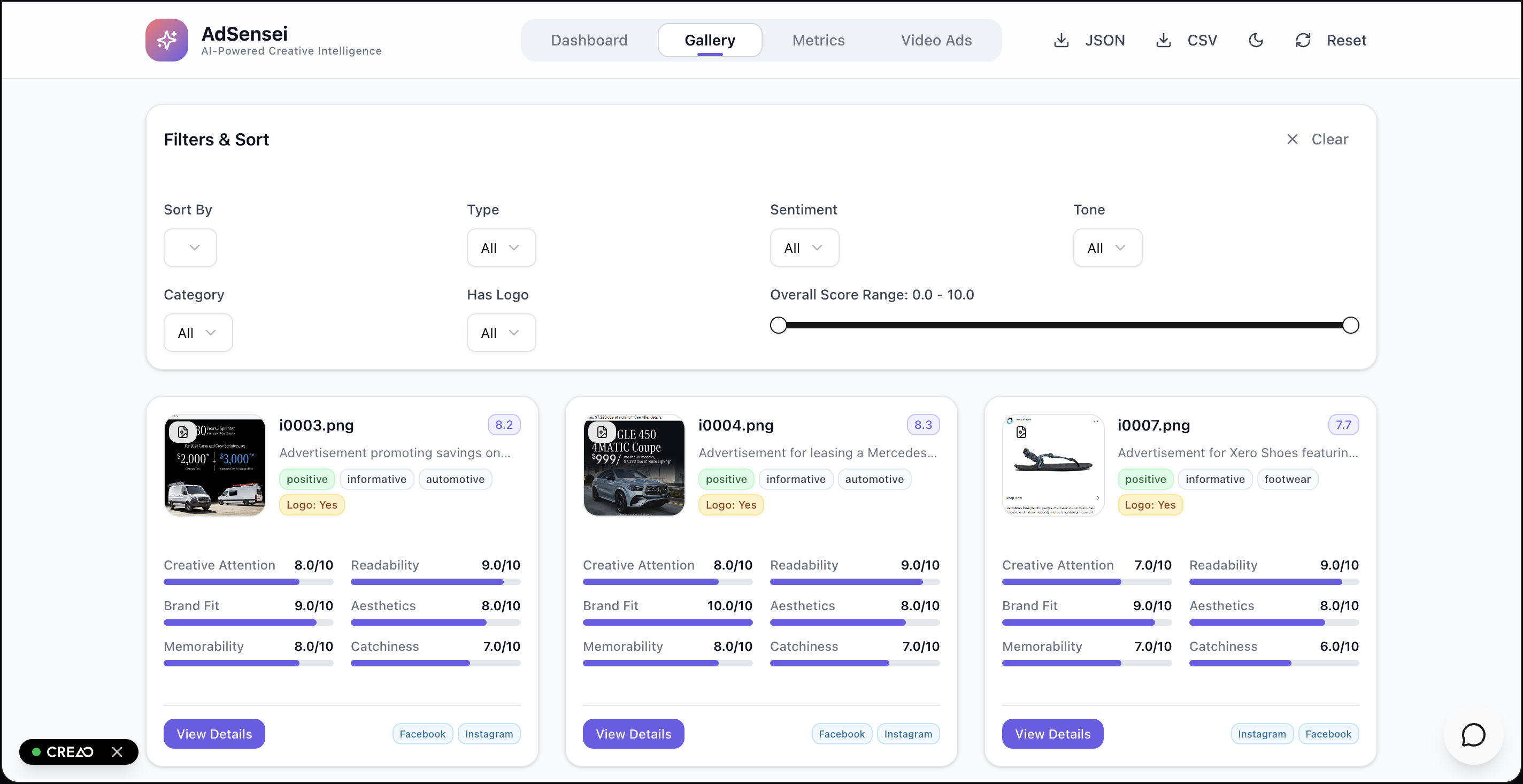
Ads Gallery with data
-
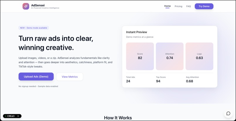
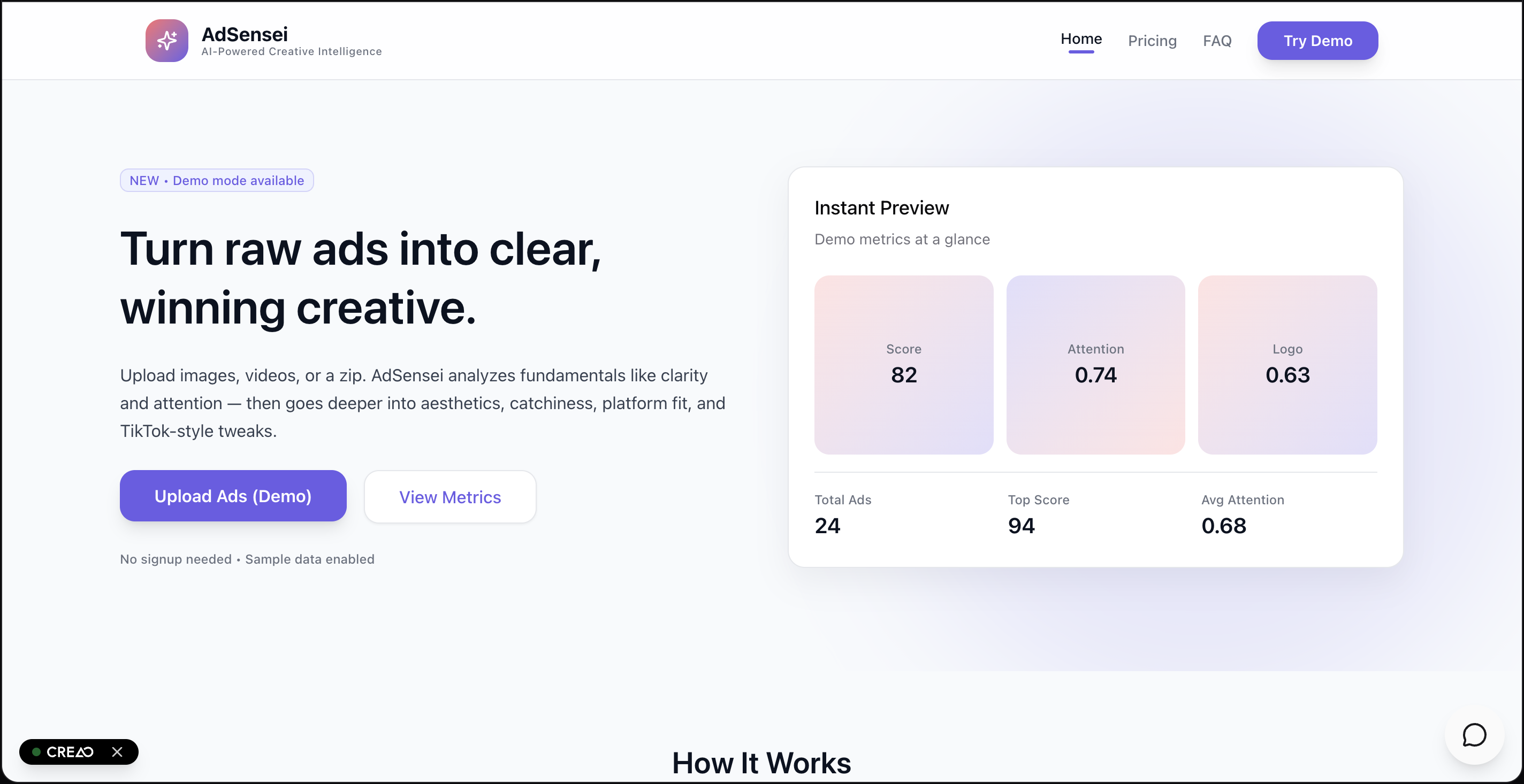
Landing Page
-
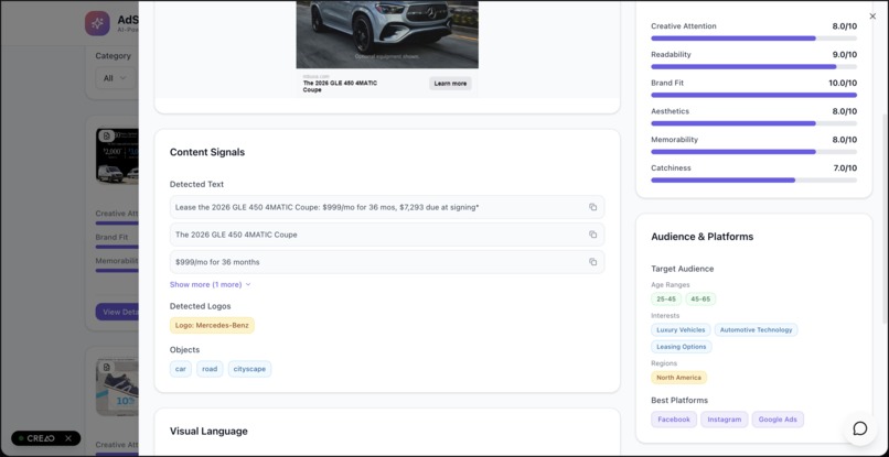
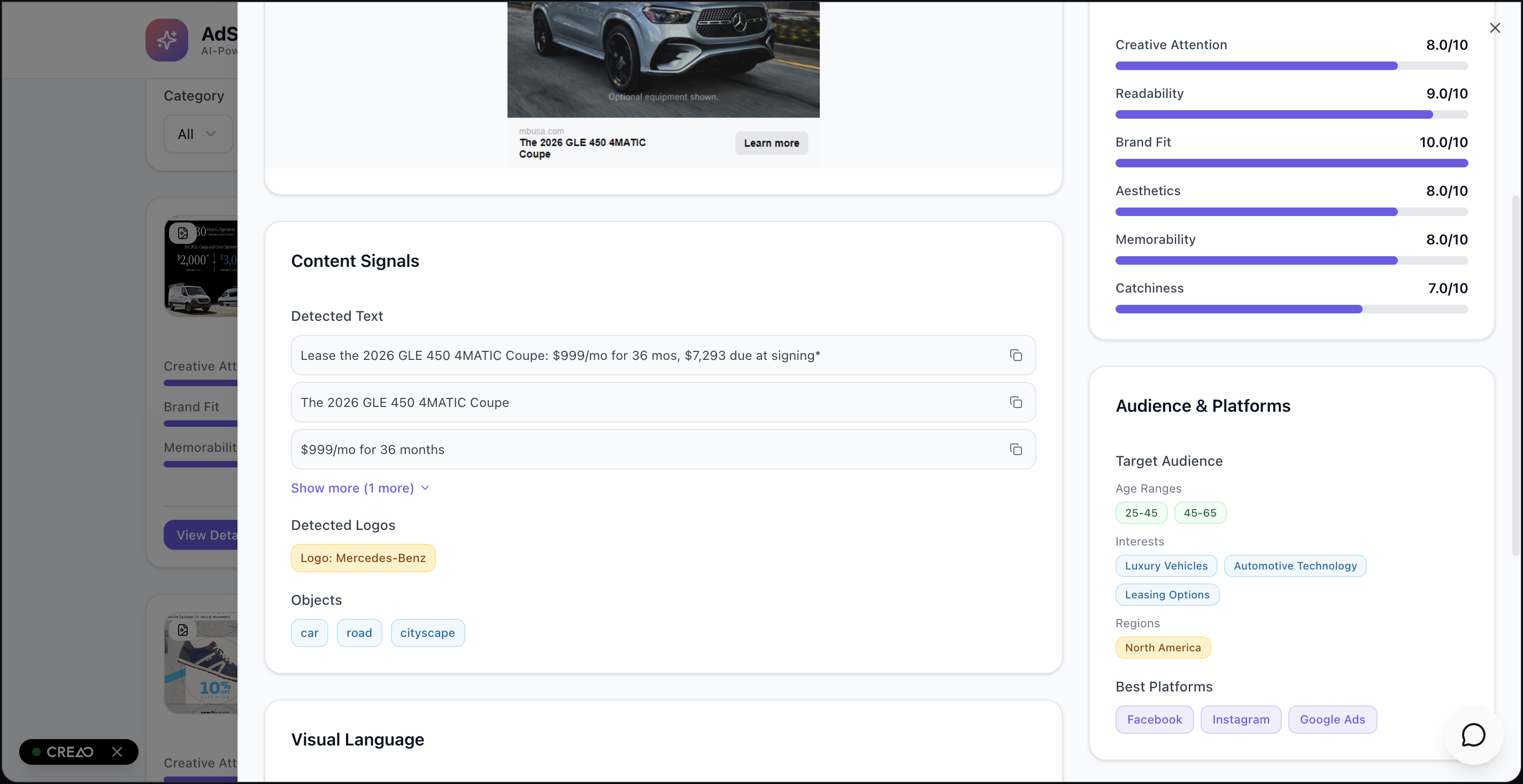
Metrics on one particular advertisement
-
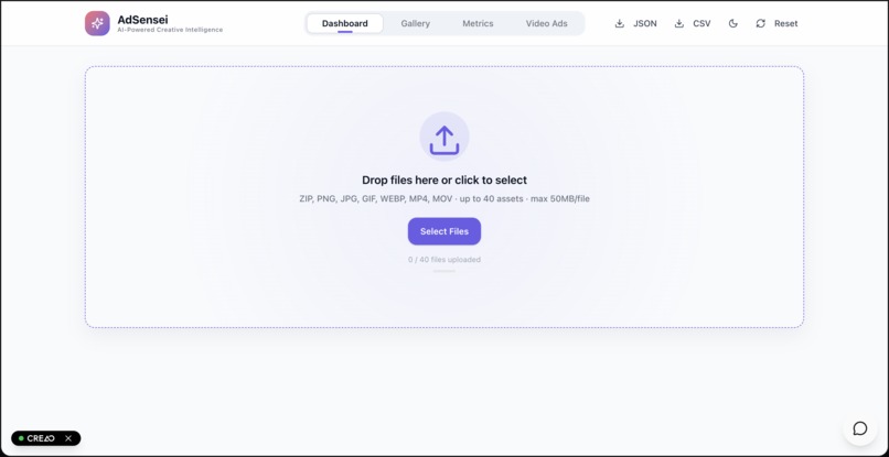
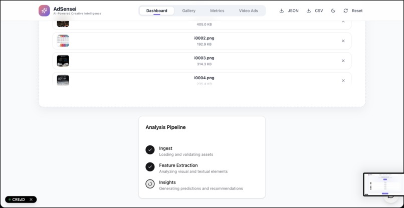
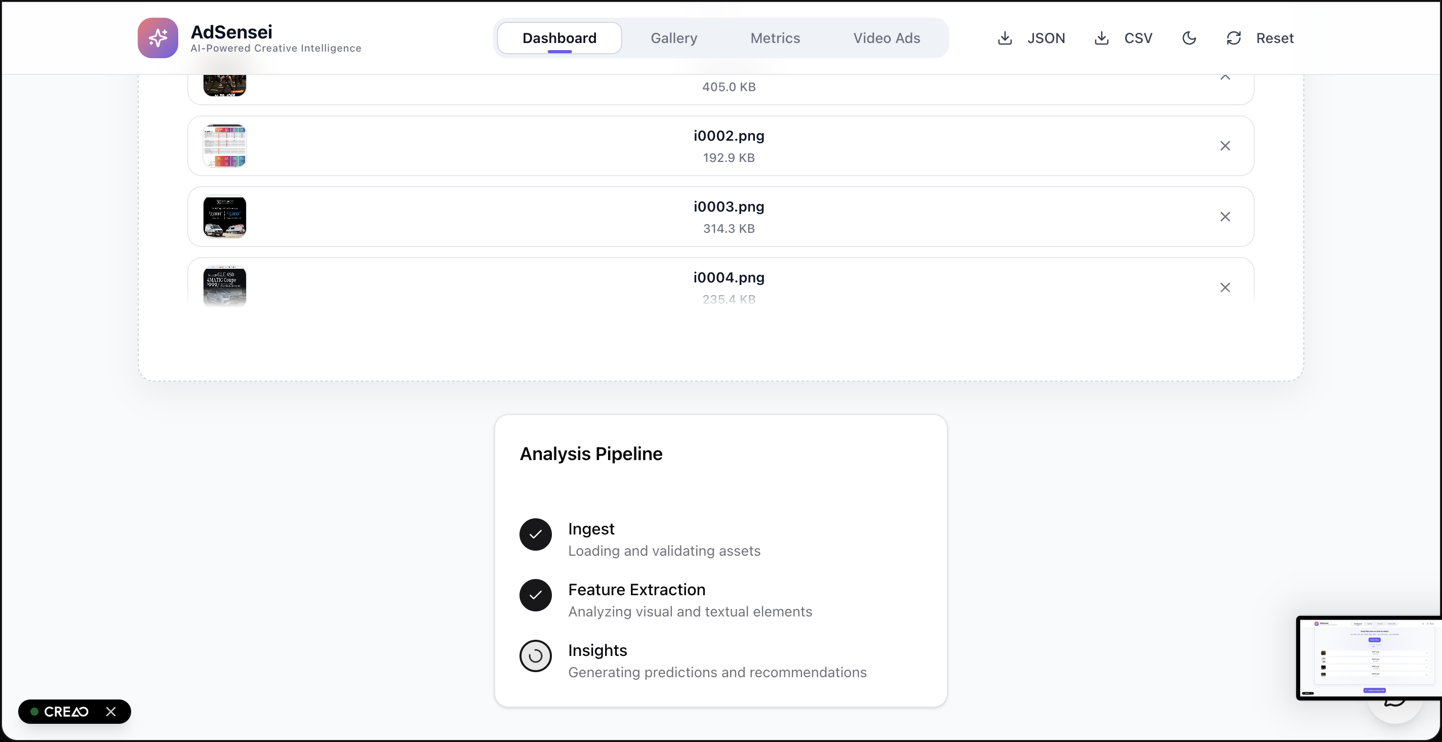
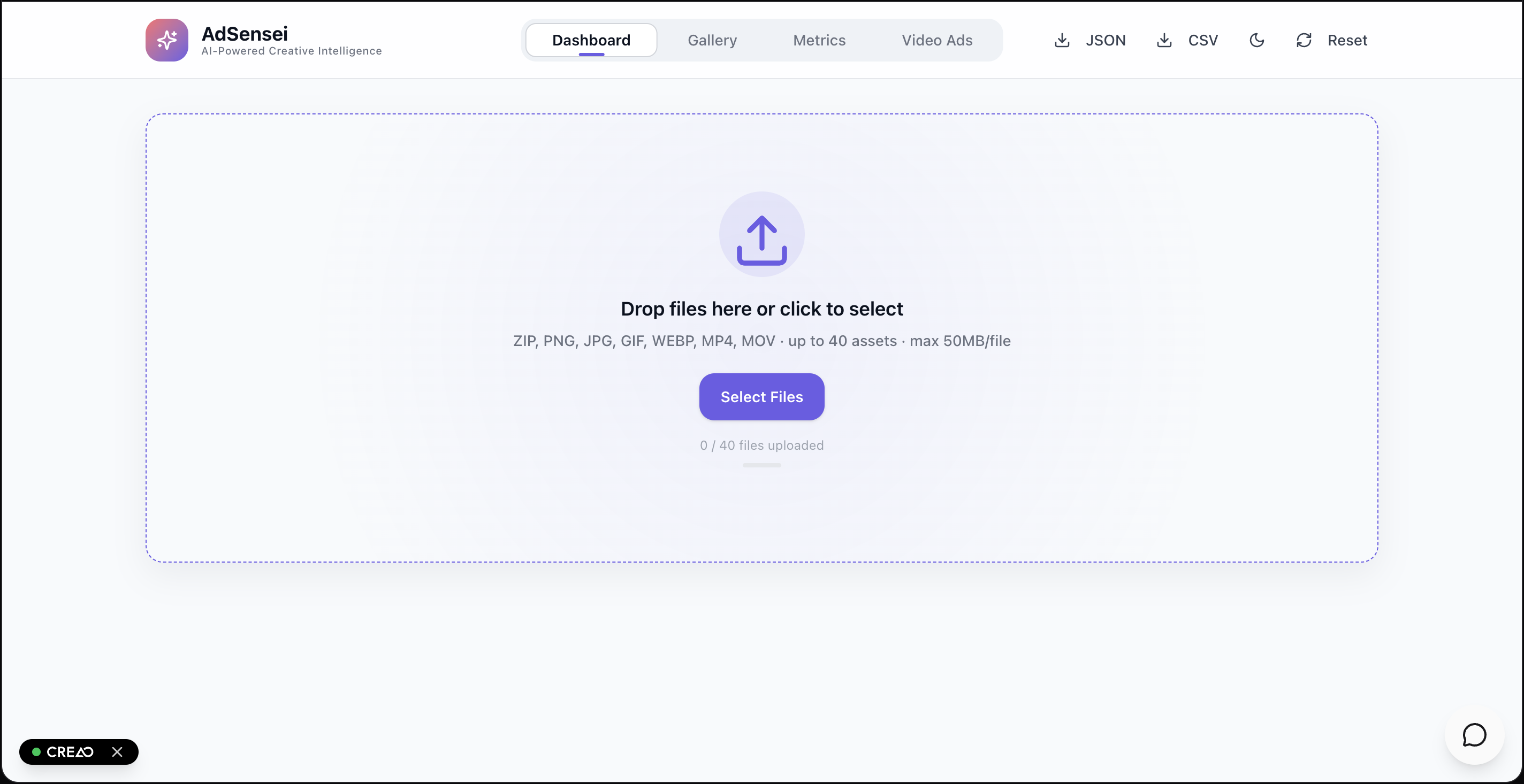
Dashboard - Upload Ads here
-
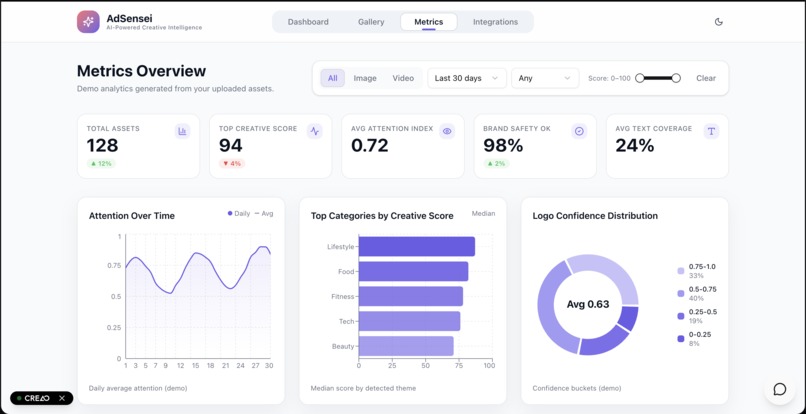
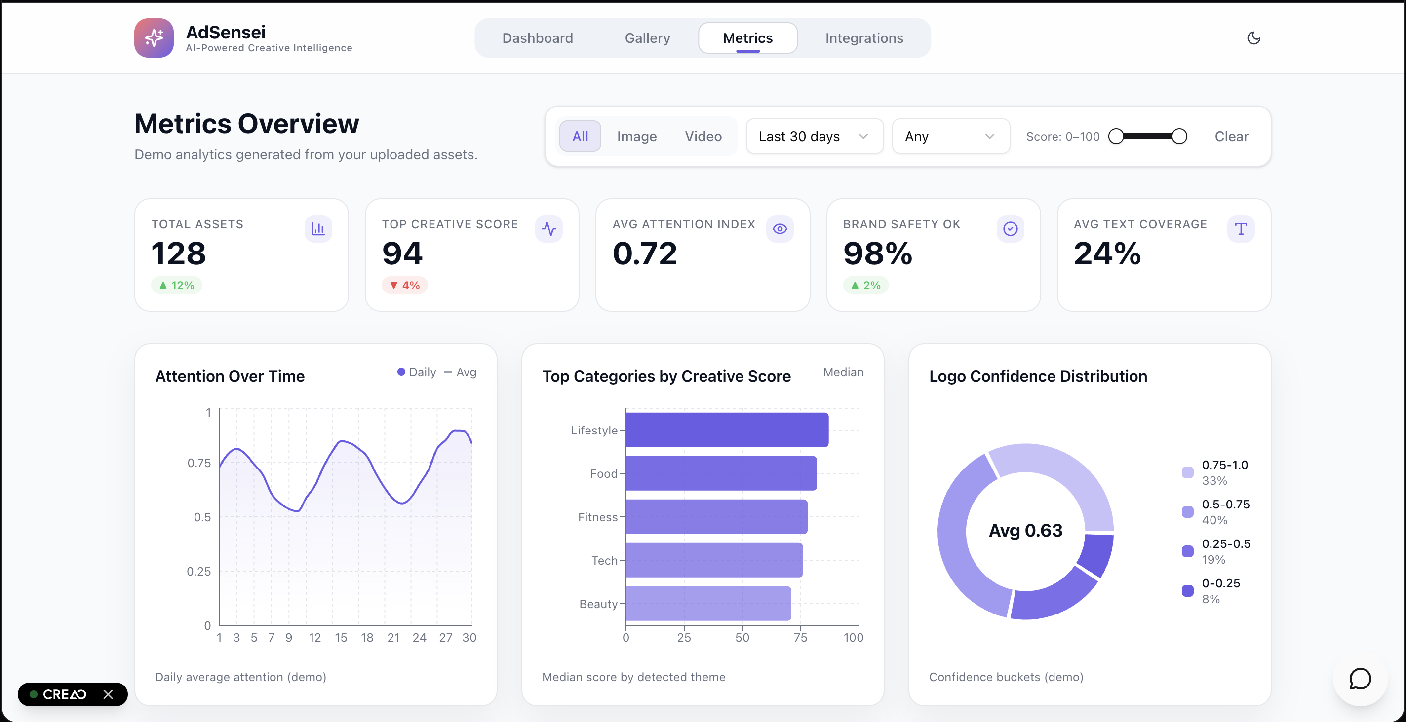
Metrics Page
About the Project — AdSensei
Inspiration
We were done debating “which ad feels better.” AdSensei turns creative gut-feel into measurable signals so designers know what to tweak and marketers know what to scale.
What it does
AdSensei converts a folder of ad creatives into a clear, prioritized playbook:
- Instant per-asset readout: tone & sentiment, product/category, objects/logos, OCR’d copy, color palette, composition notes, target audience, and best-fit platforms.
- Actionable scoring across five core dimensions—Attention, Readability, Aesthetics, Brand Fit, Memorability—each with a one-line rationale so every number is defensible.
- Smart recommendations: concrete fixes (CTA presence/placement, headline length bands, contrast/whitespace, logo size and anchor, modernized styling, eco-claims surfacing).
- Campaign roll-ups: Top 10 with reasons, sentiment & tone maps, color trends, and Dimension Profiles (e.g., most readable vs. most memorable).
Example: single-image insight (condensed)
- Scores: Catchiness 7, Aesthetics 6, Readability 8, Brand Fit 9, Memorability 7
- Detected: logo “Rinso,” benefit copy (“WHITER THAN BRAND NEW”), detergent box, flags, dresses
- Audience & platforms: 25–45, household care; strong for social, print, and nostalgia channels
- Suggestions: add CTA, modernize layout, surface eco-benefit
- Why: vibrant palette + crystal-clear benefit line; nostalgia boosts brand fit
Challenge alignment — high-value signals for recommendations
We extract diverse, high-value features that feed a recommender and generalize across campaigns:
- Tone & sentiment → audience resonance and platform fit
- Product/category → clustering and cold-start suggestions
- Text/OCR & copy shape → headline length bands, readability, CTA presence/placement
- Logos & brand anchors → recognition and consistency across variants
- Objects & context → scene elements to inform targeting/use cases
- Color & density → contrast/whitespace patterns tied to attention and legibility
- Composition notes → focal order, safe-zone usage, rule-of-thirds hints
- (Video-ready) AV signals → embeddings for distinctiveness/memorability
Why these help: they’re predictive proxies for clarity, fit, and distinctiveness—features a recommendation model can weight beyond historical CTR.
How we built it (high level)
We optimized for clarity, consistency, and speed—less black box, more “why”:
- Rubric first. Five dimensions that creative teams already speak: Attention, Readability, Aesthetics, Brand Fit, Memorability.
- Signals → explanations. Every score ships with a one-line rationale and a suggested change.
- Batch to decisions. Per-asset outputs aggregate into campaign-level Top-N, distributions, and Dimension Profiles.
- Sponsor tech in the loop.
- creao.ai for a clean, skimmable UI.
- Lava to route rationale prompts across models for sharper, less generic guidance.
- Reka for robust vision-language grounding.
- Inspired by AppLovin, we prioritized pre-spend insights (clarity, platform fit, iteration speed).
(The pipeline is model-agnostic and easy to swap as needs grow.)
Performance & parallel batch processing
Designed for fast (< 5 minutes) campaign reads and horizontal scale:
- Parallel workers process assets independently (embarrassingly parallel).
- Stateless jobs pull from a queue, emit compact feature vectors + rationales.
- Reducer stage builds sentiment/tone maps, color trends, and Top 10 with reasons.
- Caching reuses OCR/embedding results for near-duplicates.
- Scale knob: increase worker count to hit tighter SLAs.
A simple, transparent scoring form keeps things explainable: [ S_{\text{composite}}=\sum_i w_i,z(d_i),\quad \sum_i w_i=1 ] where (d_i) are normalized signals per dimension and (w_i) are tunable weights.
Challenges we ran into
- Subjectivity vs. consistency across wildly different aesthetics
- No ground truth (early on) → relied on strong proxies before CTR/CVR labels
- Signal fusion without letting a single metric (e.g., contrast) dominate
- Edge cases: tiny text, busy backgrounds, logo-as-background patterns
- Latency/cost while keeping batch UX snappy for 40–50 assets
Accomplishments we’re proud of
- Explainable scorecards teams actually read—every number has a reason
- Specific recommendations (e.g., “raise CTA ~120px,” “logo +18%”) instead of “make it pop”
- Dimension Profiles that pick winners for a purpose (readable vs. memorable)
- A clean campaign roll-up: sentiment/tone maps, color trends, and a demo-ready Top 10 with reasons
What we learned
- Clarity beats cleverness—adoption rose when the rubric was transparent
- Small, honest heuristics travel well: WCAG contrast, copy length bands, whitespace%
- Rationales drive trust—teams change creatives faster when they see the “why”
What’s next for AdSensei
- Performance linkage: learn (w_i) from CTR/CVR labels as they arrive
- Platform presets: TikTok/IG/YT rules (safe zones, duration bands, subtitle norms)
- Variant helper: headline trims, palette swaps, CTA placement experiments
- Workflow & exports: reviewer notes, shareable one-pagers, and API hooks into creative pipelines
AdSensei: clarity, not guesswork.
Built With
- amazon-web-services
- creaoai
- lava
- llm
- node.js
- render
- s3


Log in or sign up for Devpost to join the conversation.