-
-
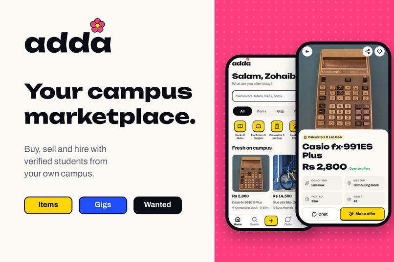
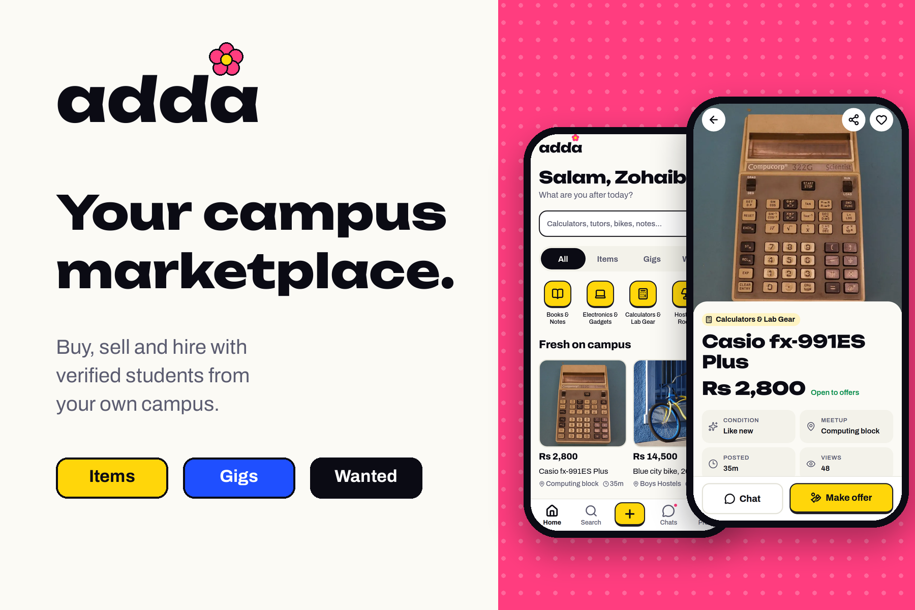
Adda: a student-only marketplace for buying, selling and hiring on campus.
-
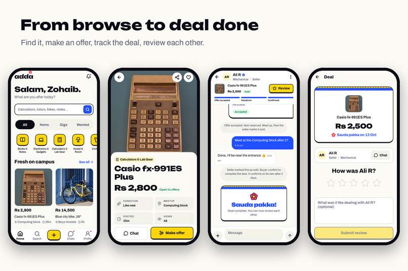
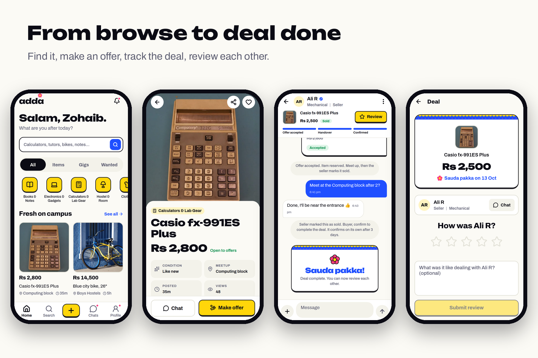
From browse to deal done: find it, make an offer, track the deal in chat, then review each other.
-
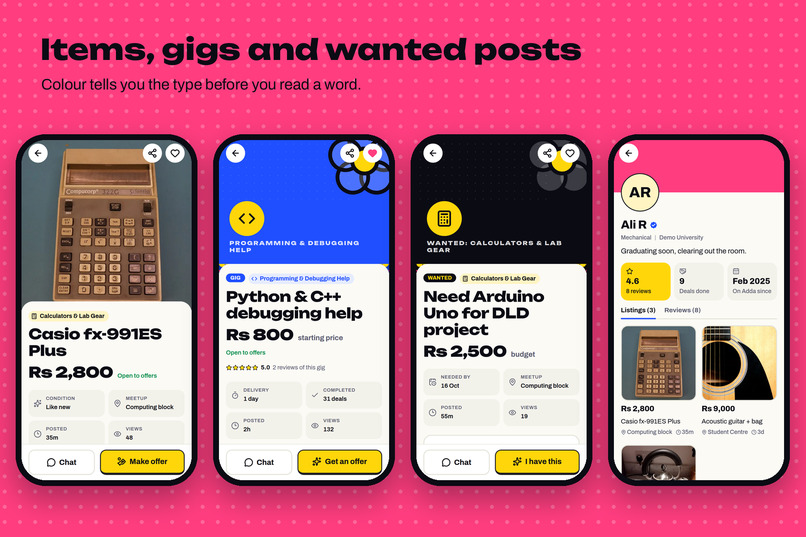
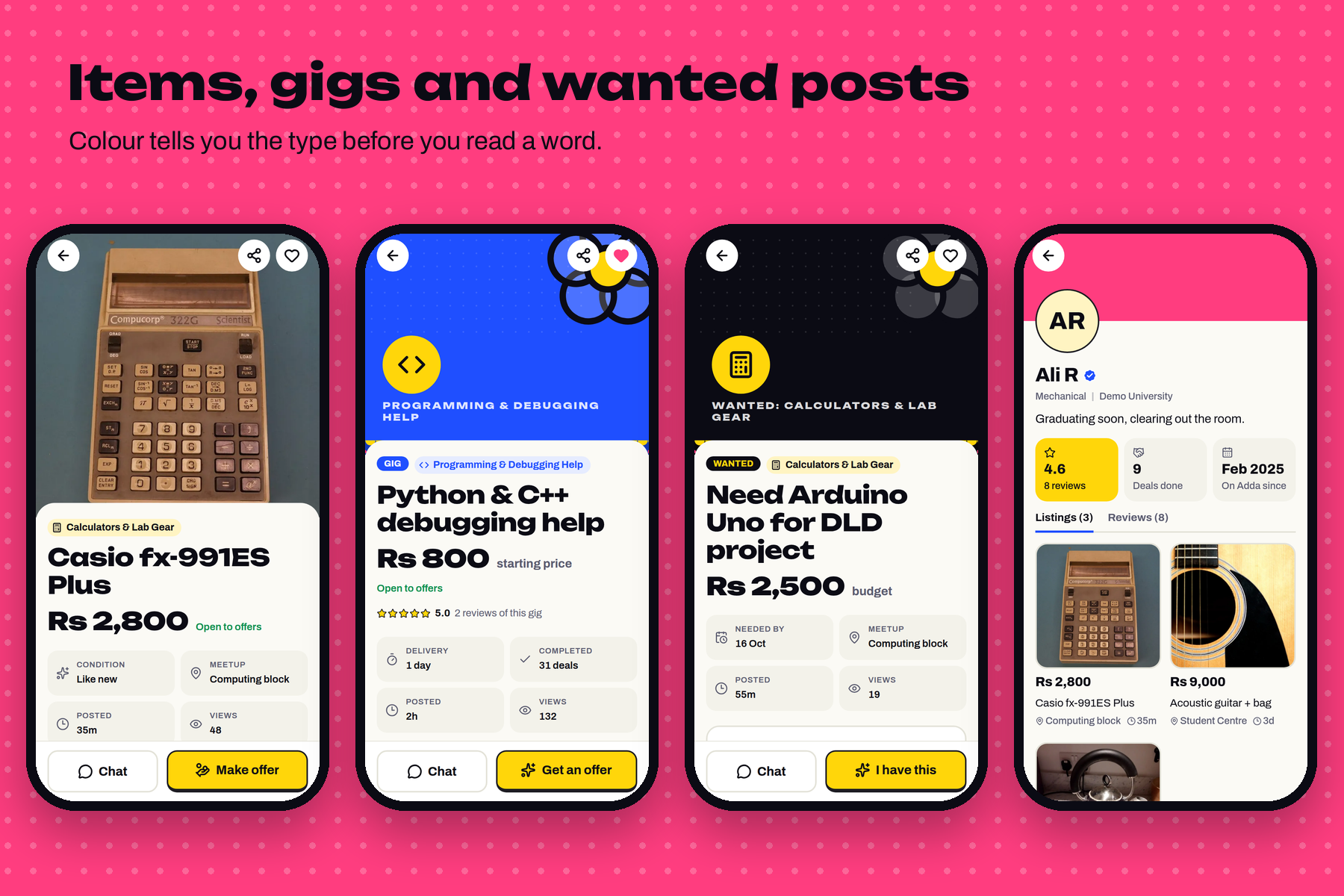
Items, gigs and wanted posts each get their own colour, so you know the type before you read a word.
-
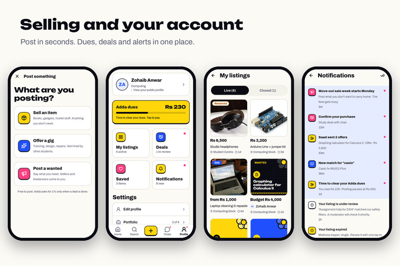
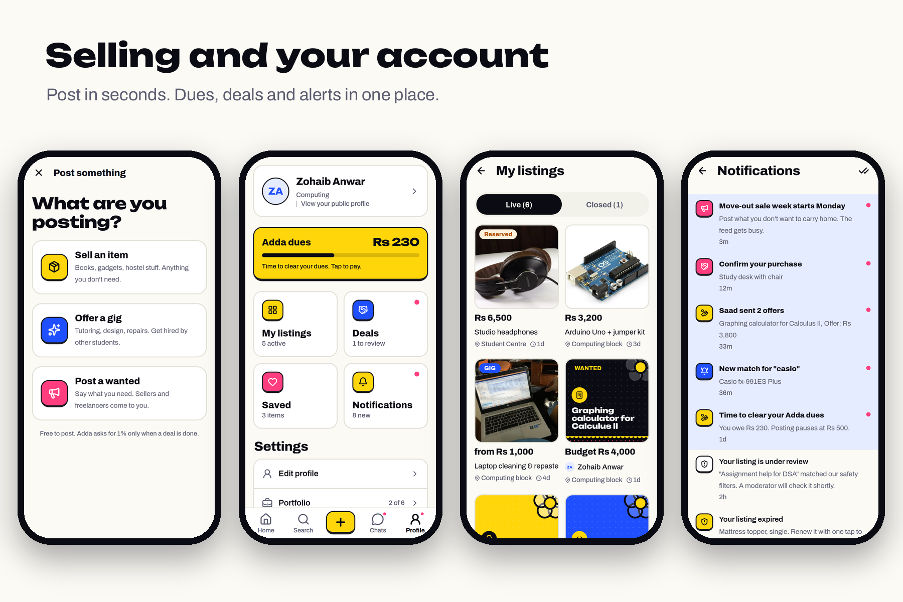
Post in seconds, and keep dues, deals, listings and alerts in one place.
Try the prototype: Open the Figma prototype Start from the "Adda first run" flow to see sign-in and onboarding, or "Adda app" to jump straight to the home feed. Tap the tab bar, listings, buttons and back arrows. 22 screens, all editable layers, plus a cover and a design system page.
The problem
On most campuses, students trade through group chats. Someone posts "selling my calculator, DM me", forty messages bury it within an hour, and the buyer can't tell if the seller is a classmate or a stranger who joined the group years ago. Hiring a tutor or someone to fix your laptop works the same way: you ask around and hope.
Big marketplaces don't solve this for students. They're built for a whole city, so you scroll past cars to find a lab coat, and nothing tells you the seller lives in the dorm next to yours.
So the design problem wasn't "make listings look nice." It was: how do you get two students who've never met to agree on a price, meet up and trust each other, with as little friction and anxiety as possible? Every decision below comes back to that question.
The name comes from Urdu, where an adda is the spot people gather: a tea stall, a bus stop, the corner where your friends hang out. That's the feeling I wanted: a familiar place, not a store.
Who I designed for
- The seller in a hurry. Moving out, graduating, clearing a dorm room. They want to post in under a minute and not answer the same question twenty times.
- The careful buyer. Often a first-year, new to campus, nervous about meeting a stranger. They need proof the other person is real before they reply.
- The student with a skill. Good at coding, design or math, and wants a few gigs without building a whole freelance profile somewhere else.
Each of them needs different things from the same screens, and the hard part was serving all three without three different apps.
Information architecture
Adda has three kinds of posts: items (a used calculator, a bike), gigs (students hiring students for tutoring, debugging, posters) and wanted posts ("Need an Arduino by Friday", and sellers come to you).
I put all three in one feed instead of three sections. Students don't think "I'm in the gigs section now". They think "I need help with my lab". A single feed with clear filters (All, Items, Gigs, Wanted) lets them browse loosely or narrow down in one tap.
The bottom tab bar has five slots: Home, Search, Post, Chats, Profile. Post sits in the middle as a big yellow button, because posting is the action that keeps a marketplace alive, and it should never take more than one tap from anywhere.
Profile acts as a personal dashboard rather than a settings page: My listings, Deals, Saved and Notifications sit as four large tiles at the top, each with a count and an unread dot. Settings live underneath, out of the way.
The core flow, and why it's shaped this way
- Sign in with a university email. No passwords. You get a one-time code or use your university Google account. The headline on this screen, "Campus ka apna bazaar", is Urdu for "the campus's own market". Verification is the single biggest trust signal in the product, so it happens first and only once. Dropping passwords also removes a common reason people give up halfway through sign-up.
- Onboarding in three short screens. Pick a public display name (your real name stays private), read four rules, make one promise. I capped it at three screens with a progress bar so it feels finishable. The rules screen literally says "Four rules. That's it.", because a short list people read beats a long list people skip.
- A home feed that feels personal. It greets you by name with a "Salam" (a common greeting where I'm from), then shows categories, fresh items, services for hire and what other students are looking for. Seeing other people's requests on the home screen tells new users this is a two-way place: you can ask, not only browse.
- Listing pages that answer questions before anyone asks. Condition, meetup spot, when it was posted and how many people viewed it sit in four tiles under the price. These are the questions buyers ask first in a chat, so the seller doesn't have to keep typing the same answers.
- Offers and chat with the deal pinned on top. Every chat shows the listing and a three-step tracker: Offer accepted, Handover, Confirmed. Group-chat deals fall apart because nobody remembers where they left off. The tracker makes the state of the deal visible at all times.
- A moment of celebration. When both sides confirm, the chat shows a "Sauda pakka!" card, a phrase from local markets that means "deal done". Ending on a small, happy moment rewards people for closing deals on the app instead of drifting off to private messages.
- Blind two-way reviews. Neither person sees the other's review until both are in. This removes the fear of a revenge review, so ratings end up honest, and honest ratings are what make the next stranger trust you.
Visual design, and why it fits this product
A palette that signals type at a glance. The colours come from the hand-painted rickshaws and trucks common on South Asian streets: cobalt blue, bright yellow, hot pink and deep ink on a warm off-white background. I gave each colour a job. Gig covers are cobalt, wanted posts are ink, items without a photo get yellow. After a minute of use you can tell a gig from a wanted post across the feed without reading a word. That matters in a feed that mixes three kinds of content.
Restraint, so colour means something. Full colour only appears on moments: the main action, gig covers, banners and celebrations. Everyday screens stay calm on warm paper. A marketplace is full of user photos in every colour, so the interface has to stay quiet enough for the listings to stand out.
One obvious main button per screen. The primary action ("Make offer", "Get an offer", "I have this") gets a heavy sticker-style edge. Secondary buttons stay flat. Each listing type gets its own verb, because "Make offer" makes no sense on a wanted post, while "I have this" does.
Keycap icons. Categories and profile tiles use chunky, keyboard-key style icons with an ink border and a weighted bottom edge. They look pressable, and they give big, easy tap targets in a grid.
Two fonts with two jobs. Unbounded, a wide display font, is only for headlines, prices, the logo and celebrations. Archivo handles everything else. Sizes follow the golden ratio (12, 15, 24, 39), and headings always sit clearly bigger than body text. Price is the first thing a buyer scans for, so the price (in rupees, like "Rs 2,800") is the boldest thing on every card.
A flower as the signature. The logo's flower is five simple circles inspired by truck-art motifs. It appears on the logo, banners, empty states and the deal-done card, and nowhere else. One repeated detail gives the app a personality without turning the whole interface into decoration.
Copy that sounds like a friend. Plain English everywhere, with the occasional local phrase where students would naturally say it. Fees, rules and warnings use the same calm, direct voice as everything else, because a scary tone around money and rules is exactly what makes people hesitate.
Designing trust without fear
A marketplace between strangers needs safety rules, and it's tempting to put them all up front. I chose the opposite: quiet signals instead of warnings.
- A "Verified" badge and a rating sit next to the seller's name.
- Chat masks phone numbers and emails, and the app explains why in one line: keeping the deal on Adda is what builds your rating.
- If a listing trips a filter, the seller sees a short "under review" notice, not an accusation.
- Fees appear before they ever matter. Posting is free. The Sell screen says "Adda asks for 1% only when a deal is done", and Profile shows a dues card with a progress bar. Nobody gets surprised by a bill.
Most students never see a single rule being enforced. They see a calm, friendly app where everyone seems real, which is the point.
Accessibility and inclusion
- Icon buttons and tappable cards carry accessibility labels and roles, so a screen reader announces "View your public profile" instead of "button".
- Text scales with the system font size, with sensible caps on tab labels and chips so layouts hold up at the largest sizes.
- Tap targets are large, and the keycap grid keeps them evenly spaced for thumbs.
- Dark text on a warm light background keeps body copy at high contrast, and a true-black dark mode covers late-night browsing.
- Post types never rely on colour alone: every card shows a colour, an icon and a text label.
- Screens stay keyboard-aware, so the message box and offer fields never hide behind the keyboard.
- No passwords to remember, and nothing costs money until a deal happens, which lowers the barrier for students on tight budgets.
How I made the prototype
I designed Adda as a real mobile app first, so every screen in the prototype reflects a layout that works on an actual phone, with real content lengths, real photos and real edge cases. For the hackathon I brought those screens into Figma as fully editable layers, laid out 22 screens across four flows (first run, main tabs, buying, selling and account), connected them with 63 interactions, and added a design system page with the palette, type scale and core components.
Challenges
- Three post types, one feed. Items, gigs and wanted posts have different fields and actions. Consistent card shapes plus distinct cover colours and verbs let them share one feed without confusion.
- Making trust visible without making it scary. Safety rules are easy to over-explain. I moved them into small signals and kept the written rules to four lines.
- The messy middle of a deal. Real deals stall and people forget to confirm. I mapped out what happens after "ok, meet at 2?" and designed for each gap: the tracker, reminders, and an automatic confirmation if the buyer goes quiet after the handover.
What I learned
Most of a marketplace's UX happens after someone taps "Make offer". Browsing is easy to design. The hard screens are the ones where two strangers need to agree, meet and trust each other, so I learned to design those moments first and the browsing around them second.
I also learned that restraint does more than decoration. Saving the bright colours for a few moments made those moments land.
What's next
- Usability sessions with first-year students during move-out week, when listing volume peaks, to test the offer flow and the tracker with real deals.
- A guided first listing for new sellers, with photo tips and price suggestions based on similar items.
- A lighter "quick sell" path for students clearing out many items at once.
Built With
- claude-code
- expo.io
- figma
- html.to.design
- postgresql
- react-native
- supabase
- typescript

Log in or sign up for Devpost to join the conversation.