-

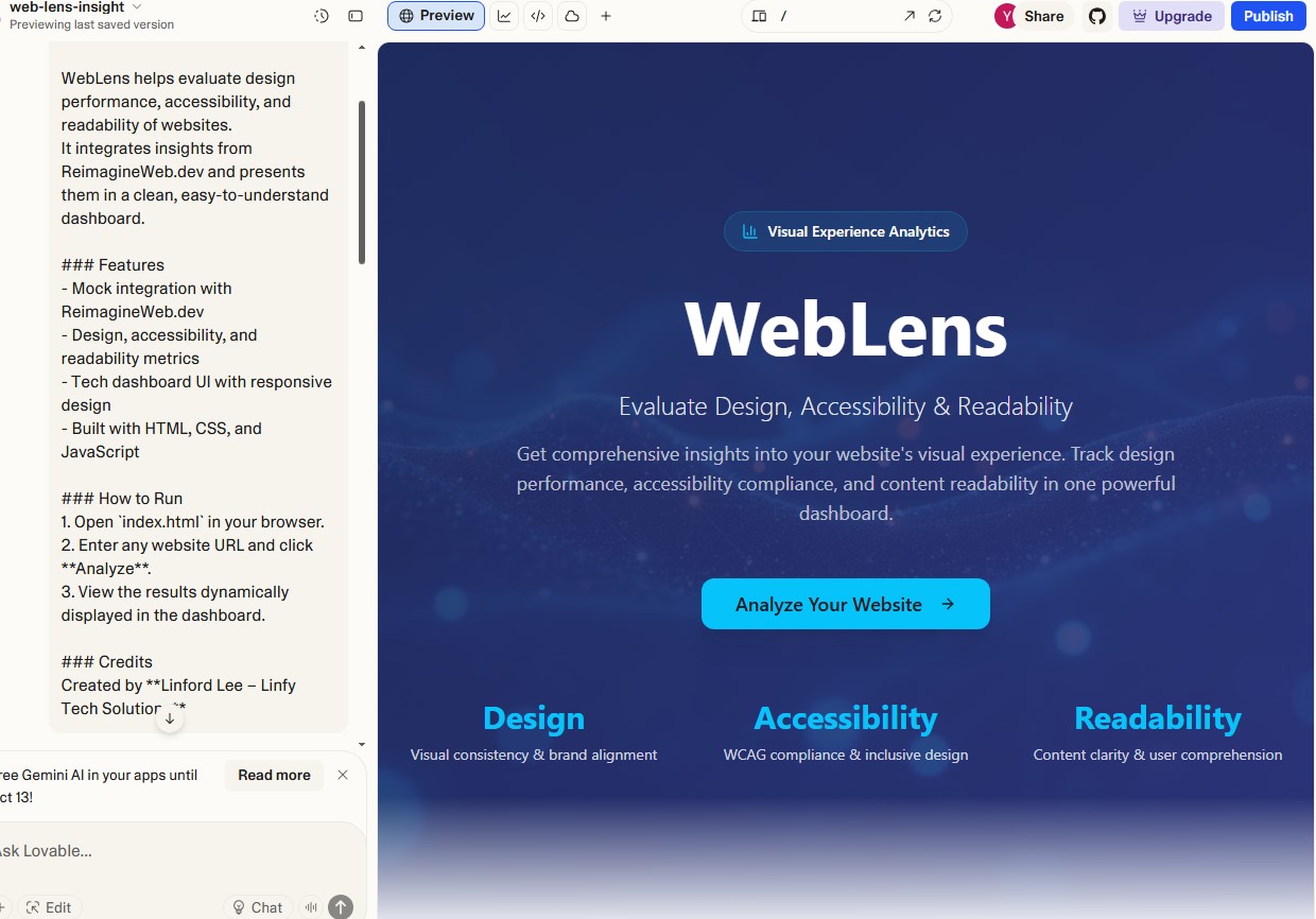
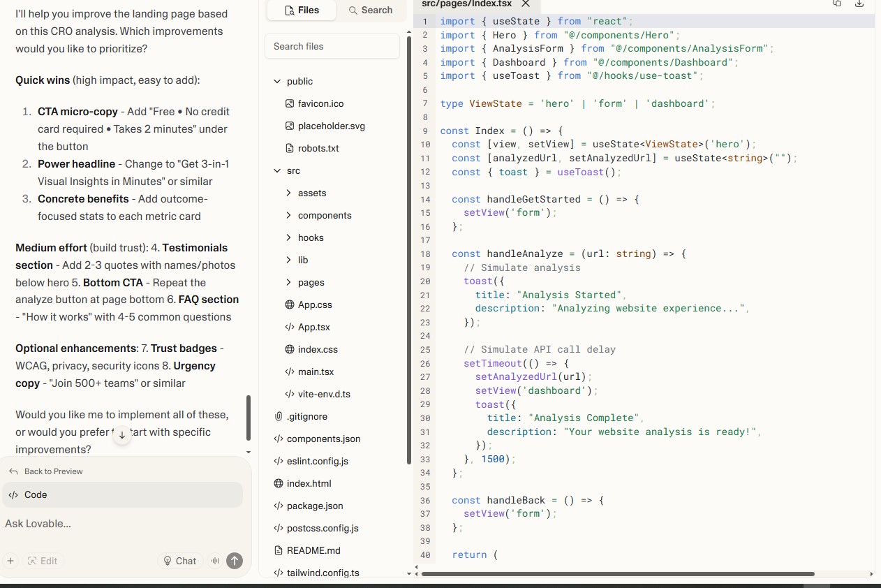
Lovable Interface
-

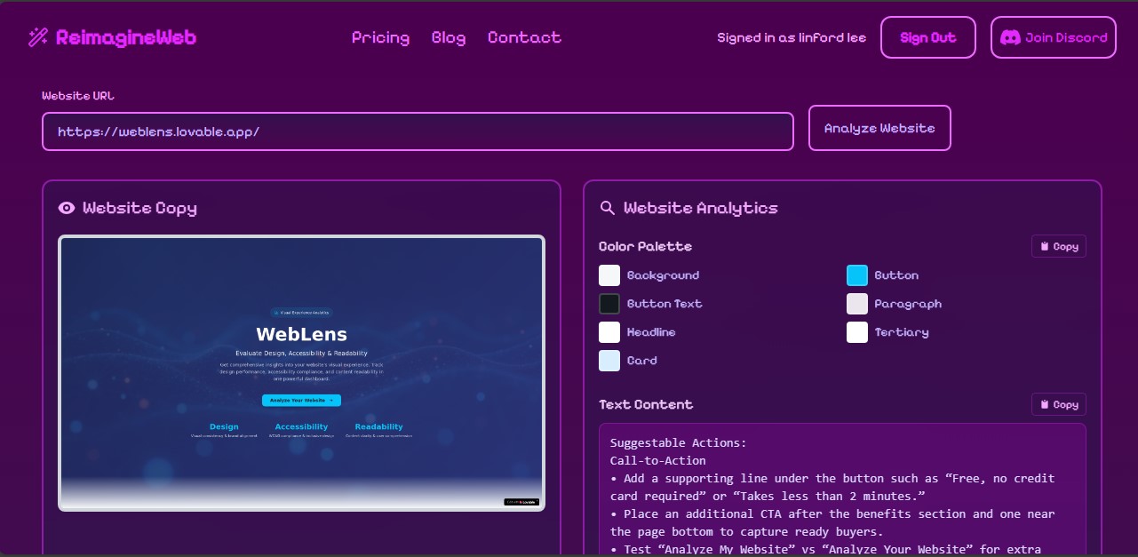
ReimagineWeb.dev Interface
-
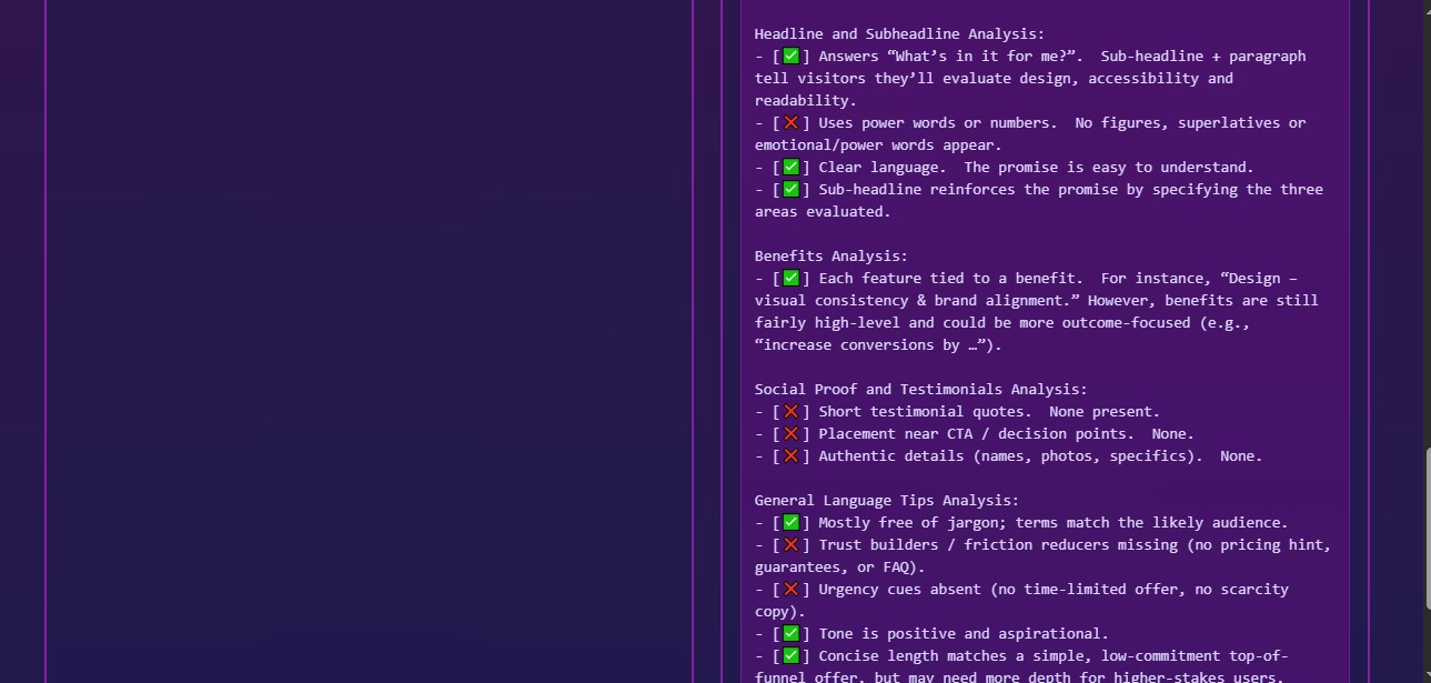
ReimagineWeb.dev Interface
-

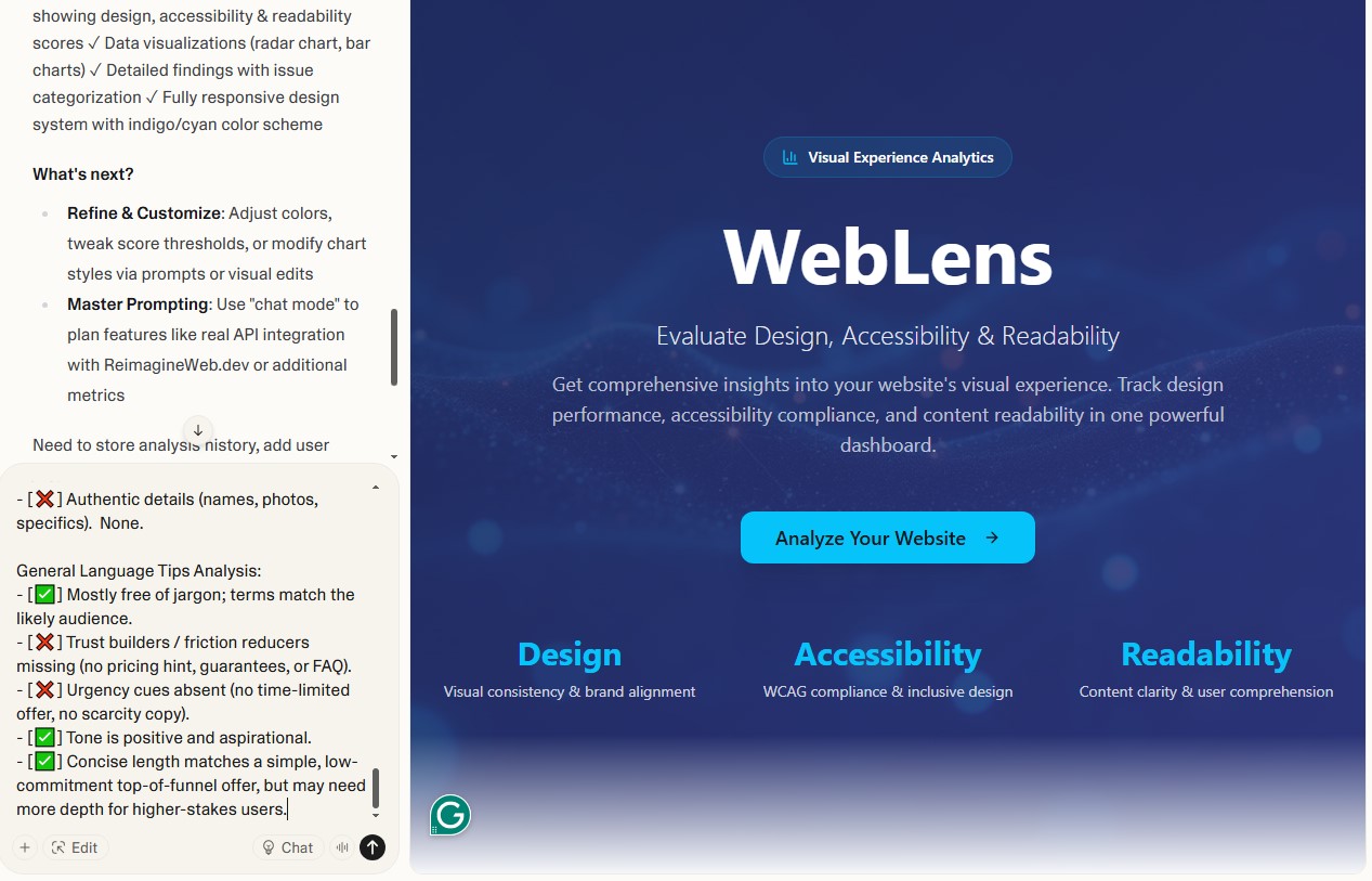
Lovable Interfsce
-
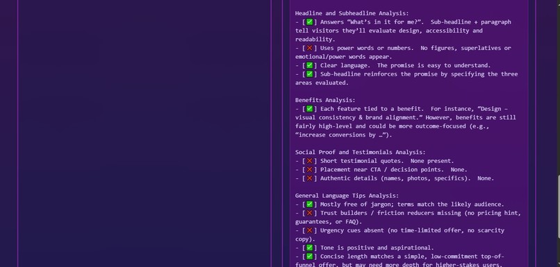
ReimagineWeb.dev Interface
-

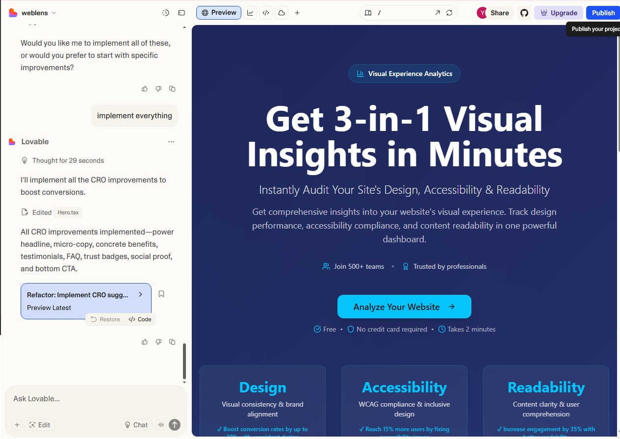
Lovable Interface
-

Lovable Interface
-

ReimagineWeb.dev Interface
-

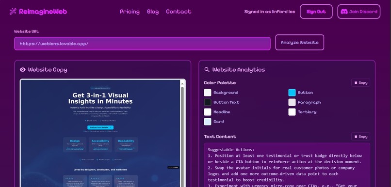
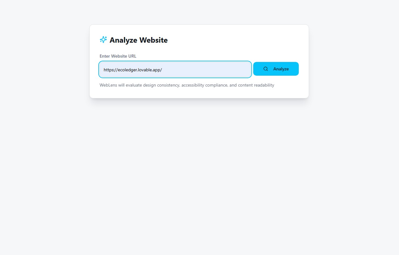
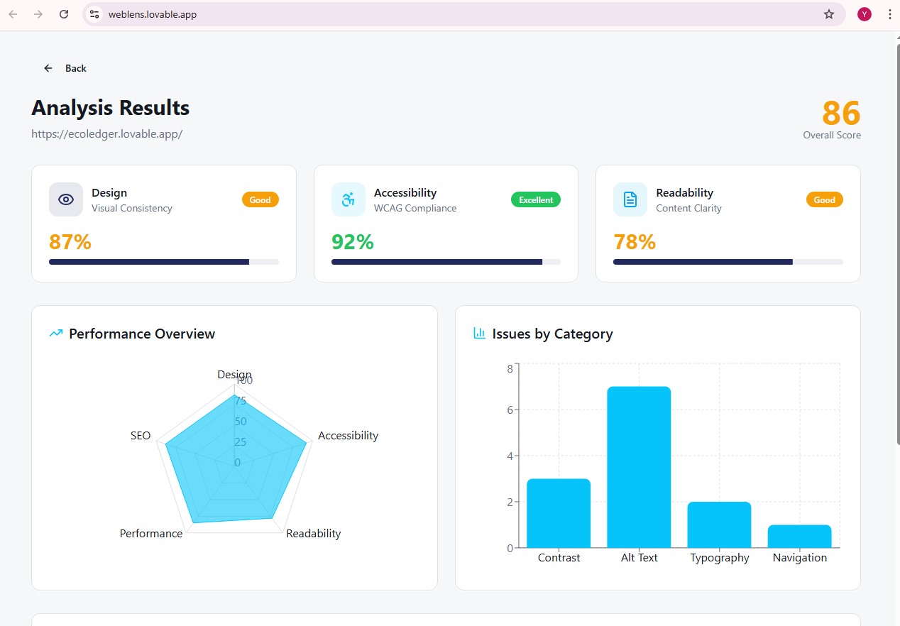
Weblens Interface
-
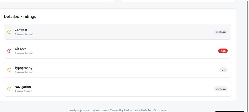
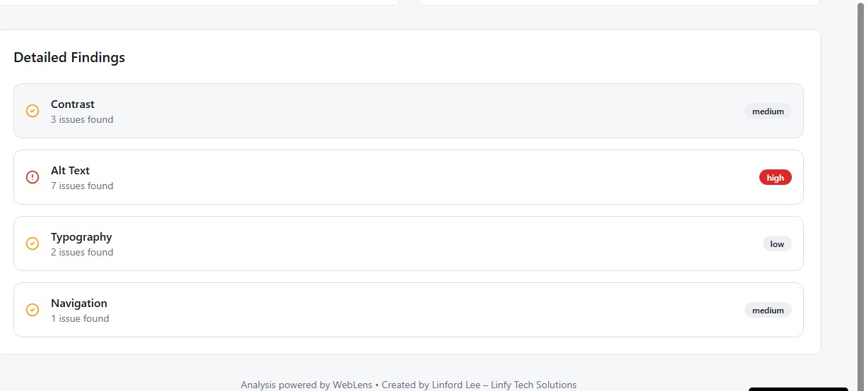
Weblens Interface
-

Weblens Interface
-
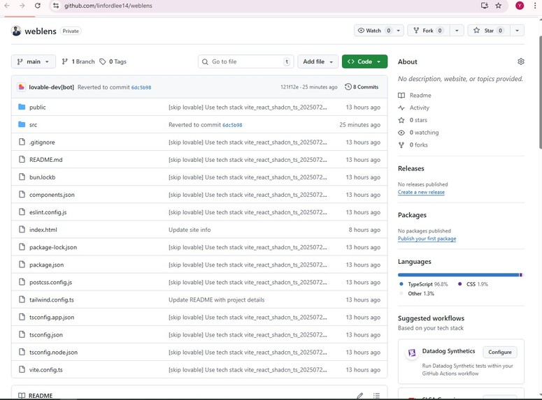
Github Repo


Inspiration
Many websites struggle with accessibility, readability, and consistent design and analyzing these aspects manually takes time and expertise. WebLens was built to make this process effortless, giving designers, developers, and beginners instant, visual insights powered by ReimagineWeb.dev.
What it does
WebLens provides an interactive analytics dashboard that displays:
✅ Accessibility Score
🎨 Design Quality Rating
📖 Readability Grade
💬 Actionable Recommendations
It helps users quickly understand how their websites perform across design and usability metrics.
How we built it
Frontend: HTML, CSS, JavaScript, TailwindCSS (Lovable-assisted prototype)
Data: Simulated dataset + visual exports from ReimagineWeb.dev
Deployment: Lovable (for hosting and demo access)
🔗 Integration with ReimagineWeb.dev
WebLens integrates insights from ReimagineWeb.dev by utilizing exported reports and screenshots to populate the dashboard with real analytical data. This integration demonstrates how third-party website analytics can be transformed into a clean, beginner-friendly interface that bridges design and data.
Challenges we ran into
Lack of a public API for ReimagineWeb.dev
Converting analytical data into meaningful, visual insights
Simplifying complex SEO and accessibility metrics for new users
Accomplishments that we're proud of
Built and deployed a working interactive dashboard
Successfully integrated ReimagineWeb.dev insights
Delivered a clean UI/UX for real-world analytics visualization
What we learned
How to rapidly prototype with Lovable and TailwindCSS
How to visualize analytical data effectively
Techniques for integrating external analytics tools without direct API access
What's next for WebLens
Implement real-time analysis once API access becomes available
Optimize for mobile-first devices
Add voice and local language support for better accessibility
Built With
- css
- html
- javascript
- lovable
- tailwindcss


Log in or sign up for Devpost to join the conversation.