-
-

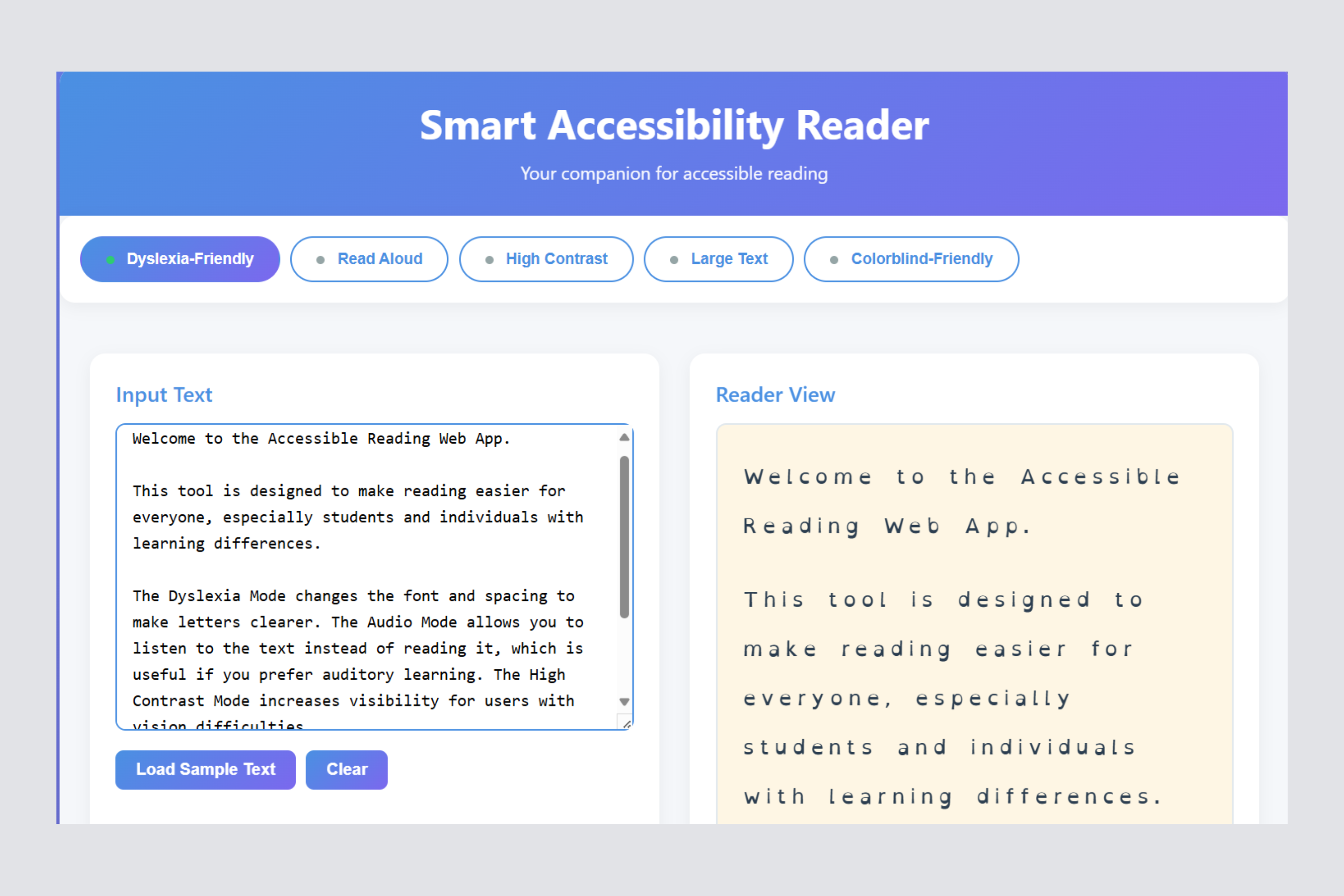
Dyslexia-Friendly Mode -> Switches to a font designed to improve readability for dyslexic users.
-
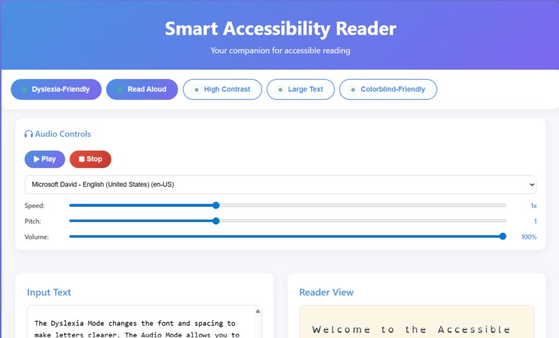
Audio Reader -> Converts on-screen text into speech for easier content consumption.
-
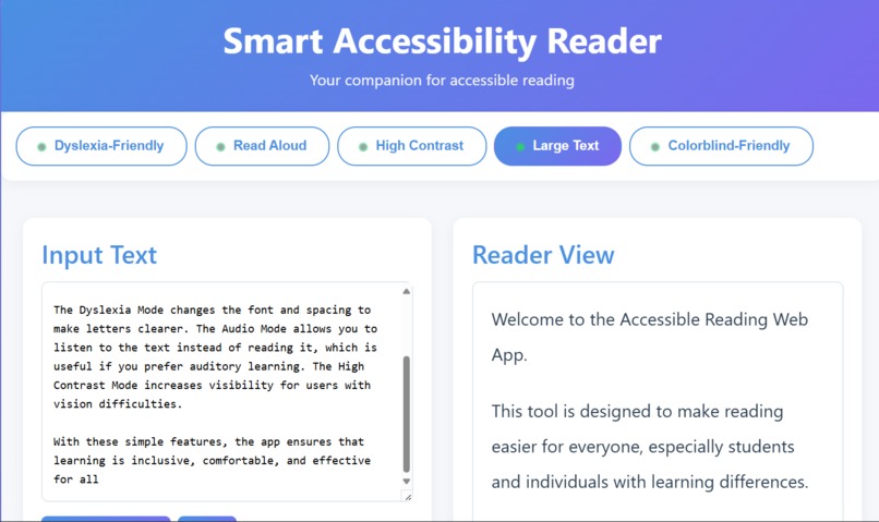
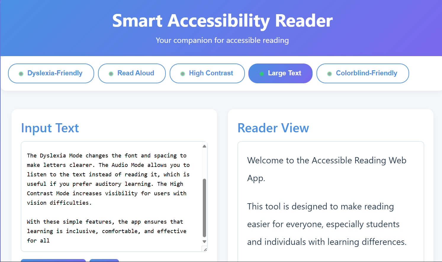
Large Text Option -> Increases font size for users with low vision or reading difficulty.
-
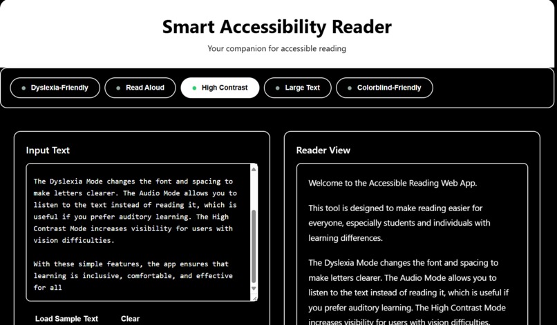
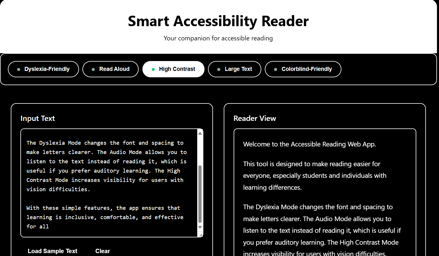
High Contrast Mode -> Boosts text and background contrast for better visibility.
-
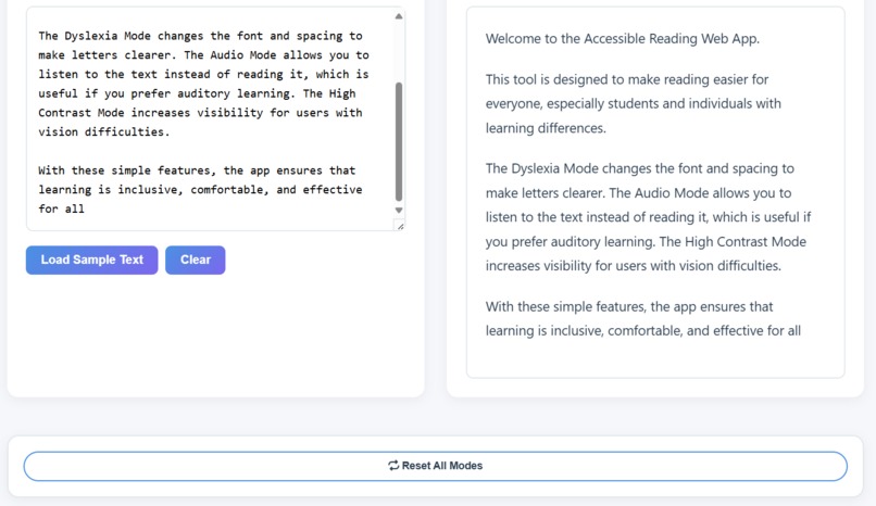
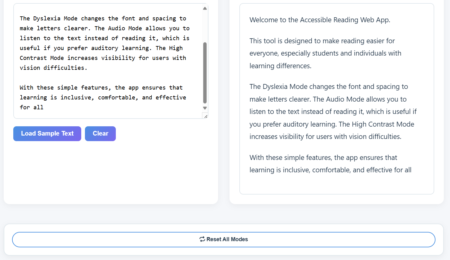
Reset Settings -> Quickly revert to default view with one click.

Inspiration
Accessibility isn’t extra — it’s essential. My project helps people with different needs read and use websites in a way that feels natural to them.
What it does
Accessibility Reader provides multiple assistive modes:
Dyslexia Mode - Uses dyslexia-friendly fonts and spacing.
Audio Mode - Converts text into speech for easier listening.
High Contrast Mode - Improves visibility for low-vision users.
Large Text Mode - Enlarges text for better readability.
Colorblind Mode - Applies accessible color palettes and indicators.
How we built it
Frontend - HTML, CSS, JavaScript
Accessibility Features - Implemented toggles for each assistive mode, ensuring smooth UI/UX.
Testing - Manually tested with online accessibility checkers (contrast, font legibility, and colorblind simulations).
Challenges we ran into
-> Testing accessibility features (like dyslexia mode and audio mode) without real users, which made it harder to know if they truly solved the problem.
->Finding the right balance between simplicity and usefulness - making sure the tool feels light and easy ,but still provides real value.
Accomplishments that we're proud of
Creating a clean and minimal design that works across devices. Building a working accessibility toolkit from scratch in limited time.
What we learned
Accessibility isn’t an add-on , it’s a core part of good design.
Even small changes (like adjusting fonts, spacing, or contrast) can transform how someone experiences a website.


Log in or sign up for Devpost to join the conversation.