-
-
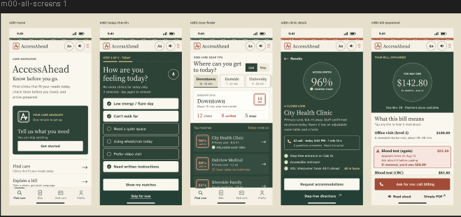
These are the base design, then we used claude to input all of the functions we wanted in the app with this design.
Inspiration
For many disabled people, the hardest part of healthcare starts before they ever step inside a clinic. A listing may claim a building is "wheelchair accessible," but that statement often applies only to the front door, leaving patients in the dark regarding exam tables, restrooms, interpreters, or waiting room sensory environments. The only way to discover these critical details is to phone the clinic—a process that presents a major barrier for Deaf patients, people with speech disabilities, neurodivergent individuals, and anyone managing severe fatigue. Arriving at a facility that cannot accommodate your needs wastes a trip that may have taken hours to arrange, often causing people to abandon seeking medical care entirely. We created AccessAhead to eliminate this hidden "pre-care" barrier so patients can know before they go.
What It Does
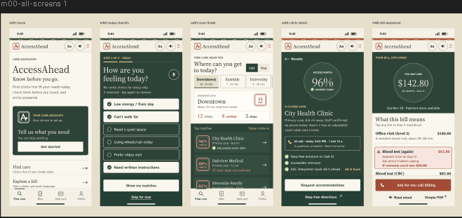
AccessAhead is a mobile application that acts as an advocate for disabled patients. Users set their lasting accessibility needs once—covering mobility, hearing, vision, sensory, cognitive, and chronic illness considerations—and complete a quick daily check-in that re-ranks clinic results based on how they feel on any given day. Clinics are grouped into travel zones that display total matches alongside verified locations. Every clinic receives an Access Match Score that clearly explains itself, marking each detail as verified or unknown alongside its source and recency. For missing information, the app offers an "Ask for Me" feature that contacts the clinic directly to convert unknown details into verified facts. Additionally, the app includes a bill explainer that translates photographed medical statements into plain language to flag potential errors, as well as a visit preparation tool that generates one-tap accommodation requests and step-free directions.
How We Built It
We developed AccessAhead using a mobile-first design strategy centered on strict digital accessibility. Starting with a palette of deep forest green, warm paper tones, and vermilion accents, we vetted every color pairing against WCAG 2.2 AA contrast standards, darkening borders and removing low-contrast states. Body text uses Atkinson Hyperlegible Next to assist readers with low vision, paired with Source Serif 4 for clear headings. Information status is always conveyed through combined text and icons rather than color alone, such as our "verified stamp" match score seal. We scripted our core assets and design system in Python as SVGs, imported them into Figma as editable frames, and maintained developer handoff using standardized CSS design tokens. The interface prioritizes physical ease of use through bottom-tab navigation, sticky primary buttons placed within thumb reach, tap targets exceeding 48 pixels, and an accessible text-resize option on every screen.
Challenges We Ran Into
Building the platform presented several structural and technical hurdles. First, comprehensive clinic accessibility data simply does not exist in a single repository, forcing us to design a multi-source aggregation model that transparently displays data origins and highlights unknown fields rather than making assumptions. Second, balancing our high-concept visual inspiration with strict WCAG AA contrast guidelines required adjusting our palette, font weights, and element states. Mid-project, we also made the strategic decision to pivot from a desktop-focused web layout to a mobile-first phone app, which required rebuilding every screen into single-column layouts fitted for 390px viewports. Finally, accounting for fluctuating health conditions pushed us to expand beyond static user profiles, leading to the creation of our daily health check-in feature.
Accomplishments That We're Proud Of
We are particularly proud of crafting a functional, fully WCAG 2.2 AA-compliant design system that maintains a warm, elegant visual identity without sacrificing contrast or legibility. We successfully built an honest, transparent scoring model that presents verified facts alongside unknown parameters, giving users clear expectations rather than false assurances. Our team seamlessly executed a complete mid-hackathon transition to a mobile-first architecture, redesigning our entire layout while preserving smooth developer handoff through structured CSS tokens. Most importantly, we engineered a platform that directly addresses the real-world barriers faced by disabled patients, transforming complex, scattered accessibility data into a dignified, user-centered care tool.
What We Learned
This project reinforced that accessibility must be foundational rather than an afterthought, as contrast ratios, target sizes, screen-reader compatibility, and plain language dictated our interface decisions from day one. We also learned that structural honesty builds user trust; showing data sources and acknowledging missing information creates a far more reliable tool than making unverified claims. From a workflow perspective, establishing a clean handoff system with shared design tokens allowed our team to align design and development efforts smoothly under tight time constraints.
What's Next for AccessAhead
Moving forward, we plan to expand AccessAhead by implementing post-visit community reviews to continuously crowdsource and refine clinic accessibility data. We aim to integrate accessible transportation booking features and provide downloadable, sign-language-translated versions of our visit preparation cards. Lastly, we intend to build a dedicated business portal where healthcare providers can directly claim their listings, update their accommodations, and verify their facility details.

Log in or sign up for Devpost to join the conversation.