Inspiration
Walking down Franklin Street in Chapel Hill, it's easy to feel like everything is within reach. There are restaurants I can stop into, shops I can browse, and buses that take me around town. I've been fortunate enough to experience these things without having to think twice about whether my basic needs will be met. But I've also come to realize that the people who experience Chapel Hill differently aren't necessarily living miles away. Sometimes, they're walking those very same streets. Even with places like UNC Hospitals on Manning Drive or the IFC Community Market in nearby Carrboro, having resources in your community doesn't necessarily mean they're within your reach. I've started to realize how much our experience of a community depends on where we live and what resources we have available to us.
That made me think about the people responsible for improving these communities. If a county has the opportunity to build a new clinic, library, or food pantry, how does it decide where that investment will actually make the greatest difference? It's not enough to know where people are struggling financially. You also have to understand which services they're missing and how difficult those services are to reach.
I've always loved mathematics, but what excites me most is finding situations where something I've learned can help answer a question that genuinely matters. This felt like an opportunity to bring together my interests in mathematics, computer science, and the community around me. I wanted to build something that didn't just show where inequality exists, but could actually help someone make a better decision about what to do next.
That's what inspired Allocate NC.
What it does
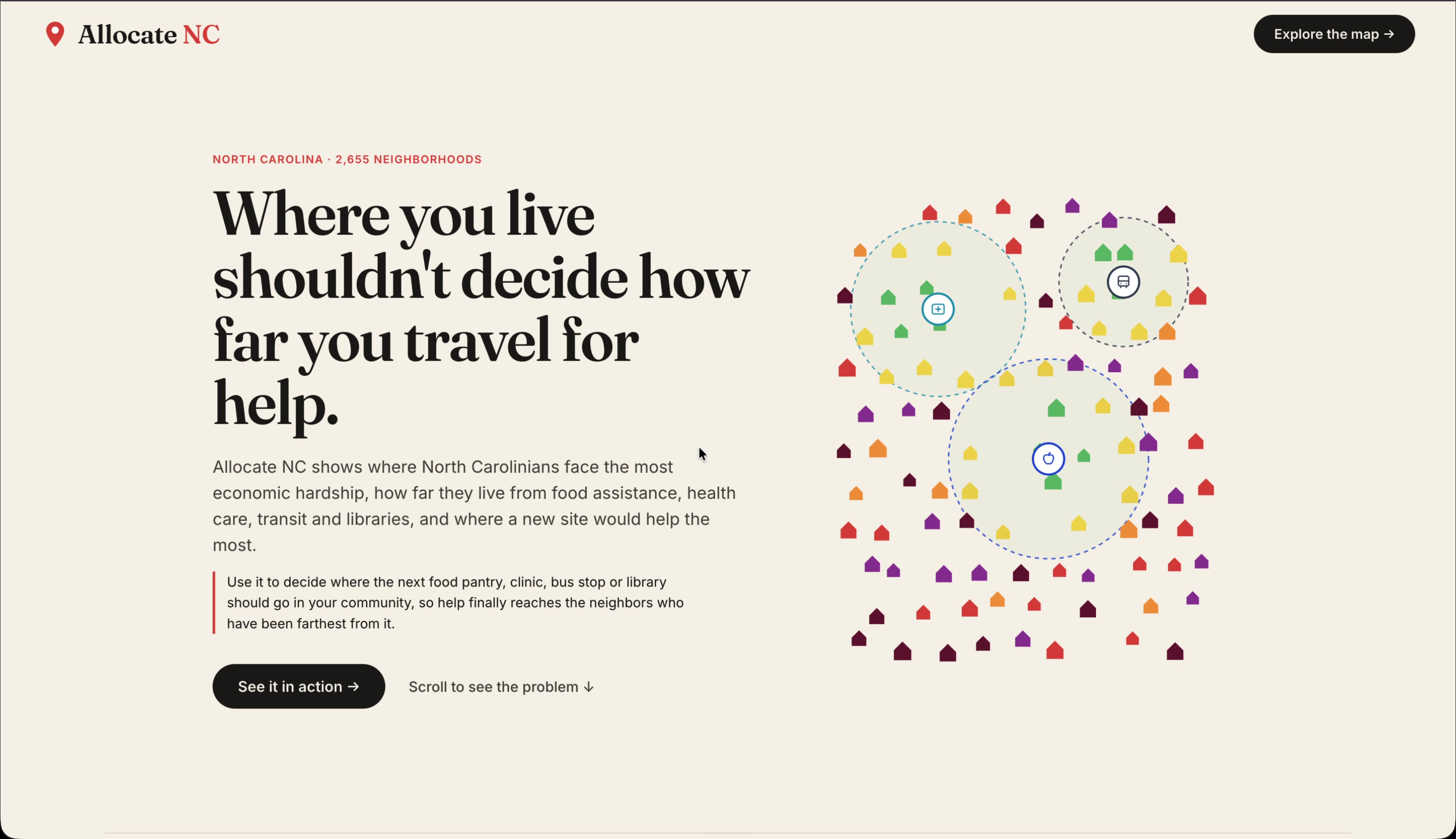
Allocate NC helps governments, nonprofits, and community planners make more informed decisions about where to develop essential community facilities across North Carolina.
The application approaches this problem in three stages:
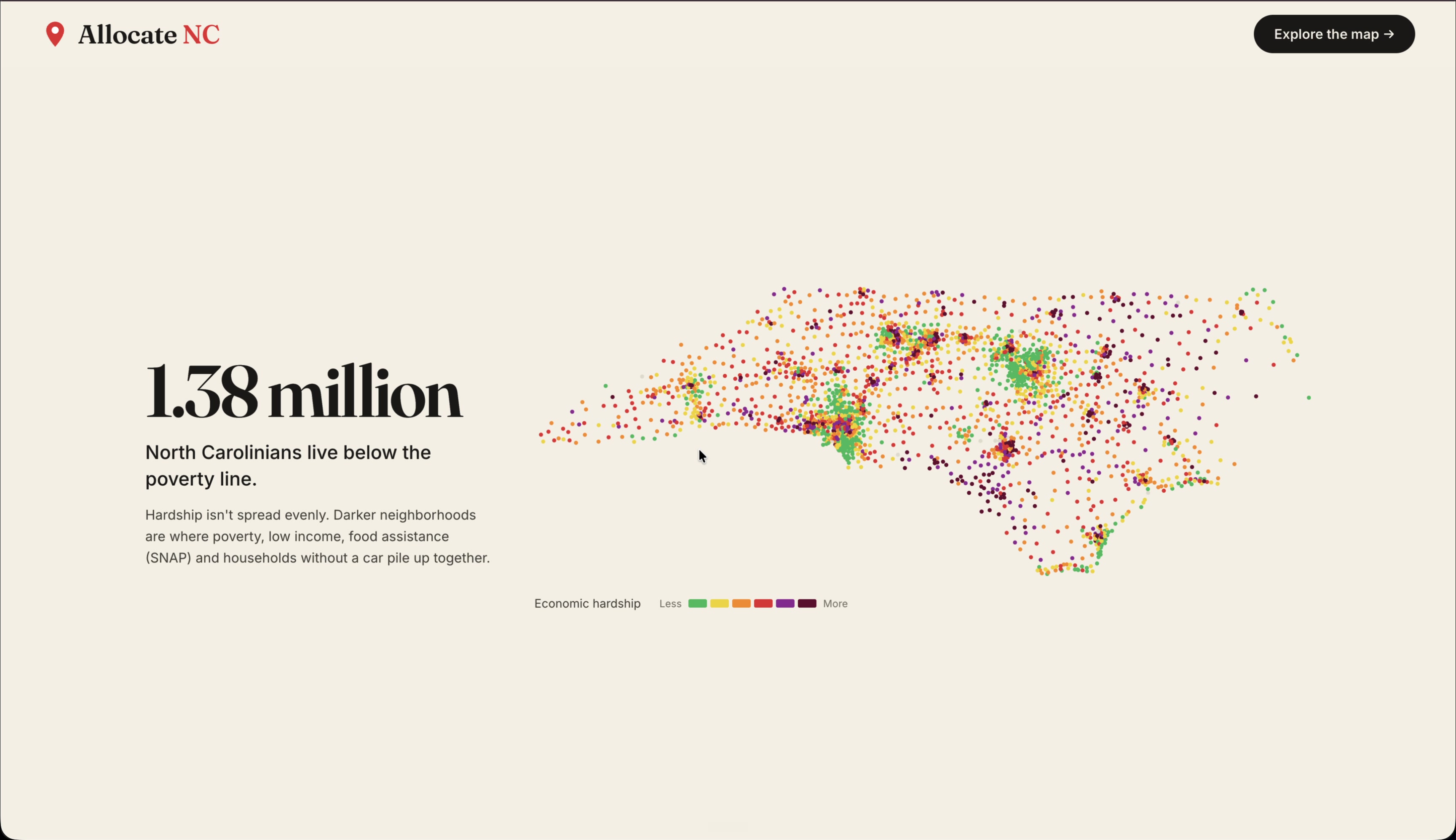
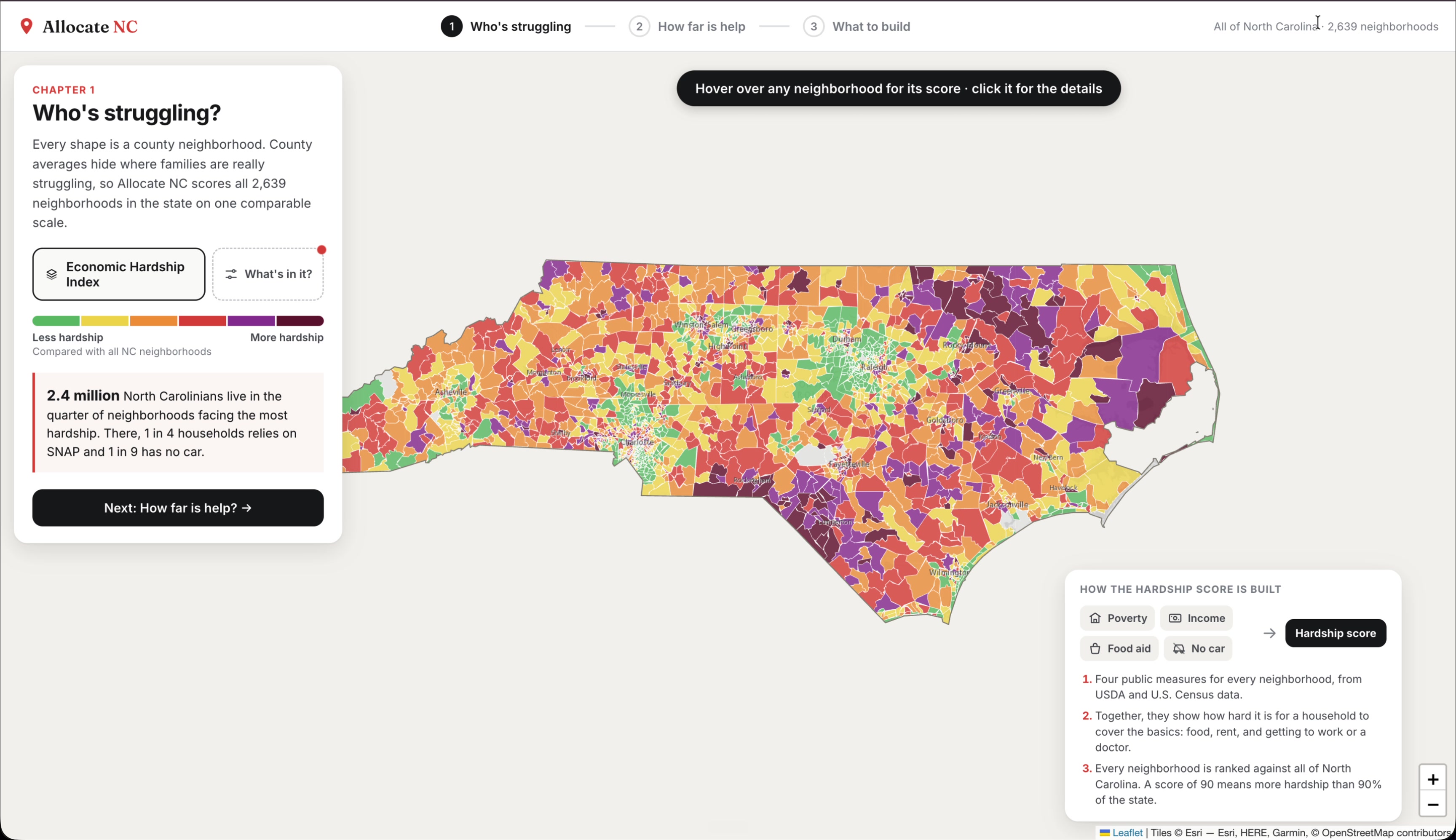
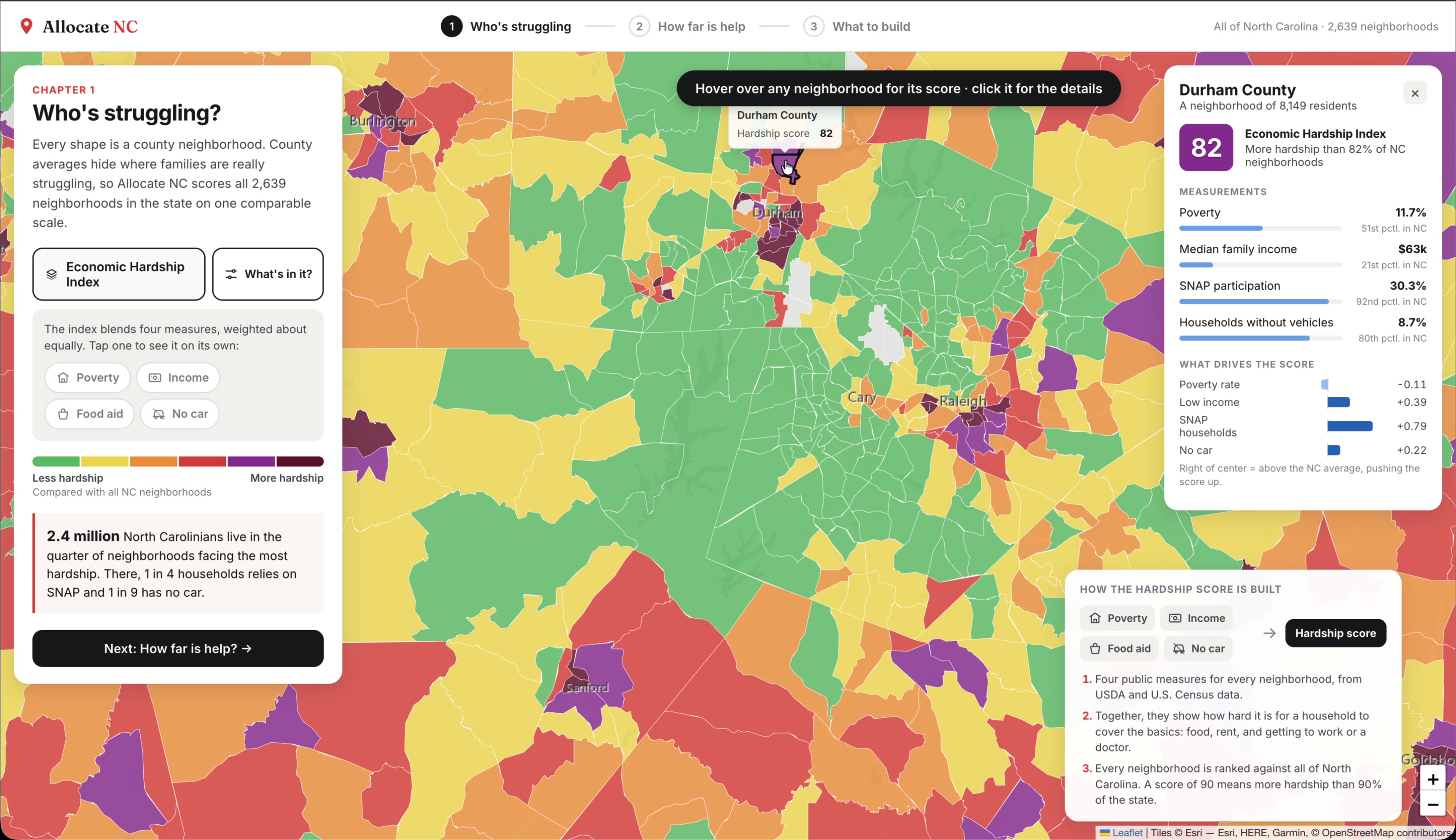
- Economic hardship: An interactive statewide map identifies neighborhoods experiencing greater socioeconomic hardship, allowing users to examine poverty, income, SNAP participation, and vehicle ownership.
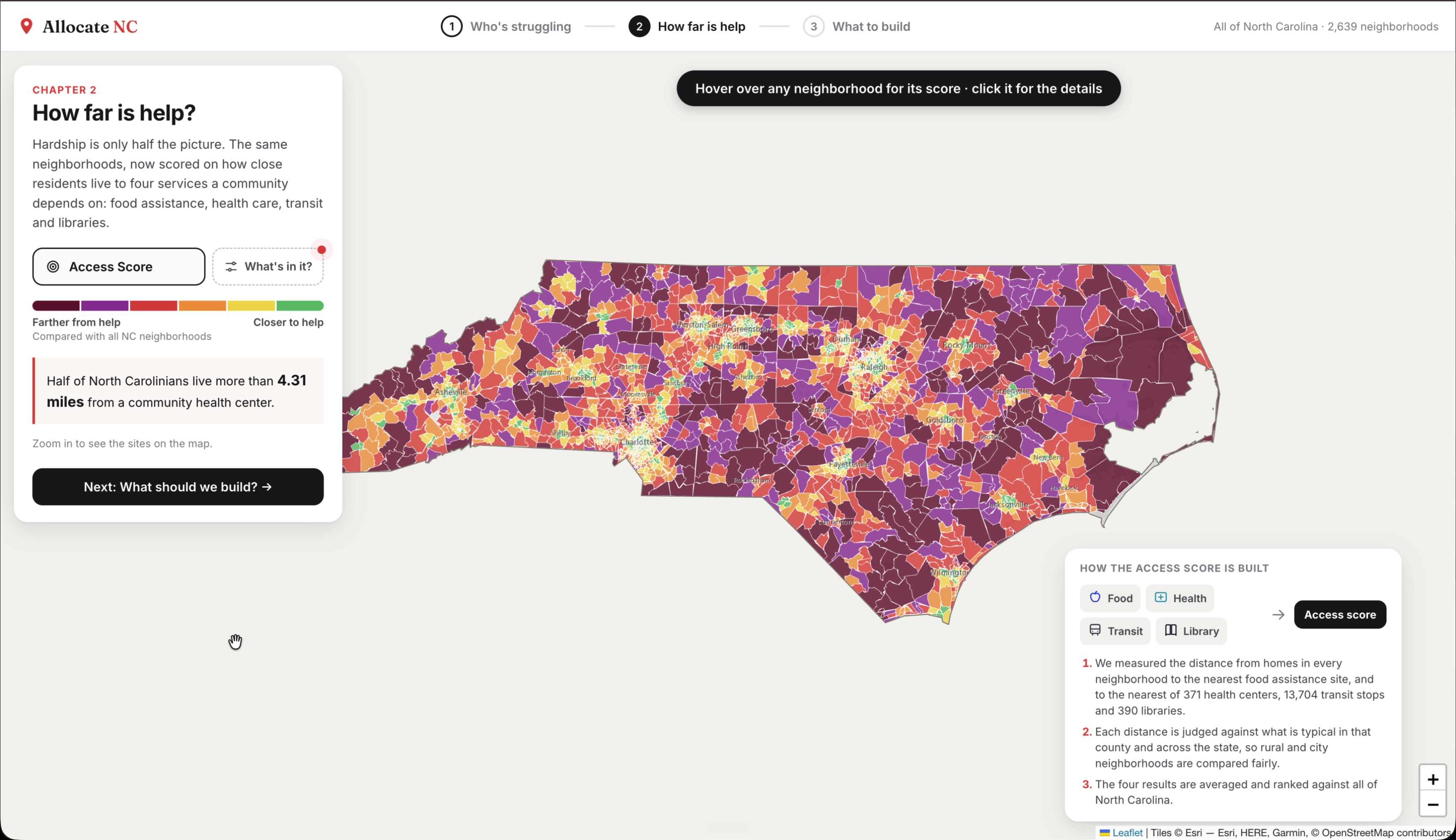
- Service accessibility: A separate map evaluates how easily residents can reach four essential services: food assistance, healthcare, public transit, and libraries.
- Infrastructure optimization: Users choose a county or statewide planning area, select which services they're considering, and specify how many new facilities they can build. Allocate NC identifies the best types and locations for new community facilities, maximizing improvements in access to essential services while prioritizing the number of residents helped and the economic hardship they face.
The planner also visualizes how access would change after the proposed facilities are added, including which neighborhoods benefit, how many residents would have a closer facility, and how much their travel distances could decrease.
The goal isn't simply to show where problems exist. It's to help answer what we can do about them.
How we built it
Allocate NC combines geographic data processing, statistical modeling, optimization, and an interactive web interface.
1. Building the Economic Hardship Index
I began with USDA socioeconomic data covering 2,660 North Carolina census tracts—small geographic areas defined by the U.S. Census Bureau, typically containing a few thousand residents—which I matched to their geographic boundaries using 2020 Census TIGER/Line data.
Rather than arbitrarily assigning weights to different socioeconomic indicators, I used Principal Component Analysis (PCA) to construct an Economic Hardship Index from four variables:
- Poverty rate
- Negative log of median family income
- Percentage of households receiving SNAP benefits
- Percentage of households without a vehicle
After cleaning the data and standardizing the variables, I fitted PCA on 2,582 eligible tracts. The first principal component explained 71.84% of the variance, with higher scores consistently associated with greater poverty, lower family income, higher SNAP participation, and fewer households owning vehicles. This suggested that PCA was capturing a common underlying pattern of economic hardship across all four indicators.
I then projected eligible tracts onto this component and converted their scores into statewide percentiles. This produced hardship measurements for 2,639 census tracts, allowing communities to be compared on a common scale.
2. Measuring geographic accessibility
Next, I assembled geographic facility datasets from HRSA, USDOT, the Institute of Museum and Library Services, and local government food-resource inventories. These allowed me to map the locations of healthcare centers, public transit stops, libraries, and food assistance facilities across North Carolina. Where complete food-assistance inventories weren't available, I used modeled locations, distinguished from observed facilities in the application.
But simply knowing where these facilities exist doesn't tell us how accessible they are.
My first approach was to define a service radius around each facility. For example, residents within a certain distance of a health center would count as having access, while those outside that radius would not. The problem was that accessibility isn't a yes-or-no question. Someone living just beyond the radius would receive the same score as someone living twenty miles away. The model also treated rural communities particularly harshly, since services are naturally more spread out, and gave an artificial advantage to facilities assigned larger radii.
I needed a way to measure accessibility continuously, without ignoring the geographic differences between communities.
I developed the following scoring function:
$$ A(d)=\max\left(0,\frac{100}{1+d/m}-\left(\frac{d}{D}\right)^2\right) $$
Where:
- (d) is the distance from a resident's location to the nearest facility of a particular type.
- (m) is the population-weighted mean distance to that type of facility within the resident's county.
- (D) is the population-weighted median distance to that type of facility across North Carolina.
The first part measures how accessible a facility is relative to what's typical in its community.
$$ \frac{100}{1+d/m} $$
Dividing (d) by (m) tells us how a resident's distance compares to the average distance in their county. If a facility is twice as far away as the county average, then (d/m=2). If it's half as far, then (d/m=0.5).
Putting this ratio in the denominator means that accessibility decreases smoothly as distance increases. Someone directly beside a facility receives 100 points, while someone at their county's average distance receives 50. Crucially, residents aren't suddenly classified as having zero access just because they cross an arbitrary boundary.
However, this introduces another problem. Imagine two residents: one lives two miles from the nearest library in a county where two miles is typical, while another lives twelve miles away in a county where twelve miles is typical. The first term assigns both residents the same score of 50.
That's why I introduced a second term, which penalizes long distances regardless of what's normal locally.
$$ \left(\frac{d}{D}\right)^2 $$
This time, we're comparing the resident's distance against the statewide median, rather than their county's average. The median provides a common statewide reference without being heavily influenced by unusually large distances.
Squaring the ratio makes the penalty increase more rapidly for particularly long journeys. At the statewide median distance, we subtract 1 point. At twice that distance, we subtract 4 points; at three times the distance, 9 points.
By subtracting this penalty from the original score, we preserve the geographic context provided by the first term while recognizing that a long journey is still a disadvantage, even when everyone nearby faces the same problem.
Finally, the outer (\max(0,\ldots)) prevents the score from becoming negative.
The equation itself represents a deliberate modeling choice, while the county averages and statewide medians are calculated from the facility-distance data. Rather than imposing identical distance cutoffs everywhere, the model balances what's reasonable to expect locally against the absolute difficulty of reaching a service.
I calculate these scores at population-representative points throughout each census tract, using straight-line geographic distances. The scores are then averaged according to population, separately for each of the four service categories. Taking the mean of those four categories gives each tract an overall accessibility score.
Finally, I convert these scores into percentiles against the same statewide distribution, so users can compare neighborhoods anywhere in North Carolina on a consistent scale.
3. Optimizing facility placement
Identifying underserved communities is only half the problem. Once we've measured economic hardship and accessibility, the more interesting question becomes: if we could build a new facility anywhere, where would it make the greatest difference? And what kind of facility should it be?
I designed an optimization algorithm to evaluate both decisions simultaneously.
For a proposed facility of type (c) at location (x), the objective function is:
$$ S(c,x)=\sum_i P_i\left(\frac{H_i}{100}\right)\Delta A_i(c,x) $$
At first glance, this may look complicated, but each part corresponds to a consideration that matters when deciding where to invest public resources.
First, how much would accessibility actually improve?
The term (\Delta A_i(c,x)) measures the change in accessibility for census tract (i) if we build facility (c) at location (x). To calculate it, we determine which residents would have a closer facility, recalculate their distances, and apply our accessibility equation again. The improvement is expressed on a 0–1 scale.
A proposed facility that substantially reduces travel distances receives more credit than one that barely improves existing access.
Second, how many people would benefit?
We multiply that improvement by (P_i), the tract's population. This means an improvement affecting thousands of residents contributes more to the objective than an identical improvement affecting only a handful.
Third, how economically disadvantaged is the community?
We multiply again by (H_i/100), where (H_i) is the tract's Economic Hardship Index percentile. A tract at the 90th percentile receives a hardship weight of 0.9, while one at the 20th percentile receives 0.2.
This doesn't exclude more affluent communities from consideration. Instead, it gives additional priority to improvements benefiting residents who face greater socioeconomic hardship.
Finally, we sum these weighted improvements across all affected census tracts. The result is a single score representing the predicted benefit of placing that particular facility at that particular location.
The optimizer evaluates 126,759 potential locations across the four facility categories, searching for the combination of service type and geographic location that produces the highest score.
When users request multiple facilities, the algorithm selects them sequentially. After each recommendation, it updates residents' distances and recalculates the remaining potential improvements. This prevents the system from repeatedly rewarding different facilities for providing the same accessibility benefit.
To make this computationally feasible, I used spatial KD-trees to efficiently identify nearby facilities and residents, along with incremental updates that avoid recalculating the entire state after every candidate. I precomputed 1,515 planning scenarios, allowing users to explore recommendations interactively without waiting for the optimization to run.
The result is an algorithm that doesn't simply recommend building in the poorest neighborhood or the most densely populated area. It identifies where a new facility can meaningfully shorten distances to essential services, benefit substantial numbers of people, and prioritize communities experiencing greater economic hardship.
4. Building the application
The data-processing and optimization pipeline is written in Python, using pandas, NumPy, scikit-learn, GeoPandas, Shapely, and SciPy.
The frontend is built with React, TypeScript, Vite, and Leaflet. It displays interactive geographic visualizations, detailed neighborhood statistics, and before-and-after infrastructure recommendations.
The application is deployed on Vercel. All geographic data and optimization results are generated ahead of time, allowing the website to operate without a dedicated backend.
Challenges we ran into
Defining what accessibility actually means. This was probably the most interesting challenge of the project. Initially, I treated access as a binary question: is a resident within a certain distance of a facility? But the thresholds were difficult to justify, especially across the geographic differences between rural and urban North Carolina. They also had unintended consequences for the optimizer.
Developing the continuous accessibility metric required thinking carefully about two competing ideas: access should be evaluated relative to local conditions, but genuinely long travel distances still need to count against a community.
The revised model eliminated the 76 tracts that had previously been tied at zero accessibility. It also made recommendations less dominated by healthcare facilities: health centers had been the first recommendation in 90 of 101 planning areas, compared with 40 after the change.
Cleaning and reconciling real-world data. Combining multiple government datasets meant dealing with inconsistent formats, geographic identifiers, outdated records, and missing or implausible values. One socioeconomic field even behaved contrary to what its definition suggested, so I excluded it rather than blindly incorporating it into the index.
Making optimization fast enough for an interactive application. Evaluating thousands of possible facility locations across multiple service types becomes expensive, especially when every proposed facility changes residents' nearest-service distances. Spatial indexing, incremental calculations, and precomputation made it possible to turn this into a responsive user experience.
Accomplishments that we're proud of
I'm most proud of developing an end-to-end system that goes beyond visualizing a problem to recommending a measurable intervention.
In particular:
- Building a statewide hardship index with a statistically derived set of weights rather than arbitrary ones.
- Developing an accessibility function that accounts for both local geographic conditions and the real burden of long distances.
- Implementing an optimizer that jointly chooses what type of facility to build and where to build it, instead of assuming the service type in advance.
- Evaluating more than 126,000 candidate locations and generating over 1,500 planning scenarios.
- Bringing the entire analysis into an interactive, publicly accessible application.
I'm also proud that I didn't simply accept the first model that produced plausible-looking results. Several of the most meaningful improvements came from questioning whether the mathematics was actually measuring what I intended it to measure.
What we learned
The biggest lesson I learned was that an optimization algorithm can be mathematically correct and still optimize the wrong thing.
Our original approach worked exactly as programmed, but its fixed-distance assumptions gave certain services an artificial advantage and flattened meaningful differences between communities.
It made me realize that defining the objective and choosing defensible measurements can be just as important as designing the optimization algorithm itself.
I also gained a much deeper appreciation for the practical side of applied mathematics: validating datasets, deciding how to represent a continuous geographic problem computationally, and finding efficient ways to evaluate thousands of potential solutions.
More personally, this project brought together things I've studied and worked on separately—linear algebra, statistical modeling, algorithms, and software development—into one application. Seeing those ideas become something that could support a meaningful public decision was especially rewarding.
What's next for Allocate NC
There are several directions I'd like to pursue to make Allocate NC more useful for real-world infrastructure planning.
More accurate travel modeling: The current system uses straight-line distances. Incorporating road networks, walking routes, and public transit travel times would produce more realistic accessibility estimates.
Better and more complete facility data: Expanding and validating statewide service inventories, particularly food-assistance locations, would improve the reliability of the recommendations. Incorporating transit frequency and service capacity would make the model more representative of actual availability.
Real-world feasibility constraints: The current optimizer identifies promising geographic locations, not construction-ready parcels. A future version could incorporate facility costs, available land, zoning restrictions, and existing infrastructure to recommend projects that are both impactful and feasible.
More flexible planning objectives: Different communities have different priorities. I'd like to let planners compare objectives, incorporate community input, and explore tradeoffs between reaching the greatest number of residents and prioritizing the most disadvantaged areas.
Ultimately, I'd like to work directly with local governments, policymakers, and community organizations to bring Allocate NC into real planning decisions, helping turn the data and recommendations into new facilities that make essential services more accessible to the people who need them most.
Built With
- facility
- geopandas
- geospatial
- kd-trees
- leaflet.js
- location
- numpy
- optimization
- pandas
- pca
- python
- react
- scikit-learn
- scipy
- shapely
- typescript
- usda
- vercel

Log in or sign up for Devpost to join the conversation.