Inspiration
The data is bad. My mind connected with the jobs data, understanding how engineers are sent out for maintenance but might abort the job due to lack of information about was needed. That engineer might not bother to accurately record why they aborted the job, or even if finished they might not record what they did.
I could have reviewed the data, running queries to flag up places issues commonly happen and I could have written a report on how good it was. That's my day job, and as this is a hackathon I wanted to see how my coding would follow my wandering mind. I also wanted to think how engineers and team leaders could be engaged with gaps in data and a potential domino effect. Simply pointing out which engineers/jobs had bad data, wasn't enough.
What it does
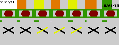
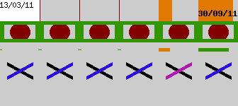
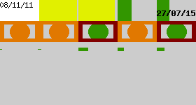
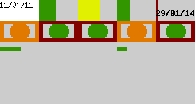
My hacked-together project takes all the jobs associated to an asset. It then paints different aspects of the jobs onto a "flag" image. The human mind can easily spot patterns, and most importantly breaks in patterns. [see annotated flag] An asset may get jobs every few months and that be normal, but at one point there is is a job that was only a few days after the following job. That can draw us in, and perhaps every time the pattern breaks it is after an orange dot which means no comment was given.
The real benefit is the view of assets. The idea is that NWL staff will be able to filter the list of assets (or generating reports) in the way they are used to, I have just hard-coded some examples. For example, show all assets with more than had more than 40 jobs, or show pump assets. On this page, the "flag" images of each asset are shown. Because the filter has selected assets of an specific nature, the flags are likely to be the same. For example the time-since-last-job bar may be all greens because the assets are reliable ones maintained every 5 years. It is not the individual assets to look at, but the typical pattern of these flags and then you can see where there are breaks.
How I built it
The data was converted from Excel into CSV and into a mySQL database, thanks to critical help from Simon and his patience waiting for conversions to run. When the detail page of an asset is looked at, PHP runs some queries on the tables to get various data of the jobs. The GD image library is used to draw different shapes onto a grey rectangle. There is nothing amazing to this build, but I hadn't spent a lot of time with the GD functions before as previous work had started with images rather than create them from scratch. My main work was reviewing the data, and learning what the field names were.
Challenges I ran into
Converting the data had it's problems. Large Excel files are horrible, CSV is better. I was aware of limited time, and thus limited opportunity I had. I didn't push myself to build a big user interface, and that actually resulted in me skipping on another project idea I started forming.
Accomplishments that I'm proud of
Visualising about 50 rows on a 300 x 100 pixel image, displaying those on a page/gird, and thus being able to visualise multiple tables/queries of a relational database on such a flat view. Normally such a view would require flicking between tabs/sheets and keeping in mind what each one looked like and how they linked. Playing with the GD image library was a fun accomplishment, but it's only the start.
What I learned
GD library has some bugs in it that limited what I could draw, I may be able to get around those. I've been able to learn about specific assets that stood out as a result of the flag images, although I'm not a domain-expert to know exactly what that means or confirm it is something that isn't right.
What's next for Abstract Assets
Understanding the values is important, and although advice is on hand it would need a lot of sit-down time to see what is relevant. The break points for shapes changing colour, and what information to display could be tweaked and adjusted. One of the things to add next would be a marker as to the priority-level of jobs. The image could also display information about the asset that isn't job-specific.


Log in or sign up for Devpost to join the conversation.