-
-
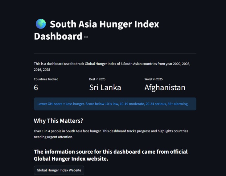
Main Title Screen
-
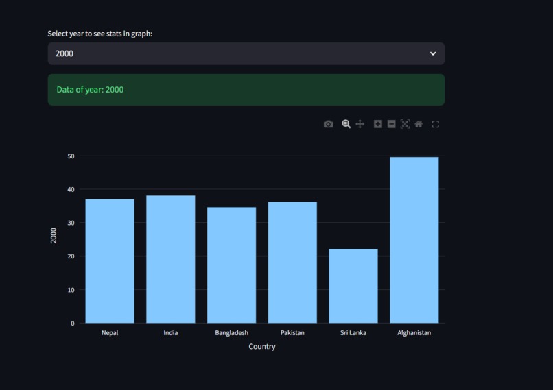
Graph Of Data
-
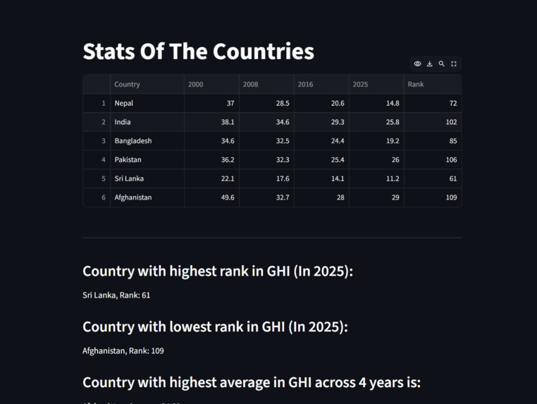
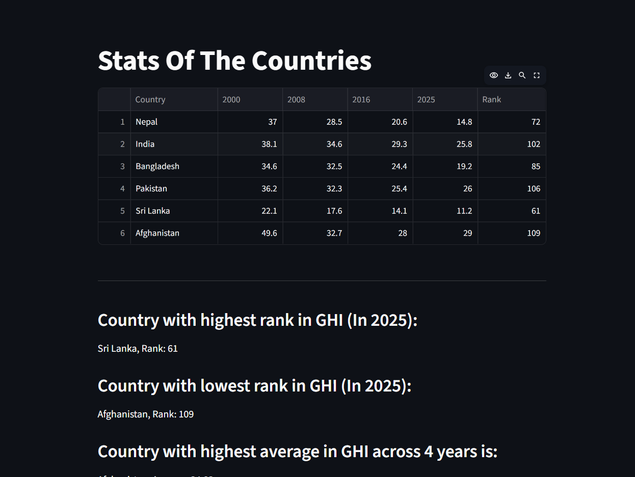
Stats Of Countries

Inspiration
Hunger is one of the most pressing global issues. South Asia alone accounts for 36% of the world's undernourished population. I wanted to visualize 25 years of hunger data to show progress, highlight struggles, and raise awareness about this critical issue.
What it does
Tracks Global Hunger Index (GHI) scores of 6 South Asian countries:
- Nepal, India, Bangladesh, Pakistan, Sri Lanka, Afghanistan
Features:
- Stats page — ranks, averages, most improved country
- Graphs page — bar, scatter, pie chart comparisons
- Improvement advice for each country
🛠 How we built it
| Tool | Purpose |
|---|---|
| Python | Core language |
| Pandas | Data analysis |
| Plotly | Visualizations |
| Streamlit | Web dashboard |
Data sourced from the official Global Hunger Index website.
Challenges we ran into
- Streamlit Cloud running Python 3.14 caused library compatibility issues
- Setting up multi-page Streamlit app structure
- Handling relative vs absolute file paths on deployment
Accomplishments that we're proud of
- Built and deployed a fully working data science dashboard
- Nepal's hunger drop from 37.0 → 14.8 over 25 years was powerful to visualize
What we learned
- Pandas data manipulation and reshaping
- Plotly visualizations
- Streamlit multi-page apps
- GitHub and cloud deployment
What's next for GHI Dashboard
- Expand to all Asian countries
- Add yearly FAO data for more granular trends
- Add 2030 hunger forecast using predictive modeling

Log in or sign up for Devpost to join the conversation.