-
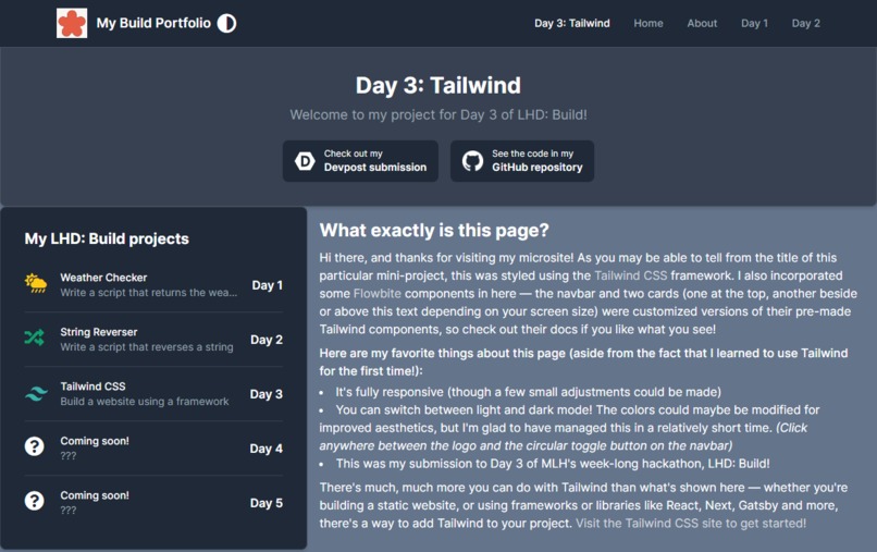
The site is mobile and desktop-friendly :)
-

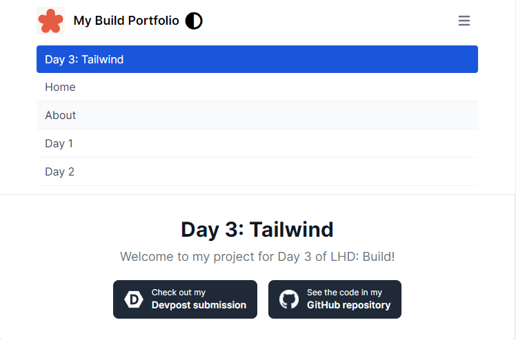
The collapsible menu on smaller screens
-
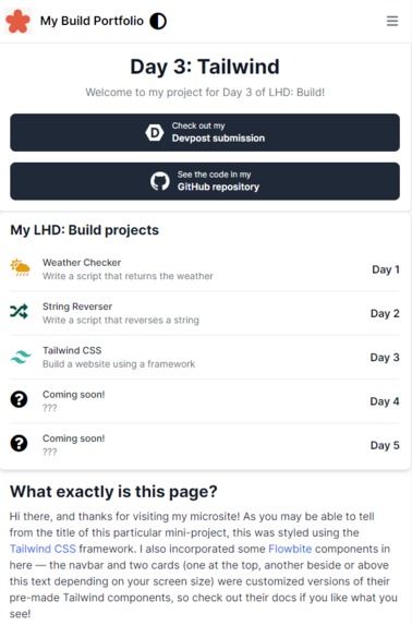
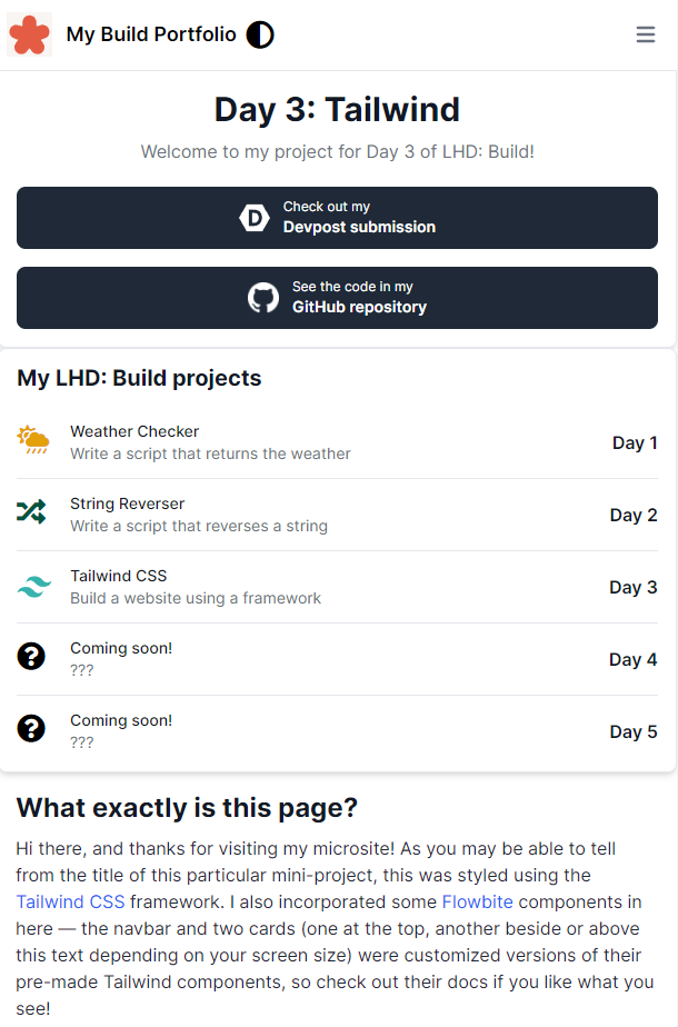
Wait, there's a dark mode?!
Inspiration
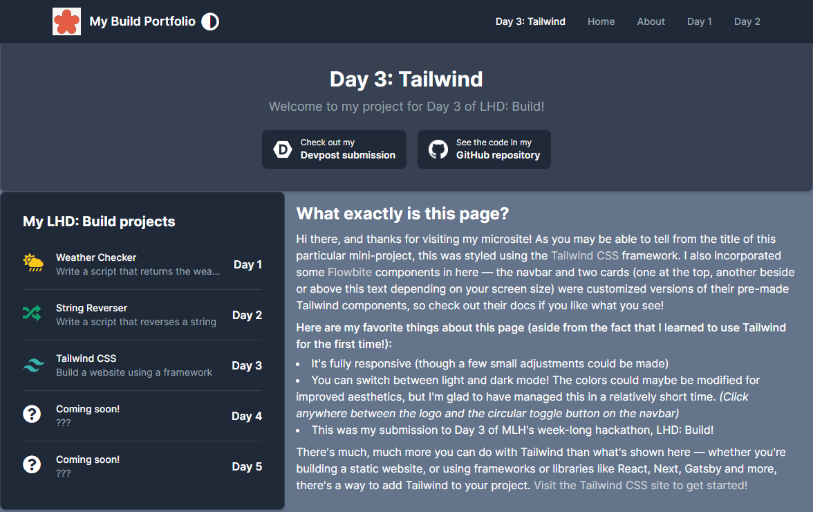
This project was inspired by the LHD: Build day 3 challenge to build a site using a framework.
What it does
I guess it looks nice and has a bunch of links to take you places? (Oh, and there's a button to toggle light or dark mode, too!) And the site is, of course, responsive as well.
How I built it
I used the Tailwind CSS framework (which I set up/installed using npm), as well as a few Tailwind components by Flowbite, to create a static site (or rather, a page on my LHD: Build gallery site). I also used some Font Awesome icons and wrote a short JS script for the light/dark mode toggle "button".
As a matter of fact, the other pages on the same microsite are actually styled with another framework, W3.CSS! Though for this challenge, I decided to try a new and quite popular one to learn to build a professional-looking UI like I've always wanted.
Challenges I ran into
Learning a new framework, though the utility classes and whatnot resembled Bootstrap to a certain degree. Making a site responsive with a mobile-first mentality is always slightly challenging (but Tailwind made it quite simple), and I had a bit of trouble finding the right Flexbox styles/classes to apply. There was also the "problem" of actually creating some kind of design for the page.
What I'm proud of/what I learned
I'm very glad to have learned Tailwind in the process of building this page on my (already existing) microsite for this year's LHD: Build. The site has a somewhat professional look to it as well, and I managed to get Flexbox and responsive design working properly. I'm quite happy with the implementation of a dark mode as well, which is another feature I've wanted to try making for a project :)
What's next for A Tailwind Site
- More components and styles to fill up the page
- Improved color schemes and styling
Built With
- css
- github
- html
- javascript
- tailwind

Log in or sign up for Devpost to join the conversation.