-
-
dashboard
Inspiration
Access to basic healthcare shouldn't depend on where a child is born, their gender, or their family's income level. Yet, that's often the reality. This project was inspired by the global need to highlight inequalities in child health access—and to give data a voice that can drive awareness and change.
What it does
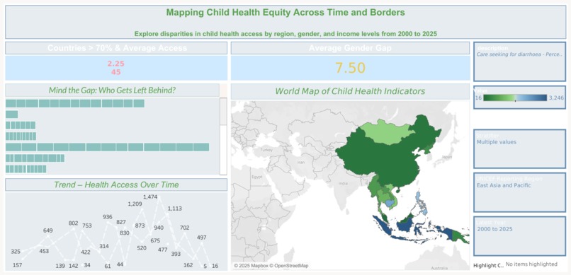
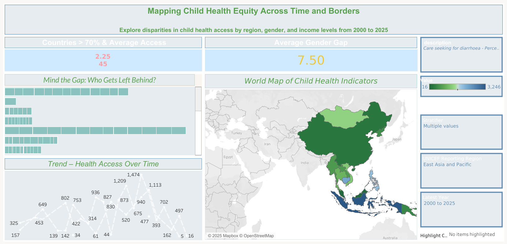
The dashboard visualizes child healthcare access disparities from 2000 to 2023, across regions, gender, and income groups. Users can interact with maps, filters, and visual trends to understand how health equity has evolved—and where urgent gaps remain.
How we built it
Built using Tableau Public Data sourced from international health databases and surveys Created a mix of maps, bar graphs, line charts, and interactive filters Structured the dashboard to offer both big-picture trends and granular insights
Challenges we ran into
Dealing with inconsistent or missing data across countries and years Designing visuals that are informative without being overwhelming Ensuring performance and readability across devices Maintaining clarity while allowing deep user interactivity
Accomplishments that we're proud of
Successfully created a dashboard that tells a compelling and data-backed story Made complex global data easy to explore and understand Highlighted actionable insights that can inform policy, awareness, and research
What we learned
Health equity is layered—and influenced by more than just income Good data visualization isn’t just about charts—it’s about clarity, empathy, and impact Interactivity enhances learning when users can explore data at their own pace Storytelling with data can turn statistics into social awareness
What's next for A Decade of Disparity: Child Health Access Insights
Built With
- csv-data-file
- global-health-database
- microsoftexcel
- tableau

Log in or sign up for Devpost to join the conversation.