-
-
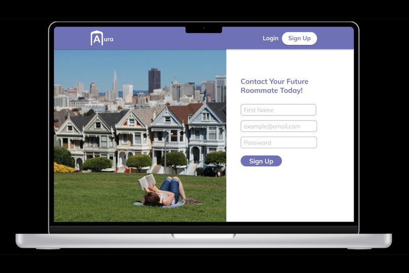
Users can sign up for Aura.
-
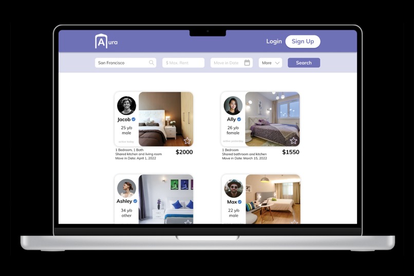
Users can view search results of potential roommates and their potential living situation.
-
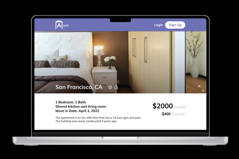
Users can view listings in detail.
-
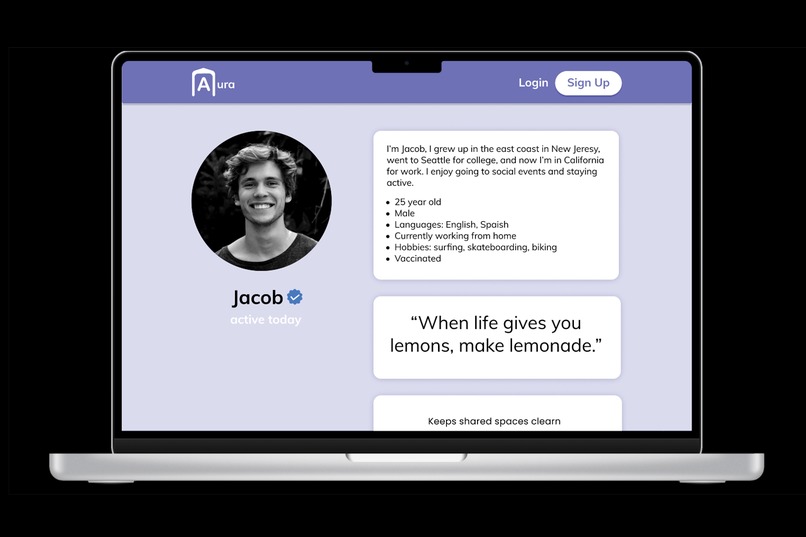
Users can view profiles of potential roommates.
-
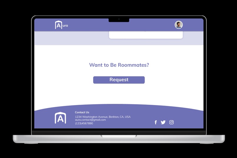
Users can request to be roommates.
-
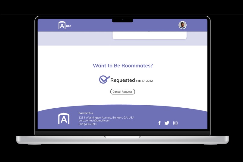
Users can request to be roommates.


Inspiration
After hearing multiple complaints from friends and family about bad roommate experiences, I noticed that they were always caused by not knowing the roommate enough before committing to live with them.
What it does
Aura is a website for millennials to find roommates effectively and inclusively. It allows users to see in-depth profiles of potential roommates.
How I built it
Aura is a website prototype designed entirely in Figma, thus there was no coding involved. My process for designing Aura used the user-centered design approach. My whole process can be seen in Figma here. First, in order to empathize with users, I analyzed current roommate finder websites to see what they did right and wrong so I would not make the same mistakes. I found that they lack vital information about the potential roommate, causing users to contact roommates that aren’t a good fit. Next, I found that people living in high-rent areas and millennials were most likely to have roommates. As a result, millennials looking for roommates in high-rent areas would be the target users. Then, I thought about my metrics of success. I decided that the best way for Aura to make a profit would be to charge a fee to connect roommates, influencing the user flow. Anyone can become an Aura user, making it inclusive to all. Furthermore, I decided what features I would implement into the design and started designing!
Challenges I ran into
A challenge I ran into was making the design look like a real website. I decided to use photography from stock photos to make my website look more complete. Another challenge I had was making all the different screens look coherent, meaning that they had the same branding and feel to them. I used the color style and object component feature in Figma to make that easier because I could drag elements onto the design rather than creating it again from scratch.
Accomplishments that I'm proud of
I am proud that I was able to design the modern and minimalistic website that I envisioned. I used rounded edges on corners and drop shadow effects on buttons to make it look more modern. My strategy for designing this website is to get the user to their sole purpose for coming onto the website (AKA viewing potential roommates) as soon as possible when they enter the site to give the best possible user experience.
What I learned
As this is my first hackathon and doing it solo, I learned many things throughout these past few days. First, I learned about going into a profession at a tech company from the Meta webinar. Second, I learned how to effectively use components, variable components, interaction overlays, and layout grids in Figma. These tools helped me create more realistic and impactful designs. Third, I learned how to use Devpost. I definitely want to go to more hackathons in the future because of this positive experience.
What's next for Aura
I would like to continue designing more screens for Aura, do user testing, and implement the feedback to improve the design. The user flows I would add are 1) roommate requests to user screens and 2) roommate listings screens.
Built With
- figma
- pexels

Log in or sign up for Devpost to join the conversation.