-
-

Logo
-

Graphs
-
Dashboard

Inspiration
We were inspired by real debugging software that has saved all of us students time and energy. We wanted to optimize machine learning debugging, metric collection, research analytics, and education by creating a program where you can step through with real metrics about how tensors are changing with every operation.
What it does
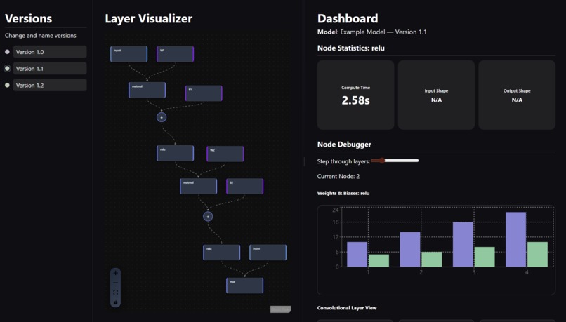
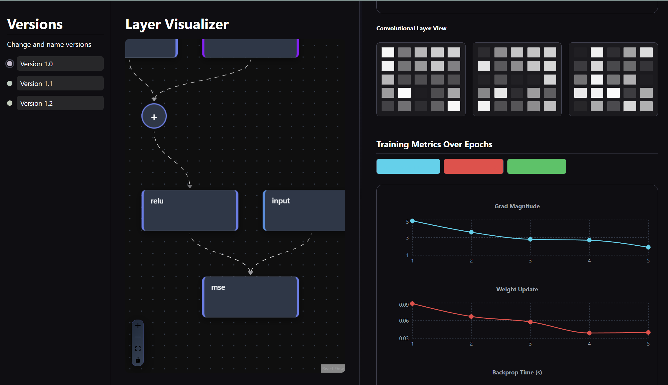
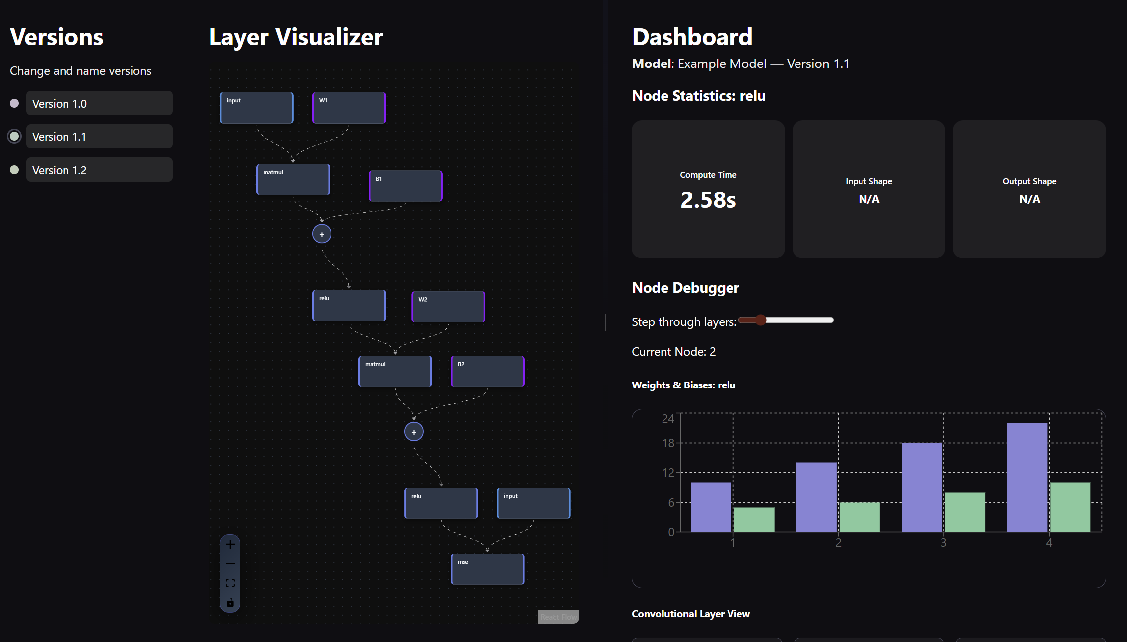
Torchlight is a web-based interface containing a version bar, a movable screen containing model layers as clickable graph nodes, and a dashboard where you can see a histogram, convolutional kernels, general statistics, and epoch line graphs. You can click on a node and immediately receive how long it takes to run, input & output shapes, and observe the change in weights and biases over time. You can also see the epochs and how they evolve in terms of time, gradient, and weight. You can switch versions (different runs), switch color schema, and see how each layer flows into another as an input.
How we built it
We modified PyTorch's functionality so that tensors carry their state or "history" as they pass through the model. We were able to override certain functions for to capture their metadata, transformations, and metrics, allowing users to step through the model training process interactively, observing how tensors change in real time until the loss function is minimized. We used React.js and standard web app development stack to create the entire interactive frontend.
Challenges we ran into
Connecting frontend to backend was the most challenging part, as the abundance of interactive/dynamic visual assets made formatting and usability slightly difficult. We found data visualization to also be somewhat difficult with its numerous functionalities and parameters; picking and choosing what can and should be represented was also key to ensuring user's learnability. Formatting data in general was a challenge of ours; we had to reorganize regular tensors into Node and Edge objects, parse them to get metrics, and format them into different graphs.
Accomplishments that we're proud of
*Layer Visualizer: * the interactive graph that we constructed with our custom classes and tensor manipulation was the highlight of our project. It visually represents ML models layer by layer and describes the input and output flow. *Graphical representation & functionality: * Creating numerous graphs, namely the histogram, kernel carousel with step through slider, and the epochs over time, we felt, were well designed and representative of what we wanted to display.
What we learned & what's next!
This was almost all of our first times working with data and visualization. We learned a lot about data science, the importance of UI and dashboard design for users, and how good visual design and flow can be used as an educational tool. We challenged ourselves with a different discipline and learned about playing to our individual strengths and the complexity of data visualization for user tools.


Log in or sign up for Devpost to join the conversation.