-
-
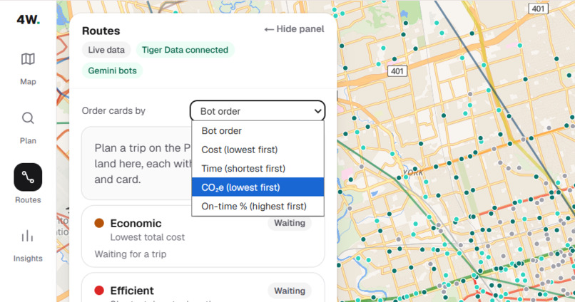
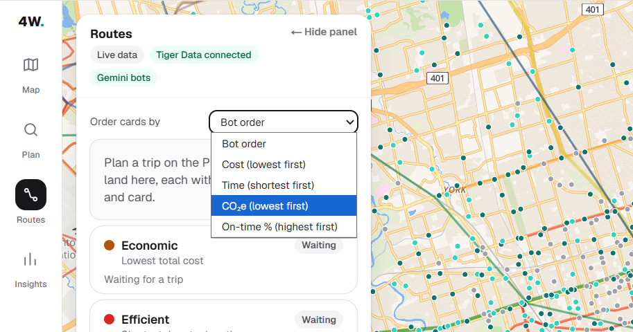
Order the four route cards by cost, time, CO₂e, or on-time percentage, or keep the bot order. The tradeoff is yours to make.
-
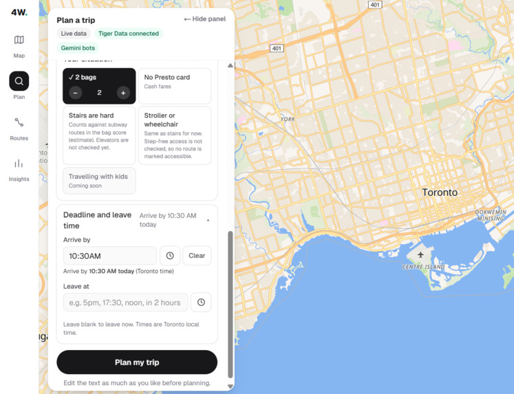
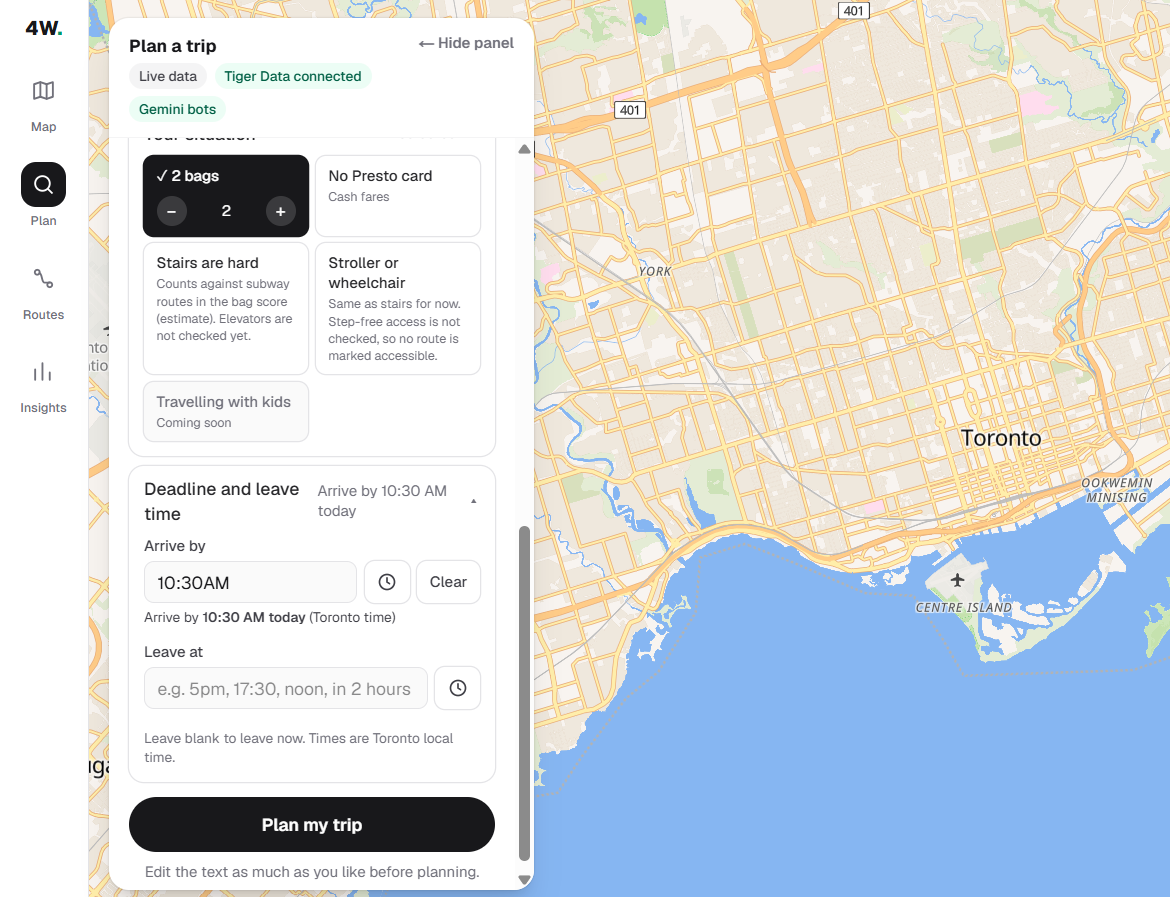
Tell 4WARD your situation, no presto card? stairs are hard?
-
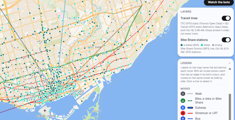
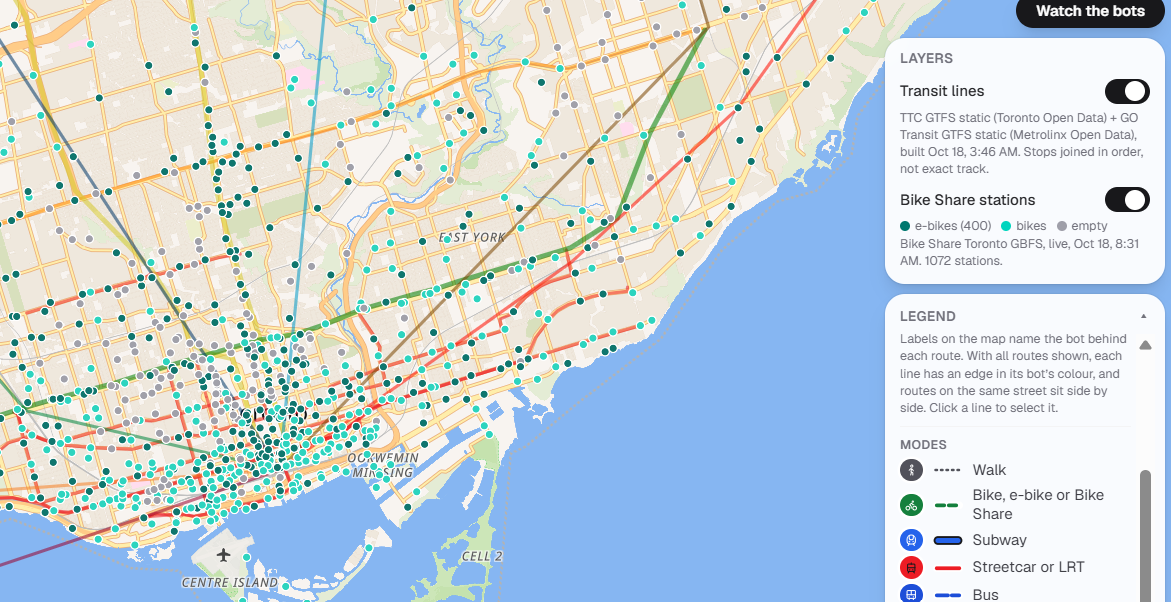
Transit and Bike Share layers: TTC and GO Transit lines from GTFS, plus 1,072 live Bike Share stations
-
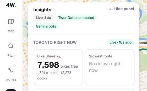
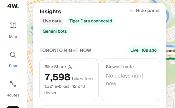
Insights: live Toronto conditions, including 7,598 free Bike Share bikes (1,321 e-bikes) and the slowest route right now
-
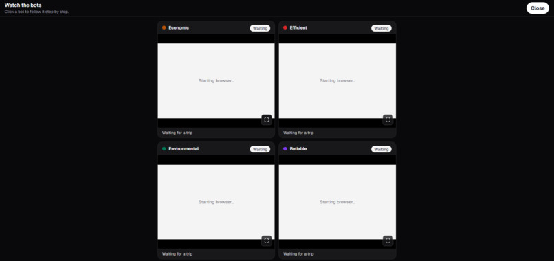
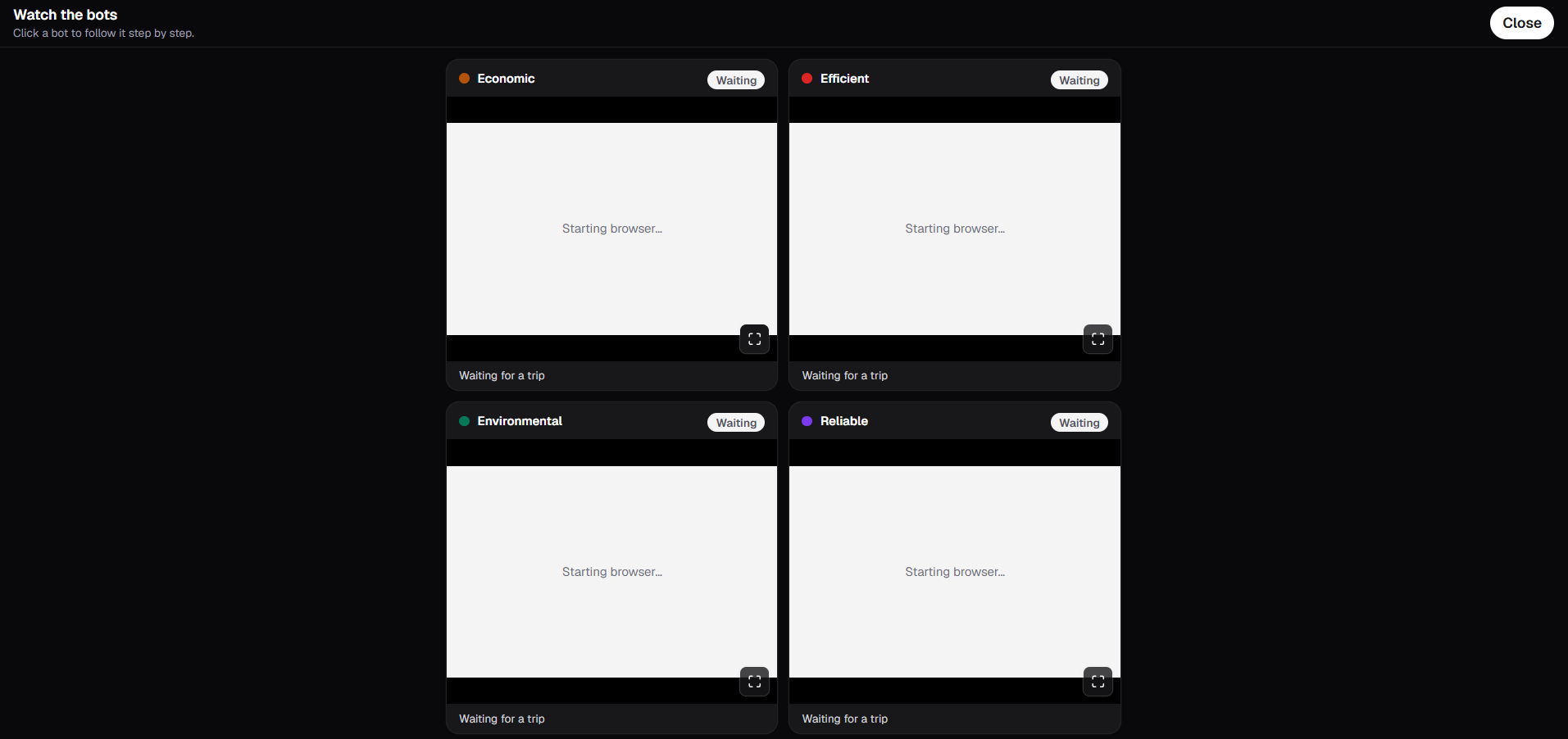
Watch the bots: all four agents work at the same time, each in its own Steel cloud browser.
-
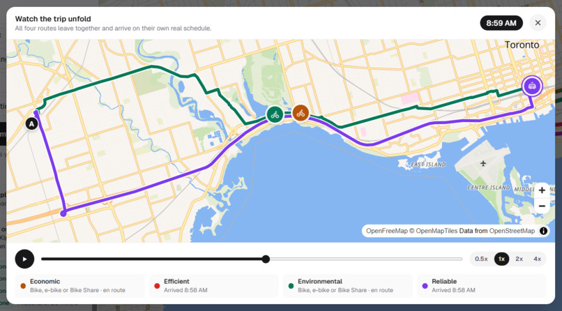
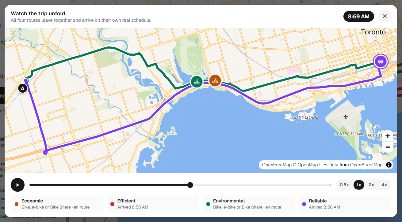
Watch the trip unfold: all four routes depart together on the map and arrive at their own real pace.
-
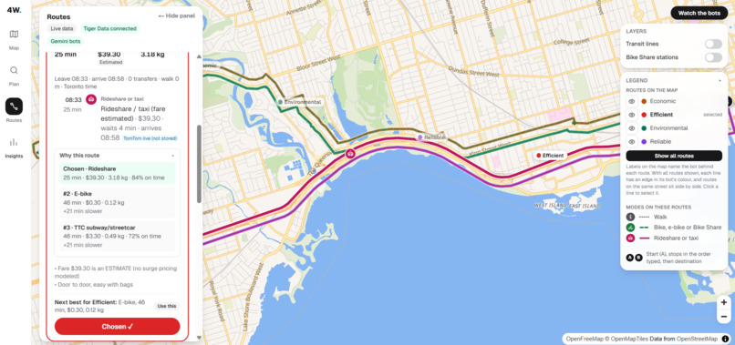
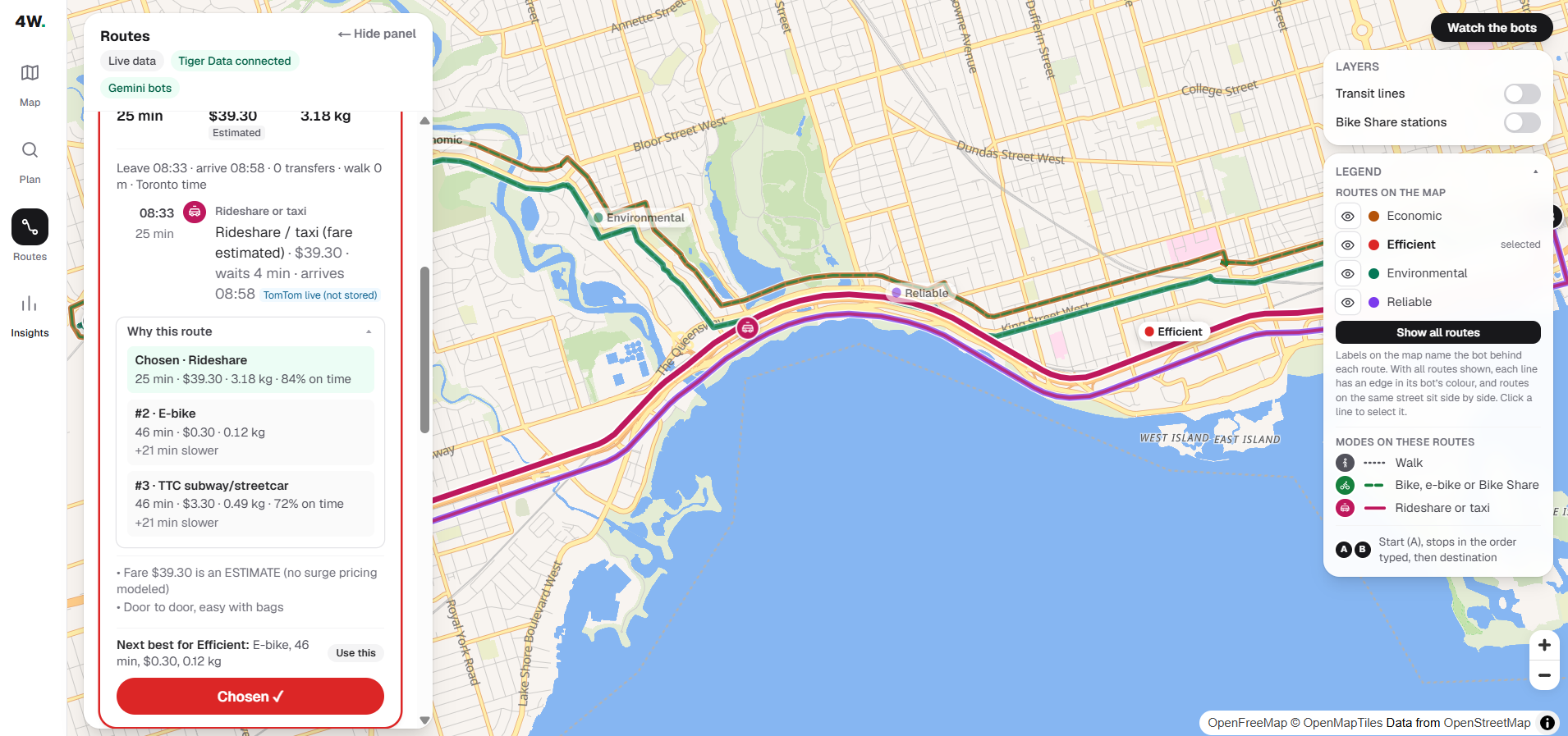
Why this route: the Efficient agent picked a rideshare (25 min, $39.30 estimated, 84% on time) and shows its ranked alternatives
-
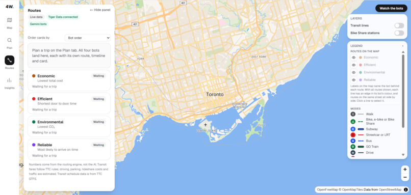
The 4WARD main view: a full-screen Toronto map with one card per agent (Economic, Efficient, Environmental, Reliable), waiting for a trip.
-
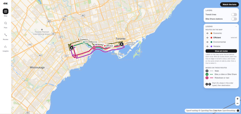
Four agents, four routes: each agent builds its own route from one trip request, drawn in its own colour on one map.
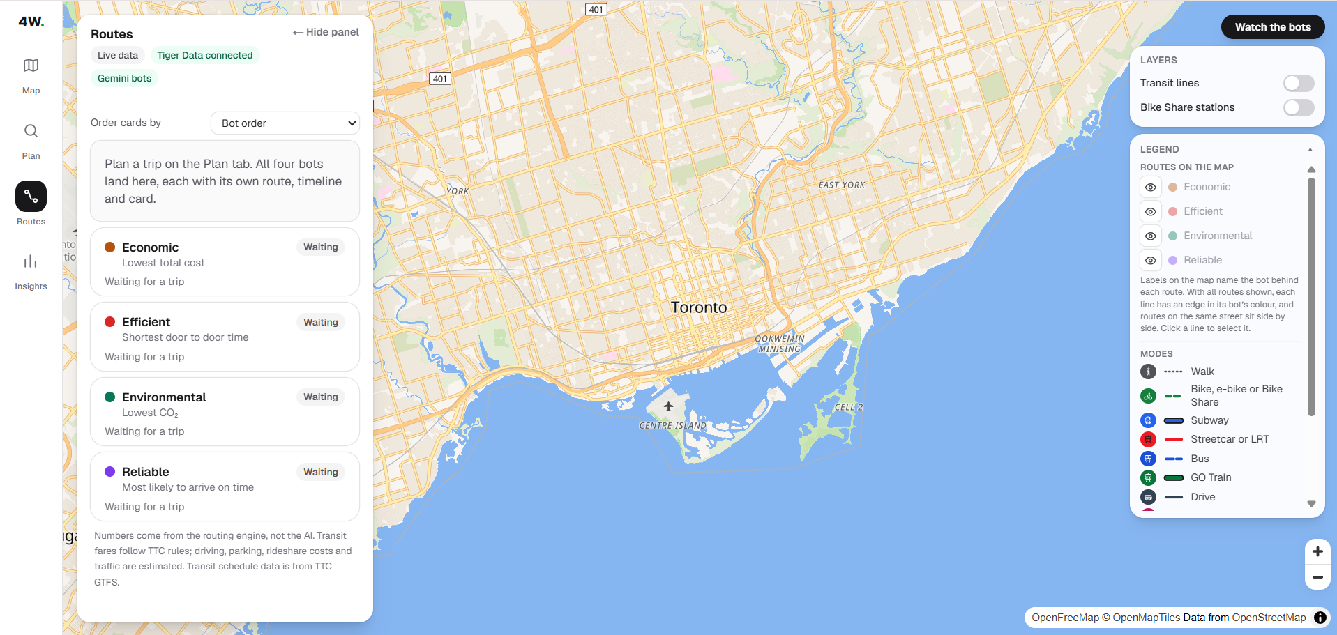
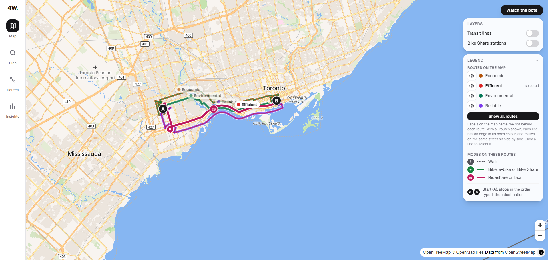
Getting across Toronto and the GTA means juggling cost, time, bags, and whether you'll make your transfer, and most map apps give you one answer. 4WARD gives you four. Type your trip in plain language, and four AI agents, each with its own browser, work through our map dashboard in parallel: one hunting for the most economical route, one for the most efficient, one for the most environmentally friendly, and one for the most reliable (the most likely to actually get you there on time). You compare the results side by side and choose. Behind it, real TTC, GO Transit, York Region Transit, Durham Region Transit, and MiWay schedule data, plus live TTC, Bike Share availability, and TomTom traffic data flow in, while Tiger Data stores the delay history, so every route is checked against real, current transit conditions, not just a schedule.
Inspiration
Planning a trip around Toronto is hard, especially as a student. You have specific needs: a budget, a class or meeting you can't be late for, a reservation to make. No single way of travelling covers all of them. The TTC is cheap but slow, Bike Share is green but weather-dependent, and a ride is fast but expensive. On top of that, matching train and bus times to a deadline is a pain, and one missed connection can mean missing class.
We wanted a tool that doesn't give you one "best" route and hope. Instead, it works out several routes, each aimed at something different, so you can see the tradeoffs and pick what fits your day.
What it does
You describe a trip in plain language, and four AI agents plan it at the same time. Each one chases a different goal:
- Most reliable: the route least likely to run late
- Economic: the cheapest way to get there
- Environmental: the lowest emissions
- Efficient: the fastest
Each agent uses our dashboard like a person would, through real browser automation in its own isolated cloud browser (via Steel), and builds its own route from transit, Bike Share, driving, walking, or rideshare. You can watch each agent work live, step by step, in its own browser window on screen. You see all four routes on one map, with time, cost, CO₂, transfers, and an on-time reliability score for each, plus each agent's own ranked top-3 alternatives so you can see it actually compared options rather than guessing once. Toggle routes on and off, pick the one you want, and get a clean view of just that route with a step-by-step timeline. Once all four are in, you can also play "Watch the trip unfold" — a synced timelapse where all four routes depart together on the map and arrive at their own real pace, so the time difference between, say, driving and transit is something you watch happen instead of just a number.
An Insights tab uses live TTC and Bike Share data stored in Tiger Data to show delay history. Anything estimated, like rideshare fares, is clearly labelled.
How we built it
Frontend
We built the dashboard in Next.js, Tailwind and MapLibre, and designed it to feel like a map app, not a website with a map on it. The map fills the whole screen, and everything else floats on top of it: a slim navigation rail on the left, a route panel, and layer controls. A "Hide panel" button clears the panels so you can see the full map.
The rail has four views. Plan is where you type your trip in plain language, or click an example trip, and type a departure time or deadline. Map shows all four routes at once. Routes lists them as cards with time, cost, CO₂, transfers and reliability, with a Pareto-optimal badge on routes that aren't beaten on every measure. Insights shows delay history from Tiger Data (TimescaleDB). When you choose a route, the map shows only that route, with a step-by-step timeline of each leg, so it stays readable.
Four AI bots (Economic, Efficient, Environmental, Most reliable) each build a route in parallel. A "Watch the bots" view shows each bot's live browser through an embedded Steel session, with a step-by-step list of what it did, and you can enlarge any bot's screen.
On the map, each route has its own colour and its own on/off toggle, and routes that share a road are drawn side by side so none are hidden. Every leg is colour-coded by travel mode with its own icon (walk, subway, streetcar, bus, GO train, drive, rideshare, park & ride), so it's clear at a glance how each part of the trip happens. A legend explains the colours and modes. Layer switches turn the TTC network and Bike Share stations on and off.
Anything estimated, like rideshare fares, is labelled in the UI. The layout works at laptop and phone widths, and we gave key elements stable test IDs so our Playwright bots and screenshot scripts keep working while the design changes. The dashboard is deployed on Vercel.
Backend
The routing engine is a FastAPI service, and every number it returns — time, fare, emissions, reliability — comes from deterministic code, never from an LLM guessing. Transit routing runs over a single compact line graph we build by compressing real GTFS static feeds from five agencies into one file: TTC (subway and streetcar), GO Transit (commuter rail), York Region Transit, Durham Region Transit, and MiWay (Mississauga) — 490 directional transit lines in one graph, found by downloading and verifying each agency's actual public GTFS feed (not every agency publishes one; we couldn't find a working feed for Brampton Transit, so a trip that's clearly within Brampton gets an honestly-labelled estimate instead of us pretending we have real data for it). A single Dijkstra search over that graph can genuinely combine agencies in one itinerary — for example, automatically finding a MiWay bus to a GO station and the GO train into downtown, without either leg being hand-coded. Walking, biking, and driving legs come from OpenStreetMap routing (OSRM), cached locally, which doubles as an offline replay mode when there's no network.
On top of the raw routes, deterministic layers compute: Presto vs. cash fares (including the 2-hour free-transfer window), GO Transit's own distance-based fare kept separate from TTC's flat fare (they're different fare systems — we never fabricate a combined discount we can't verify), driving cost (gas or EV) plus an estimated parking cost and chance of finding a spot, an emissions model with per-mode factors, and a constraint filter for bags (penalizing stairs, long walks, many transfers), no Presto card, EV, and bike/e-bike ownership. Every route is also marked Pareto-optimal when nothing beats it on time, cost, CO₂, transfers, and walking all at once. Park & ride isn't a hardcoded shortlist either: the engine searches the real nearest subway and GO stations toward the destination, computes a real drive time and a real transit time for each concurrently, and keeps whichever station actually minimizes total trip time.
Reliability is the clearest example of Tiger Data doing real work. A collector writes TTC delay observations on a timer into Postgres/TimescaleDB, and a continuous aggregate turns that into delay stats by route, stop, hour, and day of week. That score feeds every agent's ranking, weighted differently per goal, and its influence ramps up the more matching historical data exists for that route and time, capped once two weeks of history has built up — a thin history barely moves the ranking, a well-established one moves it fully. The Most reliable agent is the one built entirely around that signal: instead of reliability quietly nudging a ranking that's mostly about something else, it optimizes for on-time probability directly, from the same real stored delay history, and gets measurably more confident in its own pick the longer the system has been collecting data. It's the one part of 4WARD that genuinely improves itself over time without us touching the code.
The four agents themselves are Playwright, driving the dashboard over Chrome DevTools Protocol inside Steel's cloud browsers (so each agent gets its own real, isolated browser you can watch live, not a screenshot loop), with Gemini doing two distinct jobs: parsing the free-text trip into structured constraints (origin, destination, bags, deadline, car/bike ownership, Presto status), and function-calling its way through the dashboard's setup controls for each agent, reading a live snapshot of the page and deciding which actions to take next. The one rule we held to the whole way through: Gemini decides what to try, never what the answer is. Once the engine returns real computed candidates, the same deterministic reconciler every agent shares — not an LLM judging numbers it was only shown as text — does the actual comparison and picks the winner for that agent's objective.
Challenges we ran into
- Making four agents useful, not just four agents. Early on, bots with different goals often came back with the same route, so you'd see "four options" that were really one. We gave each bot a distinct objective and designed the dashboard so overlapping routes stay readable: lines drawn side by side in their own colours, with a toggle for each route. Some of the convergence was also a real bug: letting Gemini weigh in on which of two computed results was actually better (instead of trusting our own scoring formula) could make two very differently-motivated agents quietly converge on the same wrong pick. We moved that decision entirely into deterministic code and kept Gemini scoped to deciding what to try, not what wins. We also found and fixed a case where our own "make the bots look different" logic could overcorrect — telling a bot to avoid every other agent's pick, not just the one it duplicated, could force it into an absurd leftover option just to look distinct. It now avoids only the specific route it duplicated, and keeps an honest duplicate over a forced worse one. -Deciding what "best" even means Originally, three of our four agents were always honest about what they optimized — say "cheapest" and you got the cheapest, full stop. We used to have a fourth that blended time, cost, emissions, and effort into one score, and realized that was really just our own fixed weighting applied to everyone, which sat oddly next to a product built around tailoring the trip to you instead of deciding for you. We replaced it with Most reliable: one clean, nameable thing (on-time probability from real delay history) instead of a hidden blend, consistent with every other agent.
- Finding real transit routes. Getting the bots to build real bus, subway, and train trips, with real stops and transfers instead of straight-line estimates between points, took the most work. Each route is built from actual schedule data and checked against what a rider would really do. This meant tracking down, verifying, and downloading each agency's actual GTFS static feed (not all of them publish one), and merging five different ID schemes into one graph without breaking the join our reliability scoring depends on (TTC's route IDs have to stay exactly as TTC's real-time feed uses them).
- Real data, honestly labelled. Live TTC and Bike Share feeds are ingested into Tiger Data (TimescaleDB), and the Insights charts read from it. Rideshare has no public fare API, so those fares are estimates, and we label them as such in the app. A real, useful delay history takes days to build up, and since we only started collecting this weekend, the live history is short — so we backfilled the earliest hours with simulated data and clearly labelled it as simulated in the UI.
- Technical difficulties. Playwright bots rely on the dashboard's structure, so redesigning the UI risked breaking them, and we kept stable test IDs. We also had to get the Tiger Data connection working, keep a local SQLite fallback so the demo works if the database or network fails, build the map layers (transit/TTC lines from GTFS, Bike Share stations from GBFS), and work in parallel on one repo without overwriting each other.
Accomplishments that we're proud of
- It could be useful in real life. We built something that could help people with their day-to-day travel, especially students juggling classes, budgets and deadlines.
- A different idea. Instead of giving you one route, we run four agents with different goals, so you see the tradeoffs and choose.
- Trying to improve on tools like Google Maps. We went after a different use case for a tool people already know: a map app that compares routes by what matters to you, not just the fastest one.
- Teaching four bots to use a real app. We'd never worked with Playwright before, and now four browser agents run side by side, each clicking through our dashboard to plan its own route.
What we learned
- Real-time information is hard to get. Live delays, fares and reliability aren't available in one place, and some of it has no public API at all (like rideshare fares), so we estimated it and labelled it clearly.
- Different goals give different answers. The "best" route depends on who's asking. Cheap, green and fast often give different routes, and that's what the four agents are for.
- Agents need structure. Browser agents work better with stable pages, clear goals and checks than with open-ended prompts.
- Working on one repo as a team takes discipline. Separate branches, small commits and agreeing who edits which files saved us from overwriting each other.
- An agent should decide what to try, never what the answer is.The moment we let an LLM eyeball which of two computed results was "better," two agents with completely different goals could silently agree on the same wrong one. Keeping the actual decision in deterministic code, and Gemini scoped to deciding what's worth attempting, fixed it for good.
- A blended score is a decision dressed up as neutrality. Weighing time, cost, and emissions into one number felt like giving the user what they wanted, but the weights were ours, not theirs. Four honest single-goal agents turned out to be more "tailored to you" than one agent trying to guess your priorities for you.
What's next for 4WARD
- Beyond Toronto and the GTA. Today 4WARD covers Toronto, Durham, York, Peel and Halton. Most cities publish their transit schedules as GTFS and their bike share as GBFS, and TomTom works worldwide, so adding a city is mostly adding its feeds and settings. Next we'd expand across Ontario and Canada (Ottawa, Montreal, Vancouver), then to other countries.
- Smarter agents. A multi-step search loop so each agent can refine its route, plus a check that stops two agents from returning the same route.
- Reliability scoring. Use the delay history in Tiger Data to show how likely each route is to be on time.
- More real data. Keep collecting live data and load more years of open delay data to show how likely each route is to be on time, deepen Most reliable's confidence, and replace our earliest simulated history.
Built With
- maplibre
- next.js
- tailwind


Log in or sign up for Devpost to join the conversation.