Project Story: The 36-Hour Earth Clock
💡 Inspiration
Our modern lives are governed by a 24-hour cycle—a system inherited from ancient Babylonian traditions. While functional, I realized this system creates a mental disconnect between "time" and the physical reality of our planet's rotation. Why do we use base-12 and base-60 when our navigation and geography rely on the \(360^{\circ}\) circle?
I was inspired to build a clock that bridges this gap. I wanted to create a timepiece where time is not just a number, but a coordinate. By aligning the clock directly with the Earth's rotation, "telling time" becomes an act of tracking our journey through space.
🛠️ How I Built It
The project is built using a minimalist "Vanilla" stack: HTML5, CSS3, and JavaScript.
The Mathematics of Time
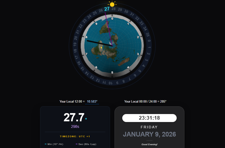
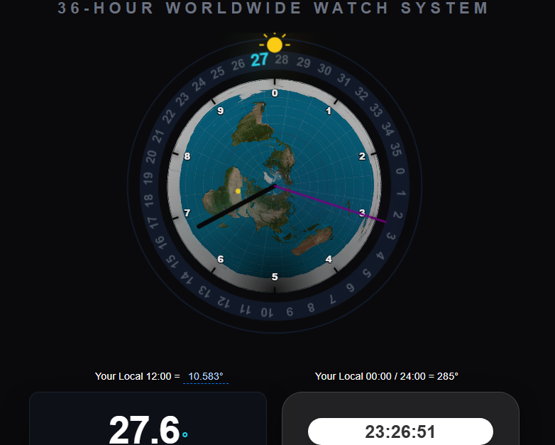
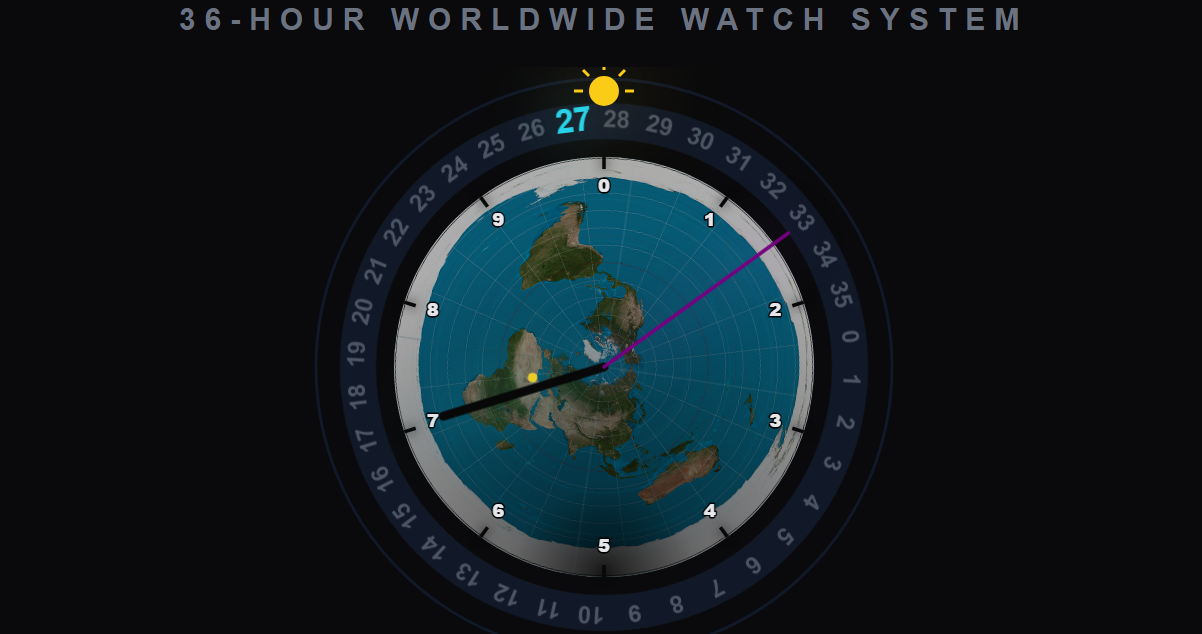
The core of the project was redefining the units of time. In this system:
- The day is divided into 36 "Hours".
- Each "Hour" represents exactly \(10^{\circ}\) of longitudinal rotation.
- To maintain precision, I introduced a "Custom Second" based on the degree.
Since \(1 \text{ day} = 86,400 \text{ seconds}\), and my system uses (360) degrees, the relationship is defined as:
$$\text{Standard Seconds per Degree} = \frac{86,400}{360} = 240\text{s}$$
Each degree is further subdivided into (360) custom seconds to allow for high-frequency tracking, meaning there are:
$$ 360 \times 360 = 129,600 \text{ units per day} $$

The Visualization
I used an Azimuthal Equidistant projection (North Pole view) for the map. I then layered an SVG coordinate system over the image. The most technical part was the "Unified Rotation" logic, where the map and the 36-unit ring are mathematically "locked" together so that the geographical longitude of Rome aligns with the (180^{\circ}) mark (Hour 18).
🧠 What I Learned
Through this project, I gained a much deeper understanding of:
- Geographic Projections: How to map linear time to circular longitudinal coordinates.
- SVG Animation: Handling complex rotations where multiple layers (map, ring, hands) must move at different relative speeds but remain synchronized to the UTC millisecond.
- UI/UX Design: Learning how to make "weird" data intuitive through color-coding (Dark for the minute hand, Purple for high-speed seconds) and dark-mode aesthetics.
🚧 Challenges I Faced
- Map-Ring Synchronization: In early versions, the map and the hour ring drifted apart because they were calculating rotations independently. I solved this by creating a combined-rotator parent element in the DOM.
- Rome's Alignment: Since the map image I used had a fixed orientation, I had to calculate a precise
MAP_OFFSETto ensure that Rome sat exactly at the bottom of the clock when the system reached its longitudinal noon. This required fine-tuning the trigonometric offsets in the JavaScript functions.
🚀 The Result
The final result is a functional, real-time dashboard that turns the abstract concept of "time" into a physical, geographical experience. It's a tool for anyone who wants to see the world—and time—from a different angle.

Log in or sign up for Devpost to join the conversation.