-
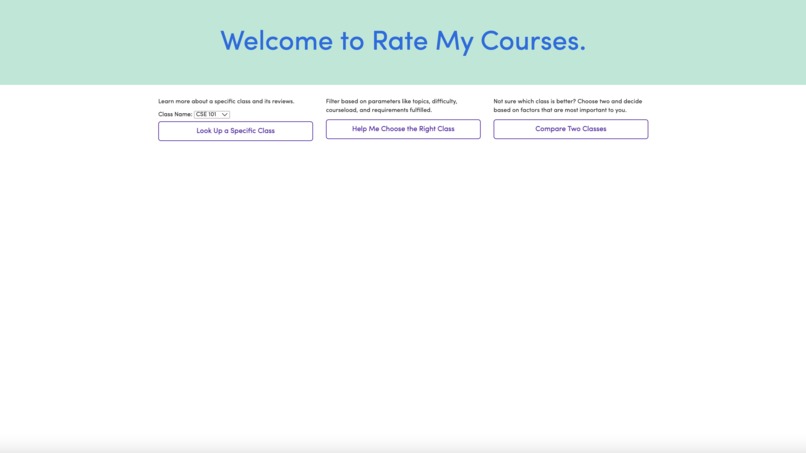
homepage
-
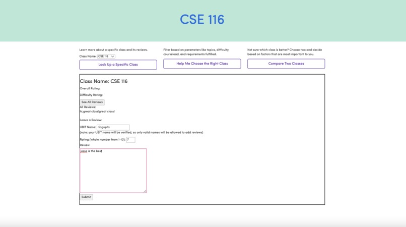
specificclass
-
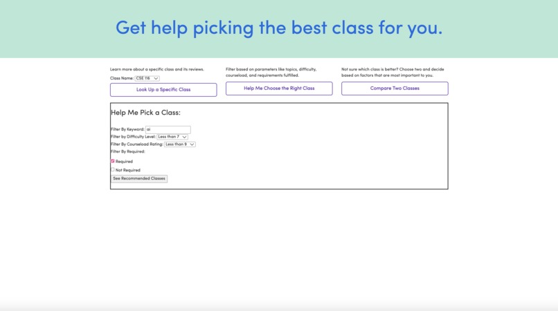
helpchooseaclass
-
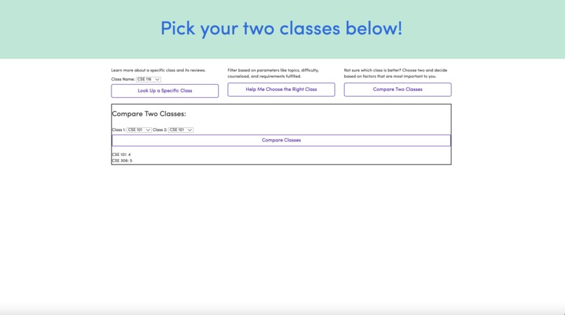
compareclasses


This project was inspired by all of our needs as freshmen majoring in CS. In choosing classes for next semester, we couldn’t tell the difference between many elective courses that we wanted to take. Even more so, we didn’t know how to choose the right classes to complement our already heavy course load from the two mandatory classes we have to take. With so many factors, requirements, and preferences to fulfill, how can students most effectively choose classes that they like and that keep them on track to graduate?
Enter Rate My Courses. This website is an essential for computer science majors especially, since a user can enter any CSE course from the menu and learn about its overall rating, difficulty rating, courseload rating, and student experiences. In case a student isn’t sure which class to pick between two, they can compare the classes side-by-side and view a direct comparison between the class ratings. And in the event a user wants to review all their options, they can filter by keyword and ratings, which returns a list of all the possible courses that meet the user’s criteria.
Through this project, we learned so much about keeping our end user in mind. During the conception stage, we had so many ideas for what direction the site should take, but we learned to prioritize the top needs of the user for the timeframe we had. We built it from the ground up, and used three main options that the user can expand to view more options. Moreover, the interface pulls from the strengths of other websites we use daily through its simplicity, one-page navigation, and uses the UB font, making it a familiar fit for UB students.
We built the project using HTML, CSS, and JS, and connected this functionality to a database and Python programming using the Bottle framework. The HTML/ CSS/ JS stored the UI elements and things the user could interact with, while the Python and Bottle programming took care of the back-end server processing.
In designing a website with an academic focus, we came across many challenges. For one, we had to implement this functionality for all CSE courses (of which there are about 80), and this was only the undergraduate component. Moreover, making the website not too overwhelming for the user involved adding a few buttons and steps to the user’s navigation, which was a challenge in understanding user psychology and ease of use. Most of all, working in a team environment and delegating the work in a project where the front-end and back-end are extremely closely related was a task, and having 20-some hours to do so meant solving challenges and adding new functionality as we conceptualized it. However, this was a great experience in full-stack development and working as a team, and creating a tool for students to use in future generations.
But Rate My Courses still has a long way to go. Some unsolved bugs include not being able to refresh ratings for each class loaded, not being able to filter courses based on keyword/ rating/ requirement, and not having class comparisons be fully detailed. In the near future, we hope to add functionality where users can view the top professors for each class. Moreover, we hope to add the ability for users to choose from courses from all departments and not just CS. Most of all, we hope to collect more user reviews on the website and understand what they find more useful, and work with them to improve Rate My Courses perpetually.

Log in or sign up for Devpost to join the conversation.