-
-

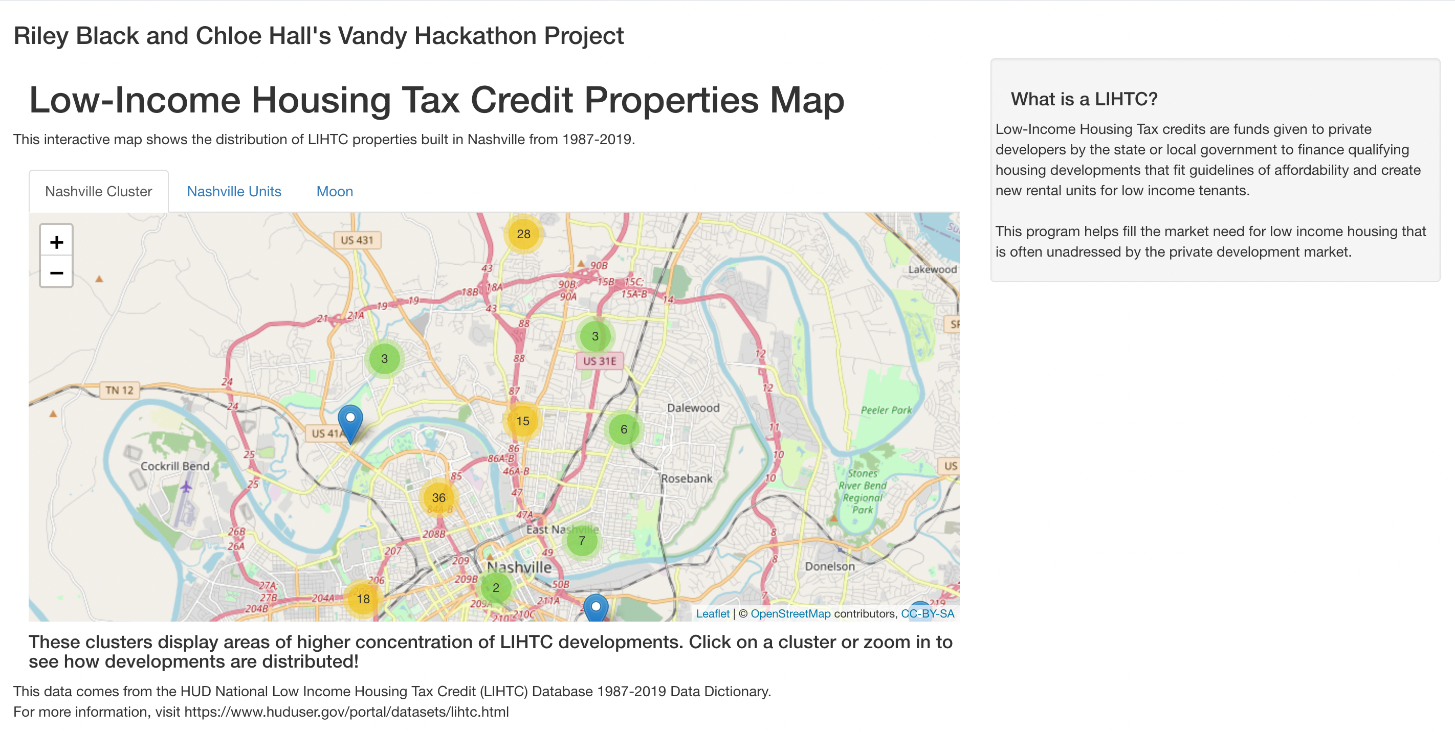
Our Cluster Distribution Map
-
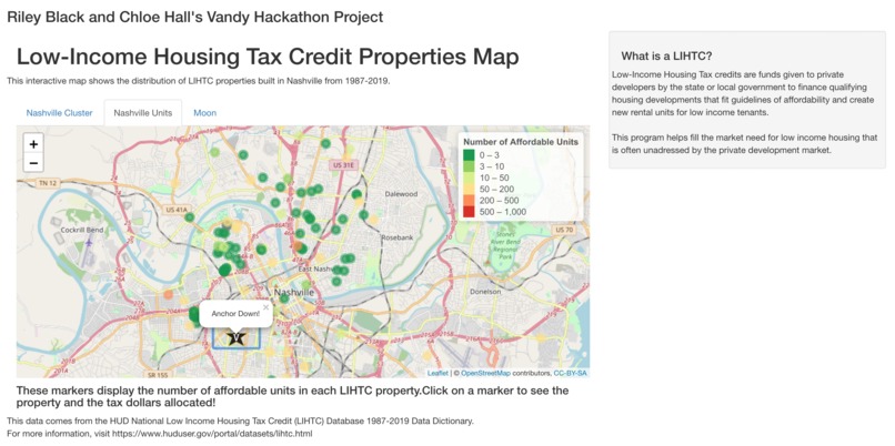
The Color Coded Unit Density Map
-
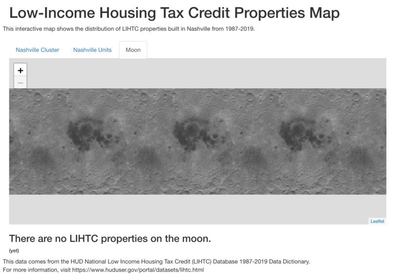
The Map of all Affordable Units on the Moon


Inspiration
We have researched a lot of metrics of affordable housing to track gentrification, rising areas of development, or possible policy interventions. When we found this dataset that tracks the location of all the built developments since the 1980s, we thought it would be an interesting challenge to map the development data and see where units have been built historically, so developers or interested policymakers could see areas of potential future expansion.
What it does
The website is an interactive map of Low-Income Housing Tax Credit Developments from 1987-2019. The 'Nashville Cluster' tab shows the distribution of developments in segmented clusters, that become more narrow as you zoom in or click on a region. The 'Nashville Units' tab shows the density of affordable units by color coding each development by the number of affordable units it contains. Each of these tabs' markers for each unit can be clicked, which will display the development's address, zip code, total tax dollars spent, and number of affordable units.
How we built it
We downloaded the CSV of all LIHTC properties and filtered it to only Nashville data. Using an R shiny file, we made a UI that displayed an OpenStreetMap using the Leaflet package and added tabs to display the different distribution data types. Then, we defined the server logic to map the markers of different developments using color or cluster.
Challenges we ran into
Neither of us has been to a Hackathon before and had limited coding experience, so we both had to get Github accounts and learn the mechanics of sharing coding with another person. We learned R shiny today so we had to experiment with the structure of the outputs and displays.
Accomplishments that we're proud of
Our main goal at the beginning of the weekend was to have a project at all, and as we worked we completed all our stretch goals and more! In addition to the multiple displays, we also added Vandy to our map and added a tab for future developers interested in expanding into the galactic real estate market (which looks up for grabs right now).
What we learned
We were most excited to learn how to translate R data analysis into a web page display because this has so many expansion possibilities of how we can share our findings. We also learned the value of having another person working on your code and problem solving alongside you!
What's next for Nashville LIHTC Properties Distribution Map
Since this map is an interactive display, it could be used to answer several research questions about how affordable units are distributed across Nashville and if there are any patterns to what area, how many tax dollars are spent, and how densely located.


Log in or sign up for Devpost to join the conversation.