-
-

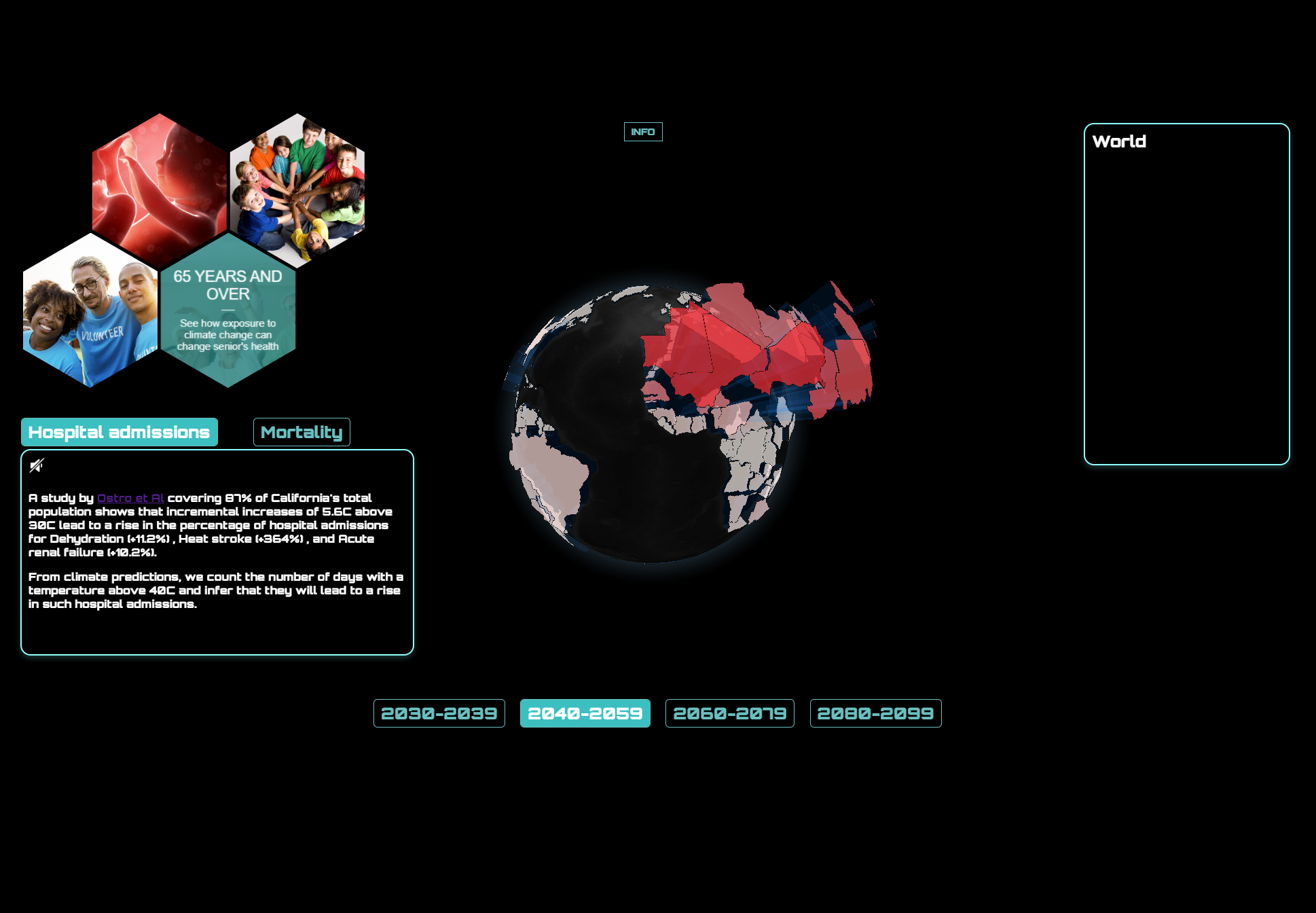
Screenshot of the interactive visualization
-

-

-


Inspiration: the concept of "exposome"
Our inspiration was the concept of "exposome", a term coined by the scientific community in 2005 to raise awareness about the importance of comprehensive exposure assessments in human health research, as a complement to the large investment in genetic research, as human health is influenced not only by genetic factors, but also by environmental exposures (such as air pollutants, chemicals, radiation etc.) and psychosocial stress. The exposome can be described as a person’s cumulative lifetime exposure to environmental factors and their related biological responses. Apart from direct health effects to individuals, the exposome can also alter genetic factors which may be passed down to future generations creating additional health concerns.
Climate change will have a great influence on the exposome through various mechanisms, with possible impacts on the health and well-being of humans. Currently, this is an active research field in the scientific community but the general public is not well-informed about it. Additionally, scientific terms and definitions make it difficult to grasp the ideas and conclusions of the scientific research. By creating an artistic visualization, we aim to bridge the gap between the exposome and climate change science with the general public.
What it does
The user can select different time periods and interactively learn about projected health effects. Additionally, there are different age ranges from which the user can select, in order to learn about specific health concerns.
How we built it
We first found relevant publications linking health impacts to climate change data based on climate scenarios projection. For example, vector-borne diseases such as the Zika virus, are closely related to climate conditions, as the optimum temperature for the Zika virus is 29 C and the range of 28 C to 34 C is the range most likely to increase Zika virus as a health impact. We focused on different health impacts.
We defined the criteria for the different health impacts from the publications from above. We based the criteria on specific climate measurements and projected measurements of a. Temperature (Temp) b. Humidity (Humidity) c. Precipation (Precip)
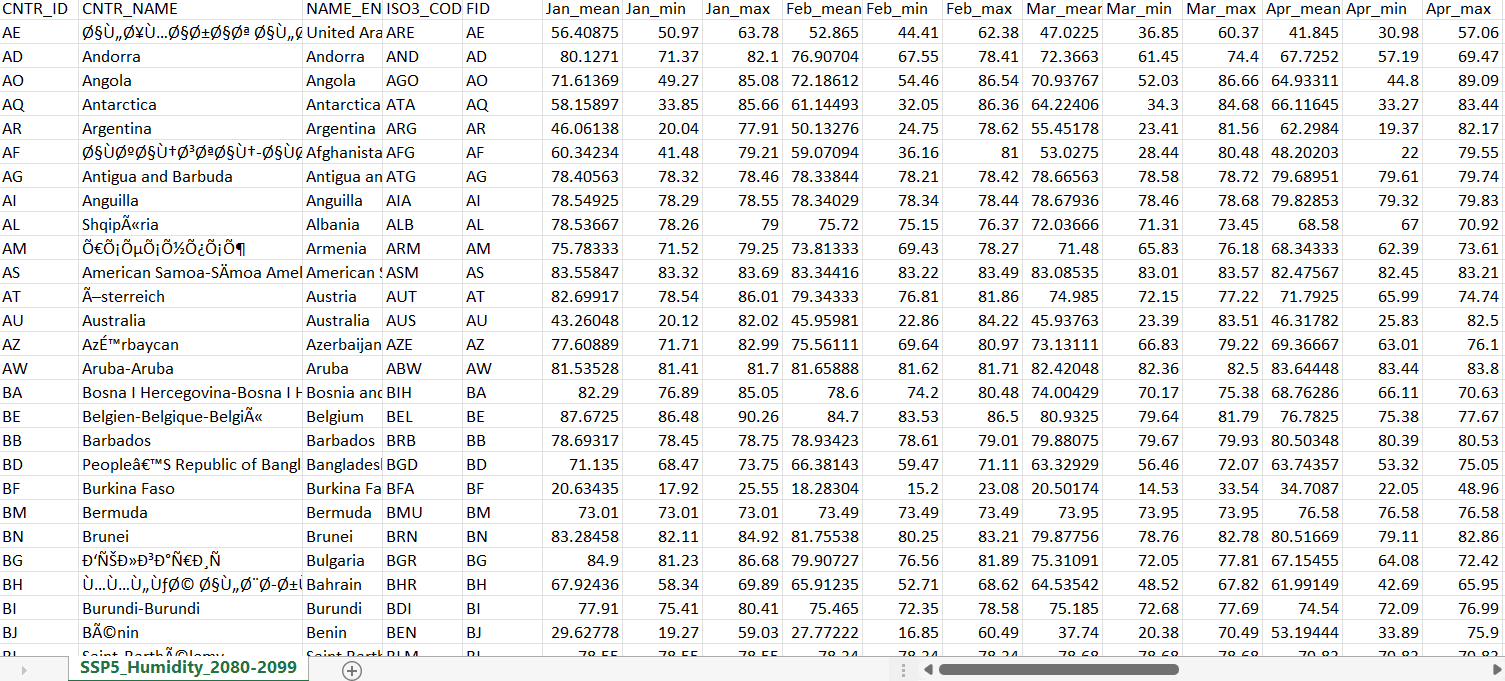
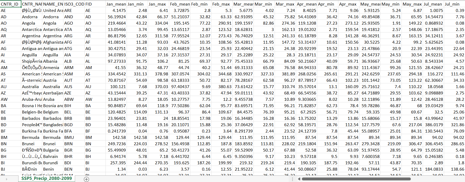
d. Number of hot days (>40C)We then gathered climate change data based on specific meteorological CMIP6 climate projections. We found monthly data for the projected time-periods, for which there were scenarios which met the criteria for specific health impact across the globe. We segmented these into countries by interpolating and calculating statistical values (mean, median, min, max) from the data within the country borders. We identified this is not a perfect measurement but it aligns to what is available in environmental datasets. The climate projections datasets used were based on the CMIP6 program: https://climateknowledgeportal.worldbank.org/download-data https://cds.climate.copernicus.eu/cdsapp#!/dataset/projections-cmip6?tab=form
We calculated the percentage of the months that met certain climate criteria, that were favourable for vector-borne diseases or other diseases. For example, the climate suitability for malaria spread is defined when all three conditions are present: 1. Precipitation >80mm, 2. Temperature 18-32oC 3. Relative Humidity > 60%, whereas for the zika virus optimal temperatures are between the range 28-34oC.
Once we had the datasets, we could link climate projections to health impacts. This is were the artisty came in. We made a 3D globe visualisation where the countries with large measurements were more attrudded from the globe. On the left was the selection panel to choose age range and health impacts. On the right was the details of the countries. When users hover over a country the information about the country measurements and health impacts appears on the right.
We thought it could be effective to account for blind users and other user wanting voice out of the information. So we included a voice out from the information about the specific health impact based on the age range chosen.
We provided a menu on the left of the interactive visualisation so users can choose the criteria of age range: Foetus Children Adult Elderly and Health impact: 1- zika virus (foetus) 2 - preterm birth (foetus) 3 - hospital admissions (children, adults, elderly) 4 - malaria (children, adults) 5- death (elderly)
Challenges we ran into
We found that processing the Climate projection CMIP6 was difficult to process to get the yearly and average in terms of python processing. With more time we can easily add more datasets and more climate scenario projections
We found it a slight delay in finding the climate indicators and ensuring it was accurate. Therefor only included these health impact. There is potential to include many more with more time
Accomplishments that we're proud of
The visualisation is a working interactive visualisation available on line for user to try
The processing of climate projections to filter against criteria of health impacts
What we learned
It takes longer than expected to process large NetCDF dataset
Climate change related health impacts entail a great degree of uncertainty, and scientific data are difficult to find
What's next for Exposome: showing how climate change impacts global health.
To advance Exposome with other dataset, climate projections and health impacts
To link to citizen science measurements were they are measuring Temp, Air Pollution, Humidity and inspire students and citizen scientist to mitigate these health impact.
The aim is to link to existing initiative like the 'Making Sensor Sensor' that measures Air pollution in School in the UK, allows students to measure and evaluate their own Air Quality Exposure and to design policy and mitigation to change this. To find out more seen https://making-sensor-sense.webflow.io/


Log in or sign up for Devpost to join the conversation.