-
-

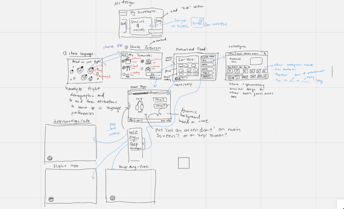
User Flow Diagram
-
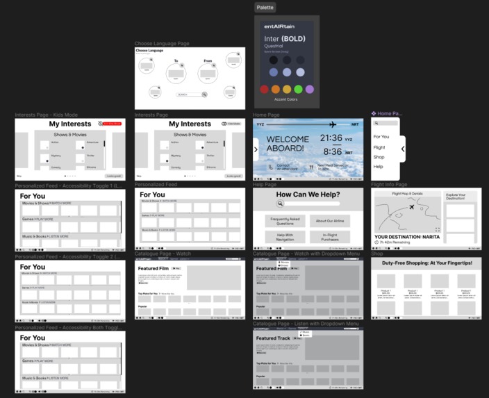
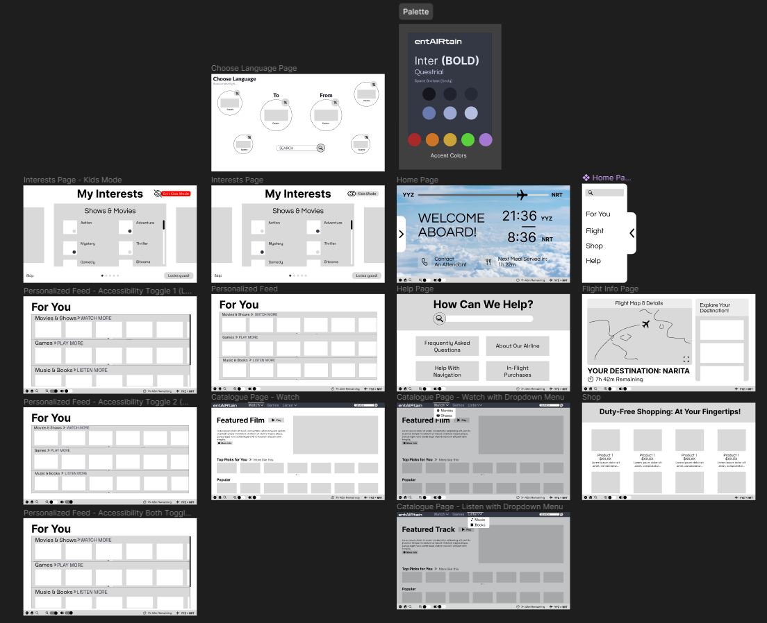
Low Fidelity Wireframe
USER RESEARCH
Regarding user research, when developing an in-flight entertainment system, we needed to ensure that we were keeping in mind the user at the forefront of our design. This includes the demographic our UI caters to and can cater towards, the goals we want to achieve, primarily being an entertainment-centric experience for the user, and what needs for these different demographics we want to help provide.
We also conducted research and ran comparisons on various other traditional in-flight entertainment systems, including those of Qatar Airways, American Airlines, and Delta Airlines. We tried to pick from these past iterations and see if we could further refine aspects of their design in relation to what we were trying to do with our product. We also needed to consider that, unlike traditional apps, this UI would be primarily used in a tablet/landscape setting, so we needed to implement our features accordingly.
Lastly, as an entertainment system, we needed to take into account the content preferences of our users. Whether it be based on their age or interests, having our design revolve around their preferences made the UI more intuitive and allowed users to discover content they relate to more easily.
DESIGN CONSIDERATIONS
In terms of design considerations, we implemented intuitive navigation through the use of clear icons and straightforward menu structures. In addition, we emphasized providing a wide assortment of discoverable content and personalized content recommendations based on user preferences and their previous viewing history.
We ensured our design was accessible, going the extra mile and adding two accessibility toggles (larger text, greater contrast) for pages that may be harder to navigate or view for some users. This ensures our UI is accessible to all passengers, including those with disabilities.
We also offer multilingual support, as choosing a language is the first thing you’ll be greeted with when using this UI, and the rest of the design will adapt based on your language preferences (although only English is shown for demonstrative purposes). We made sure to let the users know popular languages that tend to be spoken by passengers on the same flight, and if they still can’t find theirs, we incorporated a search function for ease of access. Through these implementations, we offered content in multiple languages to cater to a diverse passenger base.
We also created user controls, which will be present when viewing content such as movies, for example, and generally navigating through the UI. This includes a persistent taskbar with a “back,” “home,” and “search” feature, along with the two accessibility toggles mentioned previously. The taskbar also includes the time remaining until arrival and where they are travelling to and from for convenience.
We also ensured that a child-friendly mode was present for families whose children want to access the UI with child-appropriate content.
Built With
- figma
- miro

Log in or sign up for Devpost to join the conversation.