-
-
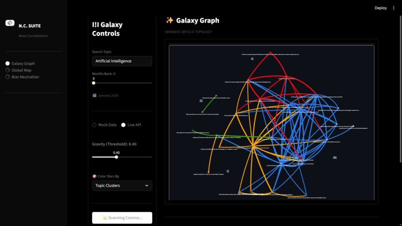
Interactive 3D network graph visualizing how news articles cluster and connect by topic
-

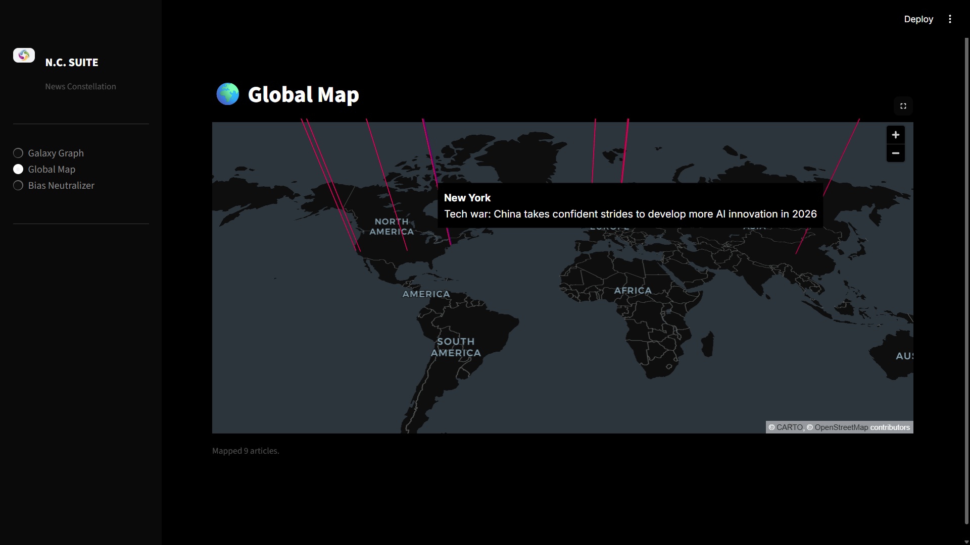
Interactive global map showing geographic origins of news articles
-
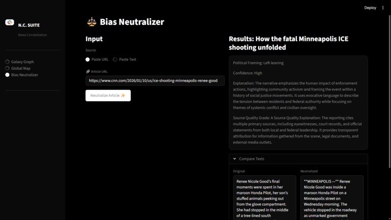
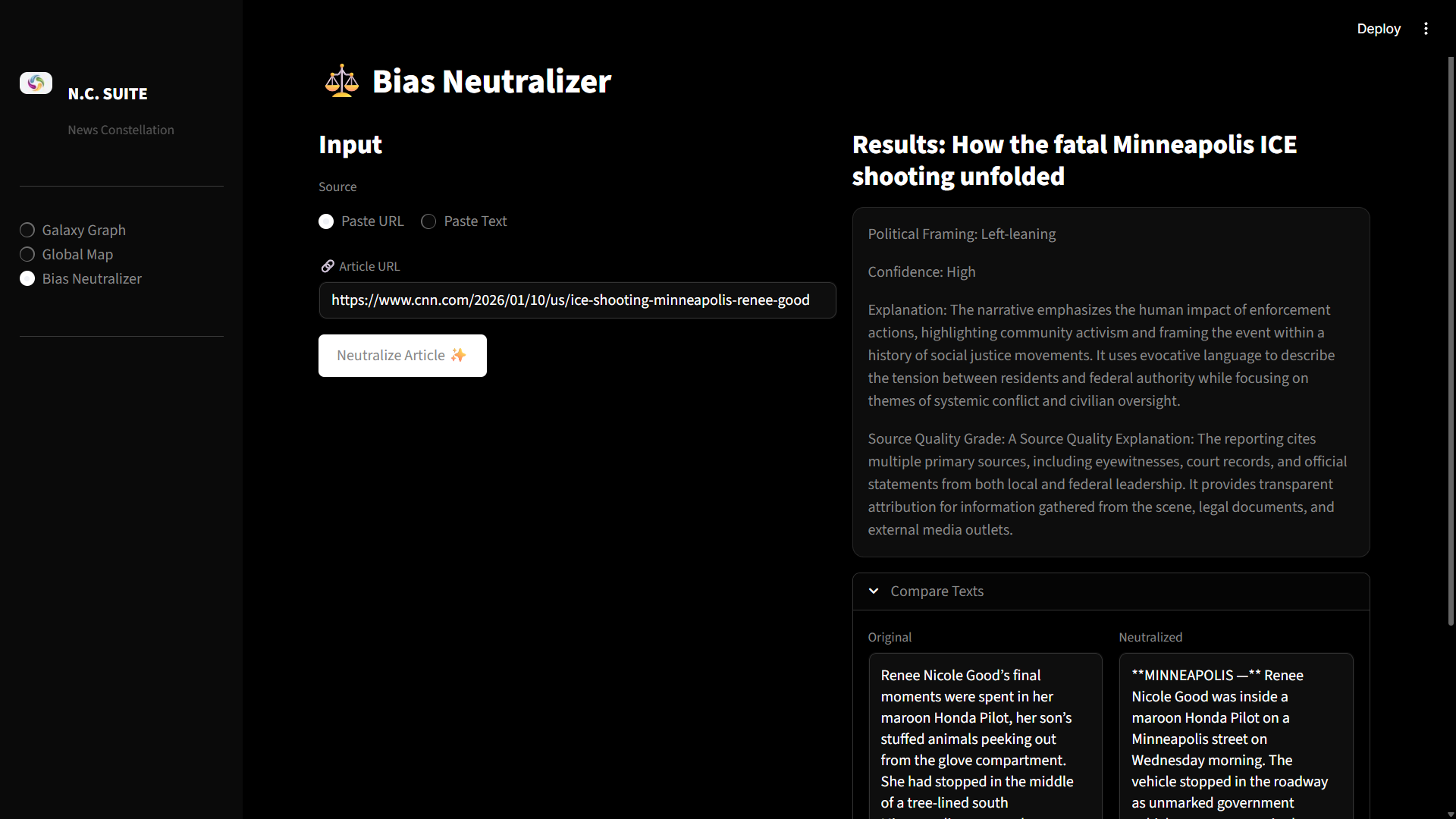
Bias neutralizer rewrites news articles into a factual, side-by-side comparison of original and neutral text
-
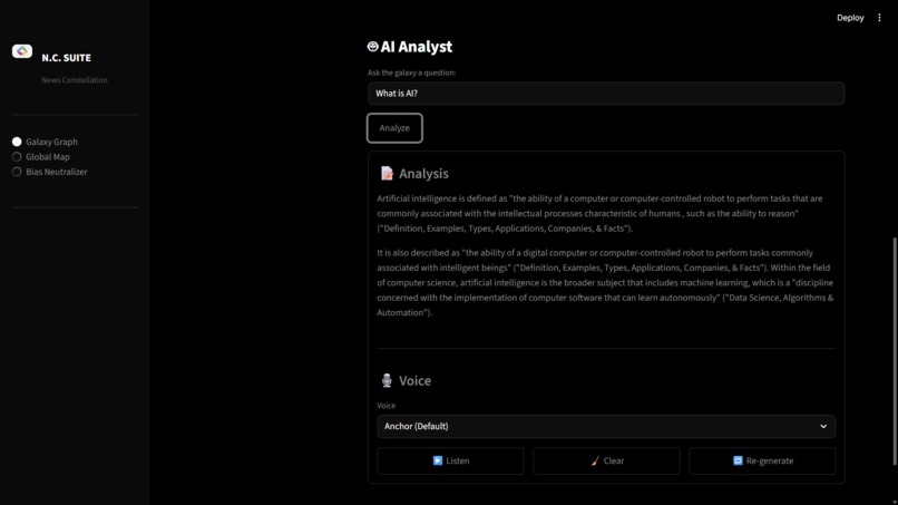
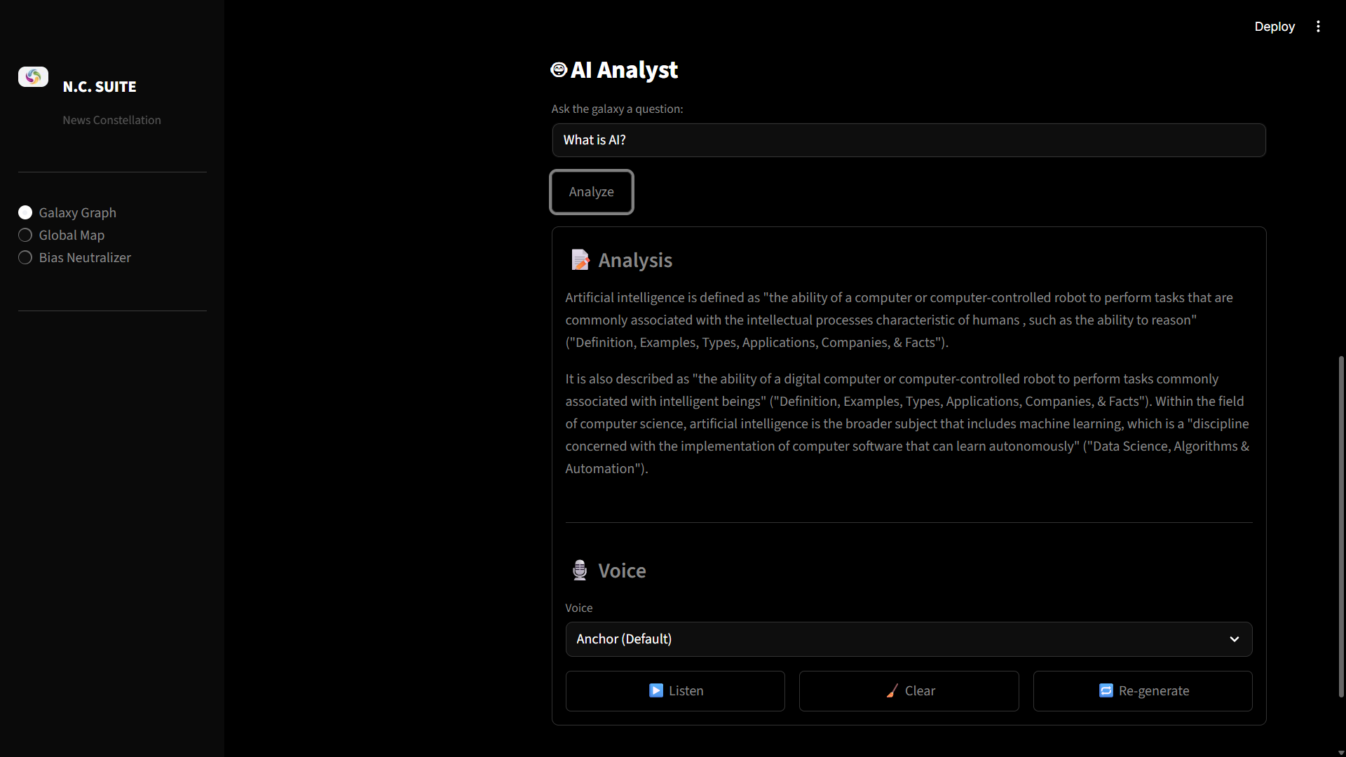
AI analysis panel summarizing news content and highlighting key insights and framing.
-
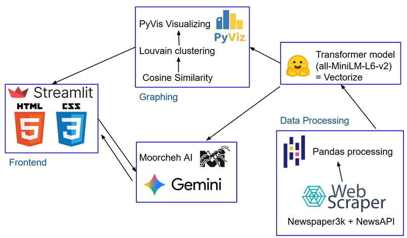
tech stack

Inspiration
Most people consume news through endless linear feeds. This format strips away context, hides patterns in coverage, and makes it difficult to recognize bias, echo chambers, or under-reported stories. We wanted to build a tool that helps people see the structure of the news, not just read individual headlines. Apogee was inspired by the idea that media literacy improves when people can visualize how stories connect, overlap, or disappear entirely.
What it does
Apogee ingests live news articles and transforms them into an interactive 3D map of the news landscape. Articles are clustered by semantic similarity rather than keywords, allowing users to explore how different outlets cover the same topics. Users can visually identify dominant narratives, fragmented coverage, and blind spots. An integrated AI assistant allows users to ask questions about clusters and receive context-aware explanations grounded in the underlying news data. A timeline slider also lets users explore how coverage changes over the past year.
How we built it
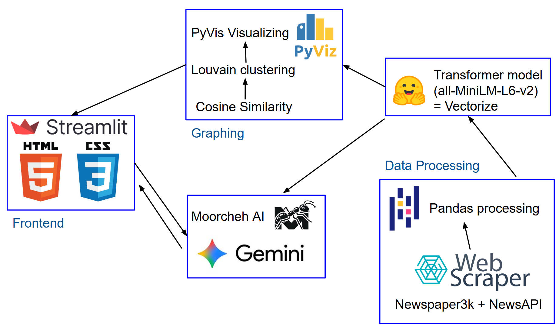
We fetch live articles using NewsAPI, then scrape full article text with newspaper3k. Each article is converted into a semantic embedding using a lightweight transformer model. We compute cosine similarity between articles to build a graph, which is clustered automatically using Louvain community detection. The graph is visualized as an interactive 3D network using PyVis and served through Streamlit. We use Moorcheh AI to store article vectors and cluster context, which enables retrieval-augmented queries sent to Gemini for contextual explanations and persistent chat memory.
Challenges we ran into
Balancing performance and interactivity was a major challenge, especially when computing similarity and scraping across many articles in real time. This took a lot of time to reduce load times and us finding the errors or bottlenecks in our code was really annoying.
Accomplishments that we're proud of
We successfully built an end-to-end system that goes from live news ingestion to semantic clustering and interactive visualization within a hackathon timeframe. We are especially proud of turning abstract NLP concepts like embeddings and similarity graphs into something intuitive and explorable. Integrating Moorcheh and Gemini to enable context-aware, memory-backed exploration of the news graph was another major milestone.
What we learned
We learned how powerful semantic embeddings and graph-based approaches can be for making sense of large, unstructured information spaces. We gained hands-on experience with unsupervised clustering, similarity thresholds, and the tradeoffs between accuracy and performance.
What's next for Apogee
Next, we want to add clearer indicators that explain why stories change in prominence over time. We plan to improve accessibility with text-first summaries for non-visual users.


Log in or sign up for Devpost to join the conversation.