
Inspiration
Motor-vehicle crashes are one of the leading causes of death in the U.S.
What it does
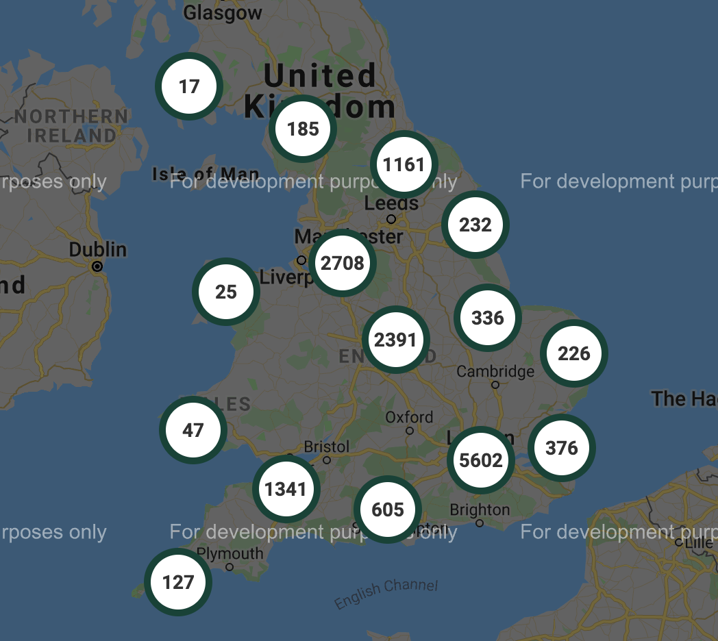
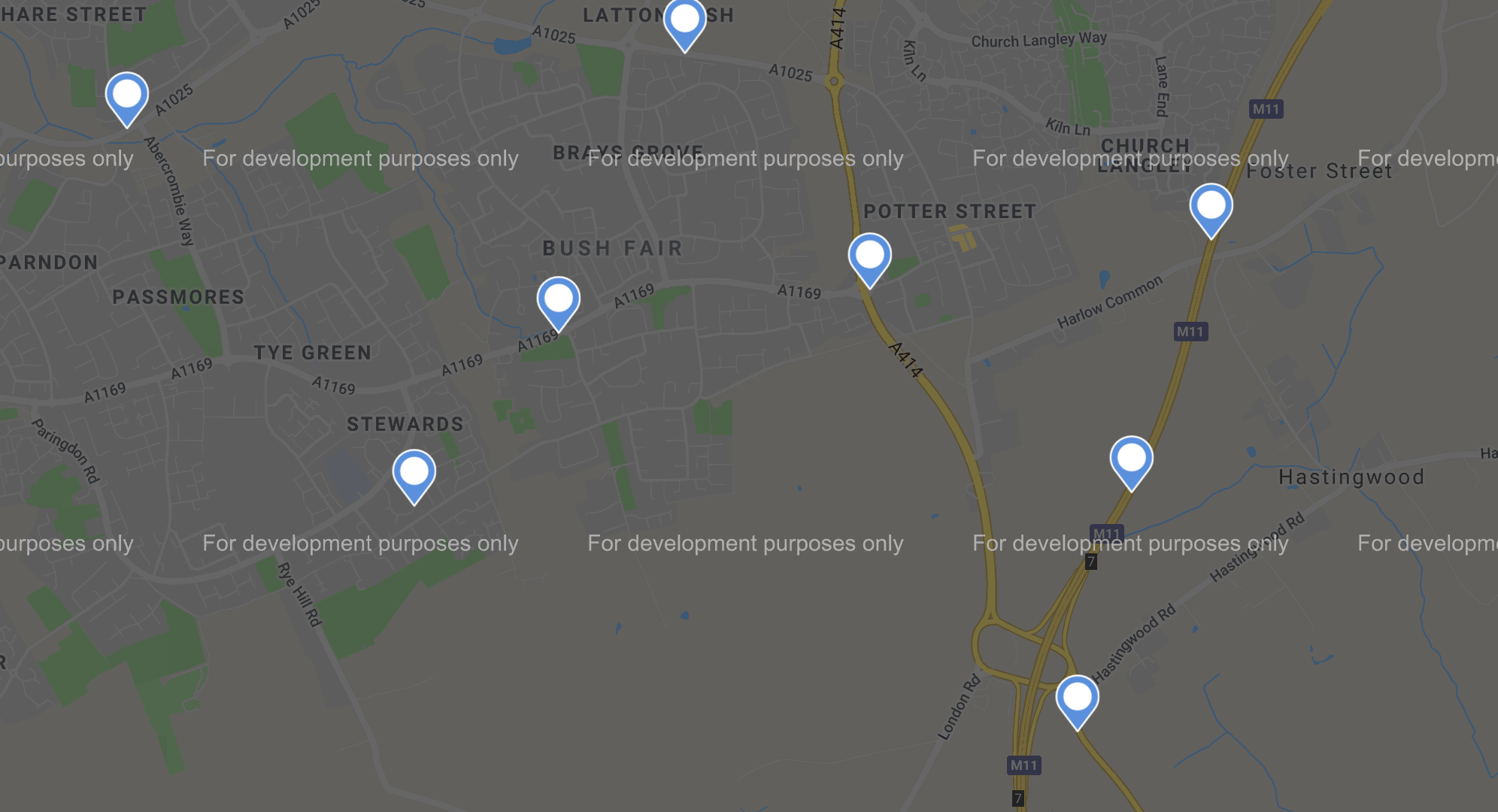
Identify accident-prone zones. Users can view a map that represents the location of car accidents happened in their area. The numbers inside circles represent accidents happened in that area. The idea is to inform the users of the accident-prone zones 'ahead', so that the users can be more cautious, drive safely and ultimately minimize the risk of being in an accident.
How I built it
Using a large data set with about 1.5 million entries, we did some data analysis to determine the accident rates for different areas at multiple times of the day. We looked at how the severity of accidents changed over time and tried to identify patterns in the data. Since this dataset was too large to work with, given computational limitations, we sampled 16000 data points and we used React JS and MapBox to map the exact latitudes and longitudes from those data points onto a map that helped in identifying accident-prone zones.
Challenges I ran into
Exploring the idea, and defining which functionalities we wanted to focus on. Crunching down data from the initial 1.5 million entries in the dataset to a smaller subset. General coding and debugging our app
Accomplishments that I'm proud of
Learning to use real data sets. Implementing an existing GitHub repository to prototype quickly Collaborating to build something meaningful
What I learned
React, MapBox API implementation, Jupyter Notebooks, teamwork
What's next for Ahead: Accident Prone Zones
Get More comprehensive car accident data to find out the ratio of cars being driven and cars getting into an accident for any given area. This would better inform how dangerous an area is. We also plan to show how the accident rate changes by the time of the day/week. We can see the accident ratio is higher on Saturday at 2 am rather than Monday at 2 pm.

Log in or sign up for Devpost to join the conversation.