-

-

-

-

-

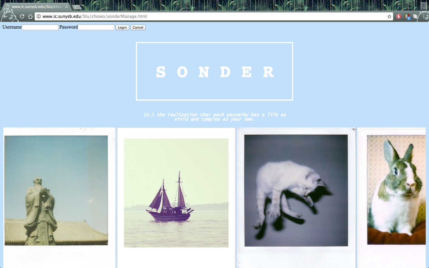
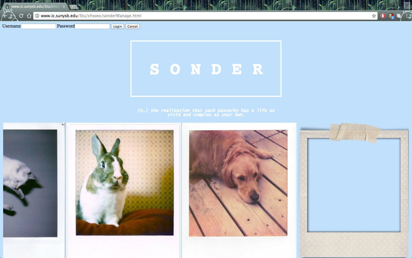
The last polaroid is what a new profile would look like.
Inspiration
Brainstorming via Facebook Messenger at 2AM, our team was inspired by Tinder's infamous card-swipe feature-- we initially wanted to build a mobile app using a similar feature, with of course, a 'health' aspect. The app would be used to provide information about your ailments, which then could be used to connect to others--in your area--with similar or perhaps, even the same ailments. Unlike Tinder's reputation as a "hookup app," our app would focus in building a supportive community via relations with others who have dealt or is still currently dealing with the same ill-health situation as the user. Because of unforeseen events, we made the ultimate decision to translate the app into a webpage instead, with our focus staying the same and with even more emphasis on the appeal of the UI: how can we make the webpage as soothing and calming to the eye as possible?
Our product is S O N D E R -- an actual term defined by the realization that every passerby (friend, family, or stranger) around you is living a life just as vivid as your own. We wanted to relay the message in a different perspective; every person you have ever met (or have yet to meet) is living a life that can be just as weighed down as your own. Through this shared experience of illnesses, whether it be insomnia, depression, physical pain, or even loneliness, one can establish a new relationship or connection with someone else who has been through the same pain... or even someone who is still experiencing said pain.
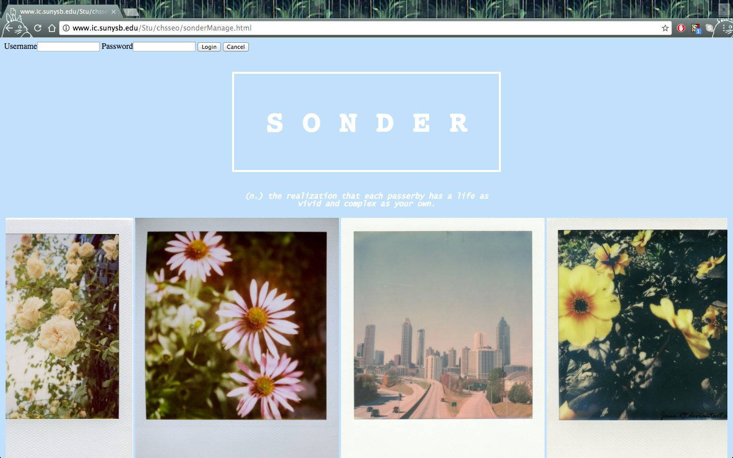
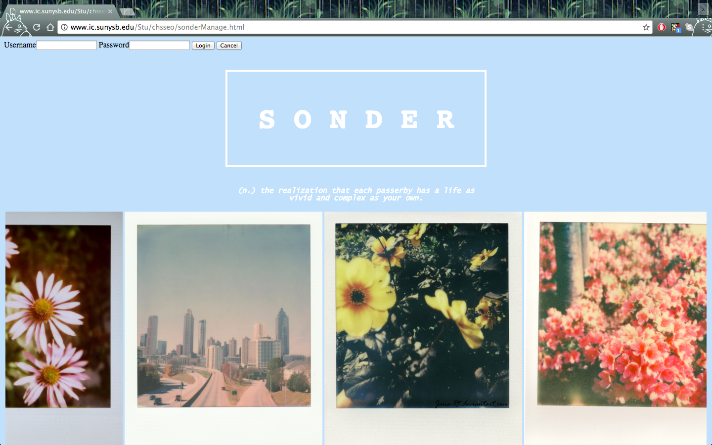
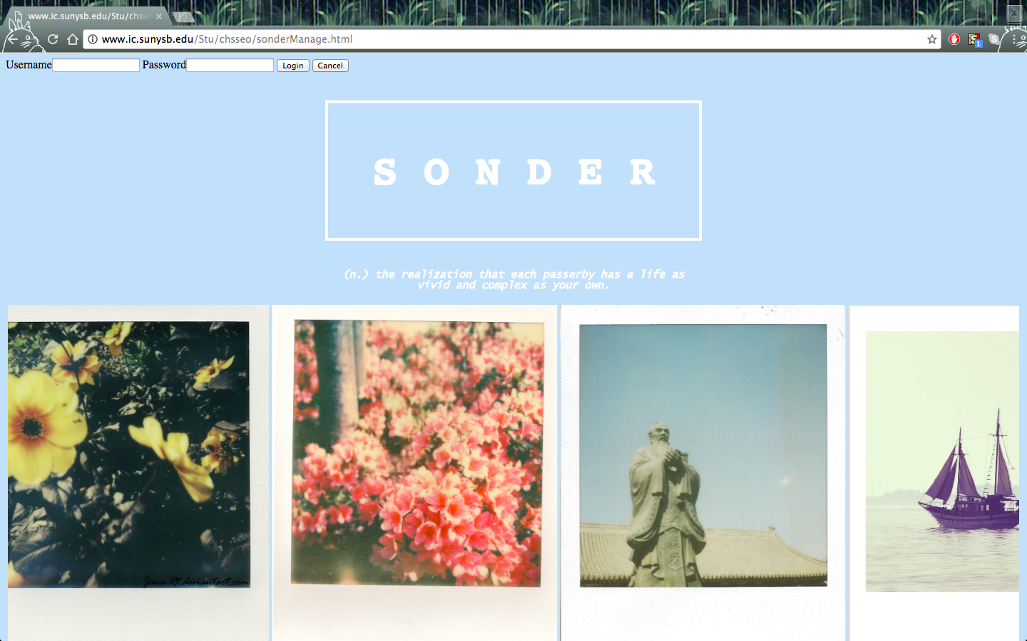
With this vision in mind, our team strived to make sure the UI of the webpage would mitigate any feelings of anxiety as much as possible. After all, S O N D E R strives to ensure the 'lifting of burdens' and we did not want our webpage to instill any additional anxiety or feelings of suffocation. This mindset allowed us to build a serene webpage with soothing, pastel colors, and a leisurely-paced marquee of profiles (prettily displayed in polaroids) that the user can watch as it scrolls, alleviating one worrisome thought at a time.
What it does
S O N D E R is website that can connect you to others dealing with similar ill health. The UI was specifically made with hard efforts to look as serene, pastoral as possible, to give off a calm and soothing vibe for anyone to feel the most comfort and relief as possible when on this website. The profiles are displayed in a dream-like fashion, with a marquee to relay a 'side-to-side' movement and feel. There is also a 'verified' section to serve as a community-based rating system, which will potentially 'weed out' the trolls or other users with bad influence-- there is no need for a user to converse with someone who will only try to bring them down. In this way, the user can choose whether to reach out to a specific profile, based on the community 'verified' ratings.
How we built it
As our team was somewhat familiar with HTML/CSS, we scoured online sources and tutorials to implement and build the website from scratch. Although using Bootstrap or a similar framework could have helped speed up the website constructing process, we knew we would not be able to learn how to use the framework in time. Since the original intent was to build a card-swiping mobile app, we kept a similar feel of 'side-to-side' movement by coding a marquee to present the profiles of other users in the area, with the profiles represented as polaroids of inanimate objects or animals, such picturesque flowers, the ocean, or bunnies. One focal point of S O N D E R is the anonymity. After all, we want this program to be used as a method of dealing with one's heavy burdens, ailments-- all of which are difficult to express when your real name and face is known. Usernames are also randomly generated for this purpose. In this way, there is no vulnerability to talk about your problems dealing with health, and there is no reason to be suffocated by these issues. Most our efforts poured into making sure the UI of the website would be as soothing to the eye as possible.
Challenges we ran into
Even though our team wanted to have a concrete plan of our product before the start of HackHealth, attending different schools (NYU & Stony Brook) made this almost impossible, with our conflicting schedules and heavy courseloads in upper-division classes, since two of our team members are juniors and the other member is a senior in college. Being a "long-distance" team forced us to rely heavily on online communication--which still was hard to schedule, and ended up taking place at 2AM or the like.
At the start of the HackHealth, all of us were brimming with excitement to code our app--however, our skill capability in the programming language proved to be an adversity, which costed us a good chunk of precious (and limited!) time. Quickly, we switched gears; we decided to translate the app idea into a webpage with the same theme and similar feel. Even though we did not know HTML/CSS/JavaScript as well as we would have liked, we knew enough to be able to learn and code in the remaining amount of time left in the hackathon.
Regretfully enough, as a team, we wished we had more time to add additional features into our website-- however, we know this is simply another opportunity for us to work on this project together in the future, at our own pace.
Accomplishments that we're proud of
- The look of the UI
- Teamwork
- The ability to bounce back from what seemed to be an initial failure
- Gaining a better grip with using HTML/CSS/JavaScript
- For each of us, this was the first webpage we have ever built. (WE MADE A WEBPAGE FOR THE FIRST TIME!!!!) Thank you to HackHealth for providing us the space and time to create this webpage!
What we learned
- Since we were sharing code together as a team, we learned the importance of organizing code in more efficient ways or writing concise code when possible. Cleaner lines of code were easier to add to each other's lines of code when trying to put everything together and test the product.
- In a team (especially one where face-to-face communication is challenging), communication of our own abilities is key. Even though we attempted to plan out our project before the hackathon, we did not realize the severity of the impact from not correctly relaying our skill capabilities before trying out a new language or framework for our project. Thankfully, we also learned to bounce back from any hindrances-- and as a team, we ended up creating a webpage that almost looks like a work of art.
What's next for S O N D E R
Since some features on our webpage are unfinished due to the lack of time, we want to go back and code the rest of our vision into the webpage and truly bring it alive and useable for the world.
In addition, we want to add additional features to our webpage... and begin working on the mobile app version as we originally intended!


Log in or sign up for Devpost to join the conversation.